Basic Responsive Collapsed Menu With jQuery - flexmenu2
| File Size: | 18.4 KB |
|---|---|
| Views Total: | 2162 |
| Last Update: | |
| Publish Date: | |
| Official Website: | Go to website |
| License: | MIT |
flexmenu2 is an easy, lightweight, cross-browser jQuery responsive menu plugin that transforms the traditional navigation into a toggleable dropdown menu on mobile (small screen) devices.
How to use it:
1. Load the main stylesheet flex.css in the head section of the web page.
<link rel="stylesheet" href="flex.css">
2. Create a normal site navigation from an unordered HTML list.
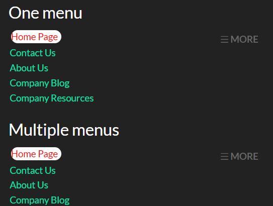
<ul class="flex">
  <li class="selected"><a href="#" class="active">HomePage</a></li>
  <li><a href="#">Contact Us</a></li>
  <li><a href="#">About Us</a></li>
  <li><a href="#">Company Blog</a></li>
  <li><a href="#">Company Resources</a></li>
  ...
</ul>
3. Load jQuery JavaScript library and the jQuery flexmenu2 plugin's script index.js at the bottom of the web page.
<script src="https://code.jquery.com/jquery-1.12.4.min.js"
        integrity="sha384-nvAa0+6Qg9clwYCGGPpDQLVpLNn0fRaROjHqs13t4Ggj3Ez50XnGQqc/r8MhnRDZ"
        crossorigin="anonymous"></script>
<script src="index.js"></script>
4. Call the function on the menu list.
$('ul.flex').flexMenu();
5. Set the threshold you prefer. For example example if the threshold is set to 5 and there are only 5 menu items the dropdown won't trigger.
$('ul.flex').flexMenu({
  'threshold' : 2
});
6. Set the text/title of the toggle link.
$('ul.flex').flexMenu({
  'linkText' : '☰ MORE',
  'linkTitle' : 'Open/Close Menu',
});
Change log:
2018-02-07
- added more options
This awesome jQuery plugin is developed by mylastore. For more Advanced Usages, please check the demo page or visit the official website.


