Mobile-friendly Multi-level Site Navigation With jQuery
| File Size: | 25.5 KB |
|---|---|
| Views Total: | 5421 |
| Last Update: | |
| Publish Date: | |
| Official Website: | Go to website |
| License: | MIT |
This is a small jQuery script that helps you create a responsive, mobile-friendly, multi-level dropdown (for desktop) & toggle (for mobile) menu for cross-platform webpages.
How to use it:
1. Load the Font Awesome and menu.css in the document's head section.
<link rel="stylesheet" href="https://maxcdn.bootstrapcdn.com/font-awesome/4.7.0/css/font-awesome.min.css">
<link rel="stylesheet" href="menu.css">
2. Create a regular multi-level header navigation as follows:
<header>
<nav id='cssmenu'>
<div class="logo"><a href="index.html">Logo </a></div>
<div id="head-mobile"></div>
<div class="button"></div>
<ul>
<li class='active'><a href='#'><i class="fa fa-home"></i></a></li>
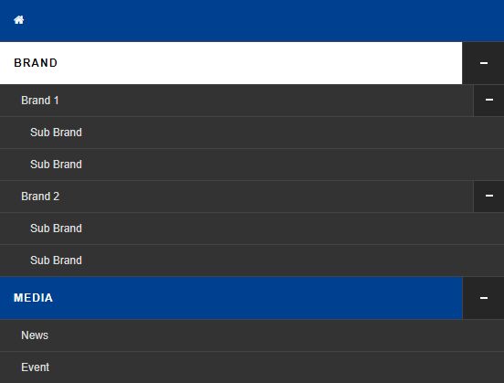
<li><a href='#'>Brand</a>
<ul>
<li><a href='#'>Brand 1</a>
<ul>
<li><a href='#'>Sub Brand</a></li>
<li><a href='#'>Sub Brand</a></li>
</ul>
</li>
<li><a href='#'>Brand 2</a>
<ul>
<li><a href='#'>Sub Brand</a></li>
<li><a href='#'>Sub Brand</a></li>
</ul>
</li>
</ul>
</li>
<li><a href='#'>Media</a>
<ul>
<li><a href='#'>News</a></li>
<li><a href='#'>Event</a></li>
</ul>
</li>
<li><a href='#'>We Are</a></li>
<li><a href='#'>Contact</a></li>
</ul>
</nav>
</header>
3. Load both jQuery JavaScript library and the menu.js at the end of the document. Done.
<script src="https://code.jquery.com/jquery-3.3.1.min.js"
        integrity="sha384-tsQFqpEReu7ZLhBV2VZlAu7zcOV+rXbYlF2cqB8txI/8aZajjp4Bqd+V6D5IgvKT"
        crossorigin="anonymous">
</script>
<script src="menu.js"></script>
This awesome jQuery plugin is developed by shahali007. For more Advanced Usages, please check the demo page or visit the official website.


