Mobile-first Offcavas Navigation With jQuery
| File Size: | 2.85 KB |
|---|---|
| Views Total: | 2123 |
| Last Update: | |
| Publish Date: | |
| Official Website: | Go to website |
| License: | MIT |
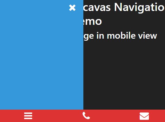
A jQuery based mobile app navigation pattern that displays a sticky bottom navigation at the bottom of the web app and shows/hides an off-canvas sidebar navigation when toggled.
How to use it:
1. Import the Font Awesome Ionic Font for the navigation icons (OPTIONAL).
<link rel="stylesheet" href="https://netdna.bootstrapcdn.com/font-awesome/4.7.0/css/font-awesome.min.css">
2. Create the off-canvas sidebar menu.
<nav id="slide-menu">
  <div class="icon-btn slide-close"><i class="fa fa-close"></i></div>
  <div class="menu">

    <!-- your menu goes here -->

  </div>
</nav>
3. Insert the menu trigger element to the bottom navigation.
<div class="mobile-sticky">
  <div class="inner-sticky">
    <ul>
      <li>
        <div class="icon-btn trigger">
          <i class="fa fa-bars fa-2x"></i>
        </div>
      </li>
      ... More Navigation Items Here
    </ul>
  </div>
</div>
4. The required CSS styles.
.mobile-sticky {
  display: none;
  position: fixed;
  bottom: 0;
  left: 0;
  width: 100%;
  z-index: 99999;
}

nav#slide-menu { display: none; }
 @media screen and (max-width: 768px) {

nav#slide-menu {
  background: #DD3333;
  position: fixed;
  top: 0;
  left: -300px;
  bottom: 0;
  display: block;
  float: left;
  width: 100%;
  max-width: 293px;
  height: 100%;
  overflow: scroll;
  padding-bottom: 25%;
  -moz-transition: all 300ms;
  -webkit-transition: all 300ms;
  transition: all 300ms;
  z-index: 9999;
}

.icon-btn.slide-close {
  position: absolute;
  margin: 6px 20px 0 0;
  top: 0;
  right: 0;
  cursor: pointer;
}

/*display mobile sticky on mobile */

.mobile-sticky { display: block; }

/* mobile sticky styles */

.inner-sticky {
  float: left;
  width: 100%;
  background: #DD3333;
}

.mobile-sticky ul {
  margin: 0;
  padding: 0;
}

.inner-sticky li {
  float: left;
  width: 33.33%;
  text-align: center;
  background: #DD3333;
  padding: 6px 0;
  list-style-type: none;
}

.inner-sticky .fa, .inner-sticky a, nav#slide-menu a { color: #FFF; }

body.menu-active nav#slide-menu { left: 0px; }

.slide-close i.fa.fa-close {
  font-size: 2em;
  color: #fff;
  right: 0;
  border-radius: 50%;
  padding: 6px;
}

.menu-mobile .menu {
  margin-top: 9vh;
  padding-left: 0px;
  padding-right: 0px;
  margin-left: 0px;
  margin-right: 0px;
}

.menu-mobile .menu li {
  list-style-type: none;
  display: block;
  font-size: 30px;
  border: solid 1px #fff;
  width: 90%;
  margin: 10px auto;
  text-align: center;
  border-radius: 7px;
}
}
5. Import the latest version of jQuery JavaScript library into the page.
<script src="https://code.jquery.com/jquery-3.3.1.min.js"
        integrity="sha384-tsQFqpEReu7ZLhBV2VZlAu7zcOV+rXbYlF2cqB8txI/8aZajjp4Bqd+V6D5IgvKT"
        crossorigin="anonymous">
</script>
6. The main jQuery script to enable the off-canvas sidebar menu.
jQuery(document).ready(function ($) {

  (function slideMenu() {

      var trigger = '.trigger'; // the triger class
      var showslide = 'menu-active'; // the active class that is added to the body
      var body = 'body'; //body of element
      var close = '.slide-close'; // the class that closes the slide
      var slideout = 'slideout'; // the class to show the slide
      var mainId = '#slide-menu' //main wrapper ID

      //open the slide and add class to body to use with css
      jQuery(trigger).click(function () {

          jQuery(body).toggleClass(showslide);
          jQuery(mainId).toggleClass(slideout);

      });

      //close the slide
      jQuery(close).click(function () {

          jQuery(body).removeClass(showslide);
          jQuery(mainId).removeClass(slideout);
      });

  }).call(this);

}());
This awesome jQuery plugin is developed by gabrielmacedoo. For more Advanced Usages, please check the demo page or visit the official website.


