Responsive Sticky Navigation Plugin For jQuery - Simple Menu
| File Size: | 101 KB |
|---|---|
| Views Total: | 8555 |
| Last Update: | |
| Publish Date: | |
| Official Website: | Go to website |
| License: | MIT |
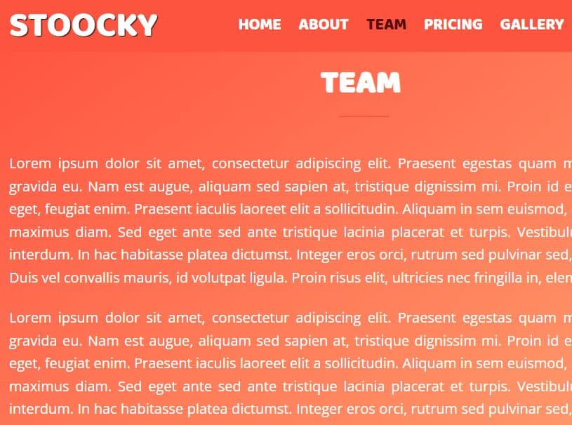
The Simple Menu jQuery plugin lets you create a responsive, sticky, multi-functional, in-page navigation menu for your long webpages.
Features:
- Auto transforms the responsive menu into a dropdown navigation on mobile devices.
- Sticks the navigation menu to the top of the webpage on scroll.
- Smoothly scrolls to specific points when you click on the anchor links inside the navigation.
- Supports scrollspy functionality.
- A sliding line that indicates which content section you're viewing on.
Installation:
# Yarn
$ yarn add jquery-simple-menu

# NPM
$ npm install jquery-simple-menu
How to use it:
1. Create the responsive sticky navigation as this:
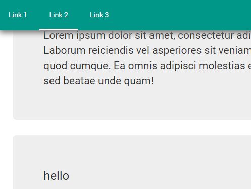
<nav class="simple-menu clearfix">
  <a class="btn btn-menu">Menu</a>
  <ul>
    <li><a href="#wayp-1">Link 1</a></li>
    <li><a href="#wayp-2">Link 2</a></li>
    <li><a href="#wayp-3">Link 3</a></li>
  </ul>
</nav>
2. Create the content sections you want to scroll through.
<div id="wayp-1" class="tracked">
  <h3>Waipoint 1</h3>
  ...
</div>

<div id="wayp-2" class="tracked">
  <h3>Waipoint 2</h3>
  ...
</div>

<div id="wayp-3" class="tracked">
  <h3>Waipoint 3</h3>
  ...
</div>
3. Apply your own CSS styles to the navigation.
.simple-menu { background-color: #009688; }

.simple-menu ul {
  -webkit-padding-start: 0px;
  -webkit-margin-before: 0;
  -webkit-margin-after: 0;
}

.simple-menu ul a {
  padding: 20px;
  color: #ffffff;
}

.simple-menu a:hover { background-color: #00776c; }

.fixed { box-shadow: 0 7px 17px -2px rgba(117, 117, 117, 1); }

.clearfix {  *zoom: 1;
}

.clearfix:before, .clearfix:after {
  display: table;
  content: "";
  line-height: 0;
}

.clearfix:after { clear: both; }

@media screen and (max-width: 728px) {

.simple-menu ul { background-color: #009688; }

.simple-menu li { text-align: center; }

.simple-menu a { border-bottom: 1px solid #79896d; }

.btn-menu {
  text-align: center;
  padding: 20px;
  color: #f8ecc2;
}
}
4. Include jQuery JavaScript library and the jQuery Simple Menu plugin's script at the bottom of the webpage.
<script src="//code.jquery.com/jquery.min.js"></script>
<script src="jquery.simple-menu.js"></script>
5. Initialize the simple menu plugin and done.
$('.simple-menu').simpleMenu({
  // options here
});
6. Initialize the simple menu plugin and done.
$('.simple-menu').simpleMenu({
  // options here
});
7. All possible options to customize the simple menu plugin.
$('.simple-menu').simpleMenu({
  menuSpeedAnimate:             600,
  pageNavigationSpeedAnimate:   1500,
  btnClassMenu:                 'btn-menu',
  stickyMenu:                   false,
  stickyMenuClassName:          'fixed',
  slidingLine:                  false,
  slidingLineClassName:         'sliding-line',
  slidingLineClassNameActive:   'active',
  slidingLineColor:             '#ffffff',
  slidingLineHeight:            '3px',
  slidingLineSpeedAnimate:      200,
  winMobWidth:                  728,
  waypointTrackedClassName:     'tracked'
});
Change log:
2018-02-22
- v0.6.3: Fix bug
2018-02-22
- v0.6.2: Updated for jQuery 3.
2017-08-31
- v0.6.0: Add webpack
2017-08-27
- v0.5.1: bugfix; no-waypoints version
2017-08-25
- fixed for mobile
This awesome jQuery plugin is developed by ikloster03. For more Advanced Usages, please check the demo page or visit the official website.