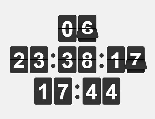
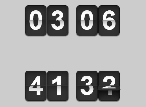
Realistic Flip Clock In jQuery
| File Size: | 7.4 KB |
|---|---|
| Views Total: | 3183 |
| Last Update: | |
| Publish Date: | |
| Official Website: | Go to website |
| License: | MIT |
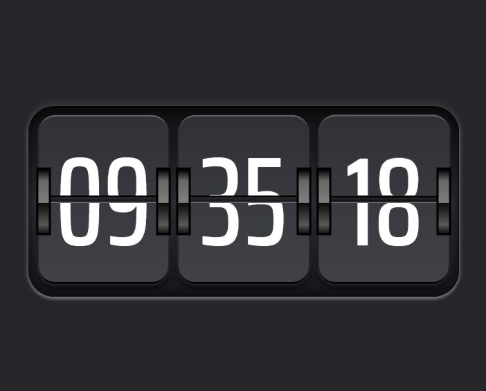
A realistic, animated flip clock that shows the current time in a retro style. Written using JavaScript (jQuery) and CSS animations.
See Also:
How to use it:
1. Build the HTML for the flip clock.
<div class="clock">
  <div class="flipper">
    <div class="gear"></div>
    <div class="gear"></div>
    <div class="top">
      <div class="text">00</div>
    </div>
    <div class="bottom">
      <div class="text">00</div>
    </div>
  </div>
  <div class="flipper">
    <div class="gear"></div>
    <div class="gear"></div>
    <div class="top">
      <div class="text">00</div>
    </div>
    <div class="bottom">
      <div class="text">00</div>
    </div>
  </div>
  <div class="flipper">
    <div class="gear"></div>
    <div class="gear"></div>
    <div class="top">
      <div class="text">00</div>
    </div>
    <div class="bottom">
      <div class="text">00</div>
    </div>
  </div>
</div>
2. The necessary CSS styles for the flip clock.
.clock {
  display: grid;
  padding: 0 12px;
  grid-template-columns: 1fr 1fr 1fr;
  grid-column-gap: 12px;
  min-width: 200px;
  height: var(--clockheight);
  border-radius: var(--radius);
  background-image: linear-gradient(
    rgb(14, 14, 15) 0%,
    rgb(26, 25, 28) 20%,
    rgb(44, 44, 52) 50%,
    rgb(20, 20, 27) 100%
  );
  box-shadow: inset 0 -3px 6px 3px rgba(0, 0, 0, 0.2),
    inset 0 4px 8px 3px rgba(0, 0, 0, 0.4),
    0 2px 3px 1px rgba(255, 255, 255, 0.3), 0 -2px 4px 4px rgba(56, 56, 61, 0.5);
}

.flipper {
  position: relative;
  width: 100%;
  min-width: 150px;
  height: 100%;
  transform-style: preserve-3d;
  perspective: 1600px;
}

.gear {
  position: absolute;
  top: calc(var(--clockheight) / 3);
  width: 12px;
  height: calc(var(--clockheight) / 3);
  background: linear-gradient(
    to bottom,
    #000000 0%,
    #666666 17%,
    #7f7f7f 52%,
    #7f7f7f 52%,
    #0c0c0c 53%,
    #595959 87%,
    #131313 100%
  );
  outline: 3px solid #000;
  z-index: 99;
  transform-style: preserve-3d;
  transform: translateZ(10px);
  perspective: 0;
}

.gear:nth-child(2) {
  left: calc(100% - 12px);
}

.top,
.bottom {
  box-shadow: 0 6px 6px 1px rgba(0, 0, 0, 0.5),
    0 2px 2px 1px rgba(255, 255, 255, 0.15);
  border-top: 2px solid rgb(102, 103, 110);
  border-bottom: 2px solid #000;
}

.top {
  position: relative;
  width: 100%;
  height: calc(50% - 15px);
  background-image: linear-gradient(rgb(48, 49, 53) 0%, rgb(56, 57, 62) 100%);
  margin-top: 10px;
  margin-bottom: 5px;
  border-top-left-radius: calc(var(--radius) * 0.65);
  border-top-right-radius: calc(var(--radius) * 0.65);
}

.bottom {
  position: relative;
  width: 100%;
  height: calc(50% - 15px);
  background-image: linear-gradient(rgb(57, 58, 63) 0%, rgb(65, 65, 71) 100%);
  margin-top: 5px;
  margin-bottom: 10px;
  border-bottom-left-radius: calc(var(--radius) * 0.65);
  border-bottom-right-radius: calc(var(--radius) * 0.65);
}

.text {
  font-size: 140px;
  display: block;
  position: absolute;
  overflow: hidden;
  width: 100%;
  height: 100%;
  line-height: 193px;
  text-align: center;
}

.bottom .text {
  line-height: 0;
}

.top.new,
.bottom.new {
  position: absolute;
  left: 0;
  z-index: 12;
}

.top.new {
  top: 0;
  z-index: 1;
}

.top.new .text {
  backface-visibility: hidden;
}

.bottom.new {
  position: absolute;
  top: 0;
  height: calc(100% - 0px);
  transform: rotateX(0.5turn);
  z-index: 1;
  opacity: 0;
}

.flipper.flipping .top.new {
  transform-origin: bottom center;
  animation: rotate var(--rotationtime) 1 ease-in-out forwards;
}

.flipper.flipping .bottom.new {
  animation: rotatebottom var(--rotationtime) 1 ease-in-out forwards;
}

@keyframes rotatebottom {
  0% {
    opacity: 0;
  }
  49% {
    opacity: 0;
  }
  50% {
    opacity: 1;
  }
  100% {
    opacity: 1;
  }
}

@keyframes rotate {
  0% {
    transform: rotateX(0) translateY(0px);
  }
  100% {
    transform: rotateX(-180deg) translateY(-10px);
  }
}
3. Load the needed jQuery JavaScript library at the end of the document.
<script src="/path/to/cdn/jquery.min.js"></script>
4. The main JavaScript to enable the flip clock.
var myhour, myminute, mysecond;

function flipNumber(el, newnumber) {
  var thistop = el.find(".top").clone();
  var thisbottom = el.find(".bottom").clone();
  thistop.addClass("new");
  thisbottom.addClass("new");
  thisbottom.find(".text").text(newnumber);
  el.find(".top").after(thistop);
  el.find(".top.new").append(thisbottom);
  el.addClass("flipping");
  el.find(".top:not(.new)").find(".text").text(newnumber);
  setTimeout(function () {
    el.find(".bottom:not(.new)").find(".text").text(newnumber);
  }, 500);
}
function setTime() {
  $(".flipper").removeClass("flipping");
  $(".flipper .new").remove();
  var date = new Date();
  var seconds = date.getSeconds().toString();
  if (seconds.length == 1) {
    seconds = "0" + seconds;
  }
  var minutes = date.getMinutes().toString();
  if (minutes.length == 1) {
    minutes = "0" + minutes;
  }
  var hour = date.getHours();
  if (hour > 12) {
    hour = hour - 12;
  }
  if (hour == 0) {
    hour = 12;
  }
  hour = hour.toString();
  if (hour.length == 1) {
    hour = "0" + hour;
  }
  if ($(myhour[0]).text() !== hour) {
    flipNumber($(myhour[0]).closest(".flipper"), hour);
  }
  if ($(myminute[0]).text() !== minutes) {
    flipNumber($(myminute[0]).closest(".flipper"), minutes);
  }
  if ($(mysecond[0]).text() !== seconds) {
    flipNumber($(mysecond[0]).closest(".flipper"), seconds);
  }
  setTimeout(function () {
    setTime();
  }, 500);
}

$(function () {
  myhour = $(".clock .flipper:nth-child(1) div:not(.new) .text");
  myminute = $(".clock .flipper:nth-child(2) div:not(.new) .text");
  mysecond = $(".clock .flipper:nth-child(3) div:not(.new) .text");
  setTime();
});
This awesome jQuery plugin is developed by gametroll. For more Advanced Usages, please check the demo page or visit the official website.