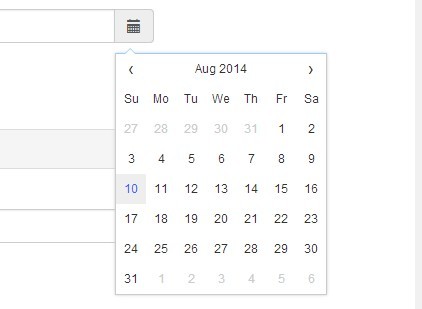
Powerful Multilingual Date/Time Picker - Tempus Dominus
| File Size: | 1.31 MB |
|---|---|
| Views Total: | 24598 |
| Last Update: | |
| Publish Date: | |
| Official Website: | Go to website |
| License: | MIT |
The written version of the Tempus Dominus Bootstrap 4 plugin.
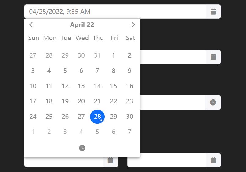
Tempus Dominus is a powerful, fully customizable and lightweight date/time picker for Vanilla JavaScript and jQuery. It is a zero dependency replacement for the native HTML5 date & time input type.
Features:
- Multiple languages.
- Automatic language detection.
- 5 view modes: 'clock' | 'calendar' | 'months' | 'years' | 'decades'.
- Allows to enable/disable dates.
- Allows date range selection.
- Allows to disable/enable dates & times.
- Allows to disabled days of the week.
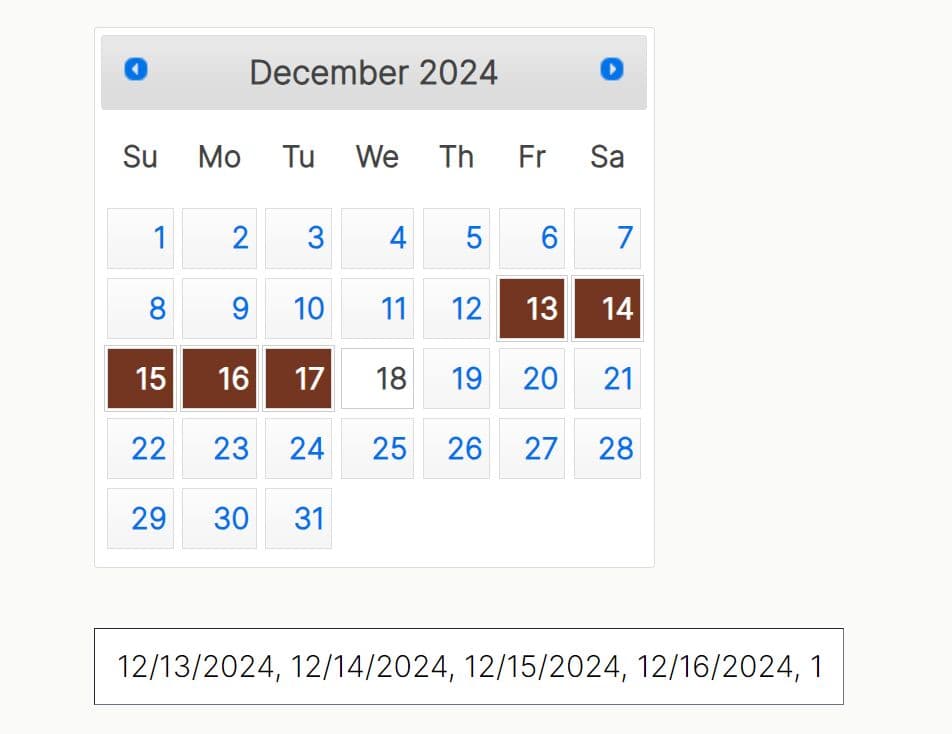
- Allows to select multiple dates.
- Smart positioning (requires popperjs library).
- Removed jQuery and Moment.js dependencies.
Table Of Contents:
How to use it:
1. To get started, load the needed popperjs library, Font Awesome 5 and Tempus Dominus' files in the document.
<link rel="stylesheet" href="/path/to/dist/css/tempus-dominus.css" />
<link rel="stylesheet" href="/path/to/font-awesome@5/all.min.css" />
<script src="/path/to/popperjs@2/popper.min.js"></script>
<script src="/path/to/dist/js/tempus-dominus.js"></script>
2. You can still use it as a jQuery plugin.
<script src="/path/to/jquery.min.js"></script>
<script src="/path/to/dist/js/jQuery-provider.min.js"></script>
3. Attach the date picker to an input field.
<input id="example" type="text" />
// Vanilla JS
new tempusDominus.TempusDominus(document.getElementById('example'), {
    // options here
});

// jQuery
$('#example').tempusDominus({
  // options here
});
4. Enable a trigger button to toggle the date picker.
<div
  class="input-group"
  id="example"
  data-td-target-input="nearest"
  data-td-target-toggle="nearest"
>
  <input
    id="exampleInput"
    type="text"
    data-td-target="#example"
  />
  <span
    class="input-group-text"
    data-td-target="#example"
    data-td-toggle="datetimepicker"
  >
    <span class="fas fa-calendar"></span>
 </span>
</div>
// Vanilla JS
new tempusDominus.TempusDominus(document.getElementById('example'), {
    // options here
});

// jQuery
$('#example').tempusDominus({
  // options here
});
5. You can also attach the date picker to any element within the document.
<span
  id="example"
>
  <i class="fa-solid fa-calendar"></i>
</span>
// Vanilla JS
new tempusDominus.TempusDominus(document.getElementById('example'), {
    // options here
});

// jQuery
$('#example').tempusDominus({
  // options here
});
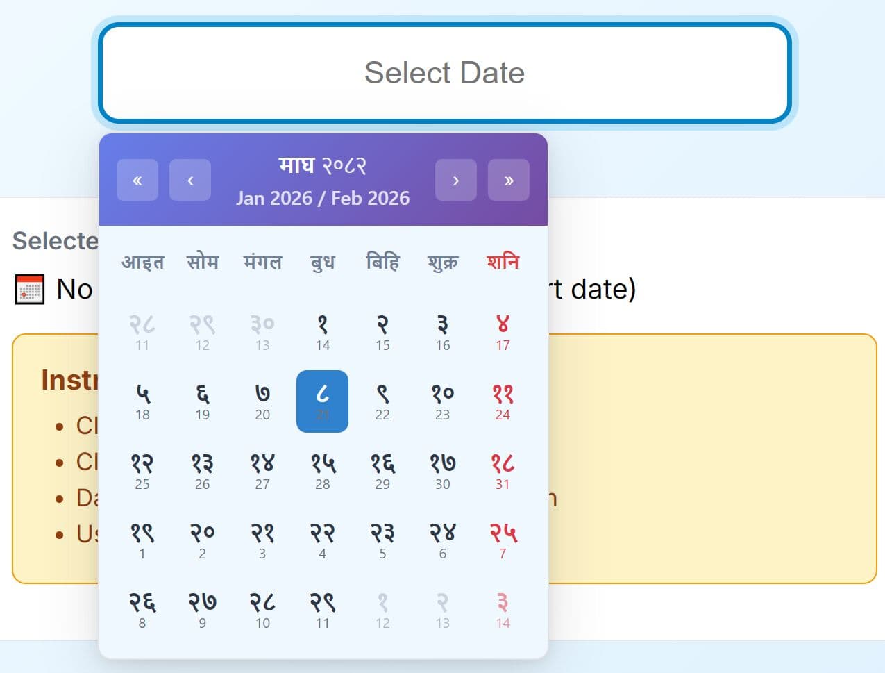
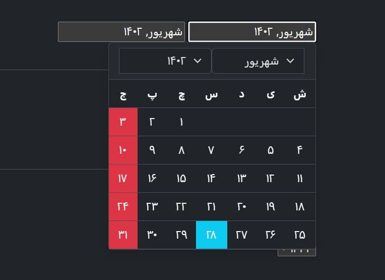
6. Set the language of the date picker. Available locals:
- de
- en
- es
- it
- nl
- ro
- ru
new tempusDominus.TempusDominus(document.getElementById('example'), {
    localization: {
      dayViewHeaderFormat: { month: 'long', year: '2-digit' },
      locale: 'es',
      startOfTheWeek: 0
    },
});
7. Combine two date pickers to create a date range picker.
<!-- Date Picker 1 -->
<label for="linkedPickers1Input" class="form-label">From</label>
<div
class="input-group log-event"
id="linkedPickers1"
data-td-target-input="nearest"
data-td-target-toggle="nearest"
>
  <input
    id="linkedPickers1Input"
    type="text"
    class="form-control"
    data-td-target="#linkedPickers1"
  />
  <span
    class="input-group-text"
    data-td-target="#linkedPickers1"
    data-td-toggle="datetimepicker"
  >
    <span class="fa-solid fa-calendar"></span>
   </span>
</div>

<!-- Date Picker 2 -->
<label for="linkedPickers2Input" class="form-label">To</label>
<div
  class="input-group log-event"
  id="linkedPickers2"
  data-td-target-input="nearest"
  data-td-target-toggle="nearest"
>
  <input
    id="linkedPickers2Input"
    type="text"
    class="form-control"
    data-td-target="#linkedPickers2"
  />
  <span
    class="input-group-text"
    data-td-target="#linkedPickers2"
    data-td-toggle="datetimepicker"
  >
    <span class="fa-solid fa-calendar"></span>
  </span>
</div>
const linkedPicker1Element = document.getElementById('linkedPickers1');
const linked1 = new tempusDominus.TempusDominus(linkedPicker1Element);
const linked2 = new tempusDominus.TempusDominus(document.getElementById('linkedPickers2'), {
      useCurrent: false
});
// using event listeners
linkedPicker1Element.addEventListener(tempusDominus.Namespace.events.change, (e) => {
  linked2.updateOptions({
    restrictions: {
      minDate: e.detail.date
    }
  });
});
// using subscribe method
const subscription = linked2.subscribe(tempusDominus.Namespace.events.change, (e) => {
  linked1.updateOptions({
    restrictions: {
      maxDate: e.date
    }
  });
});
8. All default options:
const linkedPicker1Element = document.getElementById('linkedPickers1');
new tempusDominus.TempusDominus(document.getElementById('example'), {
// enable/disable dates & times
restrictions: {
minDate: undefined,
maxDate: undefined,
disabledDates: [],
enabledDates: [],
daysOfWeekDisabled: [],
disabledTimeIntervals: [],
disabledHours: [],
enabledHours: []
},
// display options
display: {
icons: {
// "icons" or "sprites"
type: 'icons',
time: 'fa-solid fa-clock',
date: 'fa-solid fa-calendar',
up: 'fa-solid fa-arrow-up',
down: 'fa-solid fa-arrow-down',
previous: 'fa-solid fa-chevron-left',
next: 'fa-solid fa-chevron-right',
today: 'fa-solid fa-calendar-check',
clear: 'fa-solid fa-trash',
close: 'fa-solid fa-xmark'
},
// display the date and time pickers side by side
sideBySide: false,
// display an additional column with the calendar week for that week
calendarWeeks: false,
// 'clock' | 'calendar' | 'months' | 'years' | 'decades'
viewMode: 'calendar',
// 'top' | 'bottom'
toolbarPlacement: 'bottom',
keepOpen: false,
// enable/disable buttons
buttons: {
today: false,
clear: false,
close: false
},
// enable/disable components
components: {
calendar: true,
date: true,
month: true,
year: true,
decades: true,
clock: true,
hours: true,
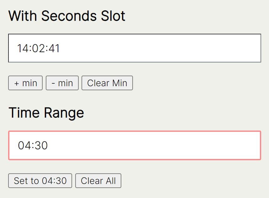
minutes: true,
seconds: false,
useTwentyfourHour: false
},
// inline mode
inline: false
},
// control how much the minutes are changed by
stepping: 1,
// use the current date/time
useCurrent: true,
defaultDate: undefined,
localization: {
today: 'Go to today',
clear: 'Clear selection',
close: 'Close the picker',
selectMonth: 'Select Month',
previousMonth: 'Previous Month',
nextMonth: 'Next Month',
selectYear: 'Select Year',
previousYear: 'Previous Year',
nextYear: 'Next Year',
selectDecade: 'Select Decade',
previousDecade: 'Previous Decade',
nextDecade: 'Next Decade',
previousCentury: 'Previous Century',
nextCentury: 'Next Century',
pickHour: 'Pick Hour',
incrementHour: 'Increment Hour',
decrementHour: 'Decrement Hour',
pickMinute: 'Pick Minute',
incrementMinute: 'Increment Minute',
decrementMinute: 'Decrement Minute',
pickSecond: 'Pick Second',
incrementSecond: 'Increment Second',
decrementSecond: 'Decrement Second',
toggleMeridiem: 'Toggle Meridiem',
selectTime: 'Select Time',
selectDate: 'Select Date',
dayViewHeaderFormat: { month: 'long', year: '2-digit' },
locale: 'default',
// 0 = Sunday, 6 = Saturday
startOfTheWeek: 0
},
keepInvalid: false,
debug: false,
// show the date picker on focus
allowInputToggle: false,
viewDate: new DateTime(),
multipleDates: false,
multipleDatesSeparator: '; ',
promptTimeOnDateChange: false,
promptTimeOnDateChangeTransitionDelay: 200,
// provide developers a place to store extra information about the picker
meta: {},
// change the target container
container: undefined,
// enable date range selection
dateRange: false,
// custom separator for multiple dates
multipleDatesSeparator: '; ',
// placemenet
placement: 'bottom',
});
9. API methods:
const myPicker = new tempusDominus.TempusDominus(document.getElementById('example'), {
      // ...
});

// return the current date
myPicker.viewDate

// return a DateTime object
myPicker.dates

// return the picked date
myPicker.dates.picked

// return the last picked date
myPicker.dates.lastPicked

// return the last picked index
myPicker.dates.lastPickedIndex

// add a DateTime
myPicker.dates.add(DateTime);

// set the date index
myPicker.dates.setValue(value: DateTime, index?: number);

// convert a DateTime object to a string
myPicker.dates.formatInput(value: DateTime);

// convert a string into a DateTime object
myPicker.dates.setFromInput(value: any, index?: number);

// return true if the target date is part of the selected dates array
myPicker.dates.isPicked(DateTime, Unit?);

// return the index at which target date is in the array
myPicker.dates.pickedIndex(DateTime, Unit?);

// clear all picked dates
myPicker.dates.clear();
// OR
myPicker.clear();

// toggle the date picker
myPicker.toggle();

// show the date picker
myPicker.show();

// hide the date picker
myPicker.hide();

// add/remove CSS classes
myPicker.paint(Unit | 'decade', DateTime, string[], HTMLElement);

// enable the date input
myPicker.enable();

// disable the date input
myPicker.disable();

// toggle the date input
myPicker.enable();

// destroy the date picker
myPicker.dispose();

// update options
myPicker.updateOptions(object, boolean?);
10. Events:
const myPicker = new tempusDominus.TempusDominus(document.getElementById('example'), {
      // ...
});

const subscription = picker.subscribe(tempusdominus.Namespace.events.change, (e) => {
      // on change
});

const subscription = picker.subscribe(tempusdominus.Namespace.events.show, (e) => {
      // on show
});

const subscription = picker.subscribe(tempusdominus.Namespace.events.hide, (e) => {
      // on hide
});

const subscription = picker.subscribe(tempusdominus.Namespace.events.update, (e) => {
      // on update
});

const subscription = picker.subscribe(tempusdominus.Namespace.events.error, (e) => {
      // on error
});
Changelog:
v6.10.4 (2025-05-08)
- Bugfix
v6.10.3 (2025-04-18)
- Bugfix
v6.10.2 (2025-03-13)
- Made keyboard nav option optional
- Bugfixes
v6.10.0 (2025-02-27)
- Keyboard navigation and aria improvements
v6.9.11 (2024-09-08)
- Bugfix
v6.9.10 (2024-08-05)
- Add 'sk' locale
- Fix 'cs' locale
v6.9.9 (2024-06-01)
- Add Ukrainian localization
v6.9.8 (2024-05-16)
- Fixed dayViewHeaderFormat
v6.9.7 (2024-05-09)
- Added pt-PT locale
v6.9.6 (2024-03-29)
- Added China locales
v6.9.5 (2024-02-02)
- Customized styling - enhancements in scss files
v6.9.4 (2023-12-22)
- SCSS now provides root css variables
- Custom date format parsing errors are now caught and provided through the event system
- Bug fixes
v6.7.16 (2023-11-11)
- Enabled code path for parsing multiple dates when date picker is in date range mode
- Added Czech localization
v6.7.16 (2023-10-09)
- Bugfixes
v6.7.13 (2023-08-18)
- Bugfixes
v6.7.11 (2023-07-07)
- Bugfixes
v6.7.10 (2023-07-04)
- Bugfixes
v6.7.7 (2023-04-23)
- Placement option
- Exported default en-US locale
- When userCurrent is false the clock will now display -- instead
- Bugfixes
v6.4.4 (2023-03-22)
- Bugfix
v6.4.3 (2023-03-17)
- Fixed an issue with the date formatting
- Fixed format escape brackets
v6.4.1 (2023-03-15)
- Migrated custom date format to main code
- Added Date Range functionality
- Fixed Leading delimiter added when multipleDates
v6.2.10 (2022-12-24)
- Bugfix
v6.2.9 (2022-12-16)
- Bugfix
v6.2.8 (2022-12-15)
- Pre commit hooks. Linter and prettier are now run before each commit.
- Locales and plugins now have typings included.
- Bugfixes.
v6.2.7 (2022-11-05)
- Bugfixes
v6.2.6 (2022-10-29)
- Fixed disabled/enabled dates performance issue. This also should fix the next/previous month selection
- Fixed view date syncing across options and not updating correctly
v6.2.5 (2022-10-25)
- Added Polish localization
- Updated locales to include formats
- Export (re-export?) Options interface
v6.2.4 (2022-09-29)
- Bugfixes
v6.2.3 (2022-09-28)
- Fix popper reference
v6.1.2 (2022-09-23)
- It is now possible to replace popperjs with another positioning system via
v6.0.1 (2022-08-31)
- Lots of improvements and bugfixes
v6.0.0 (2022-08-16)
- Lots of improvements and bugfixes
This awesome jQuery plugin is developed by Eonasdan. For more Advanced Usages, please check the demo page or visit the official website.