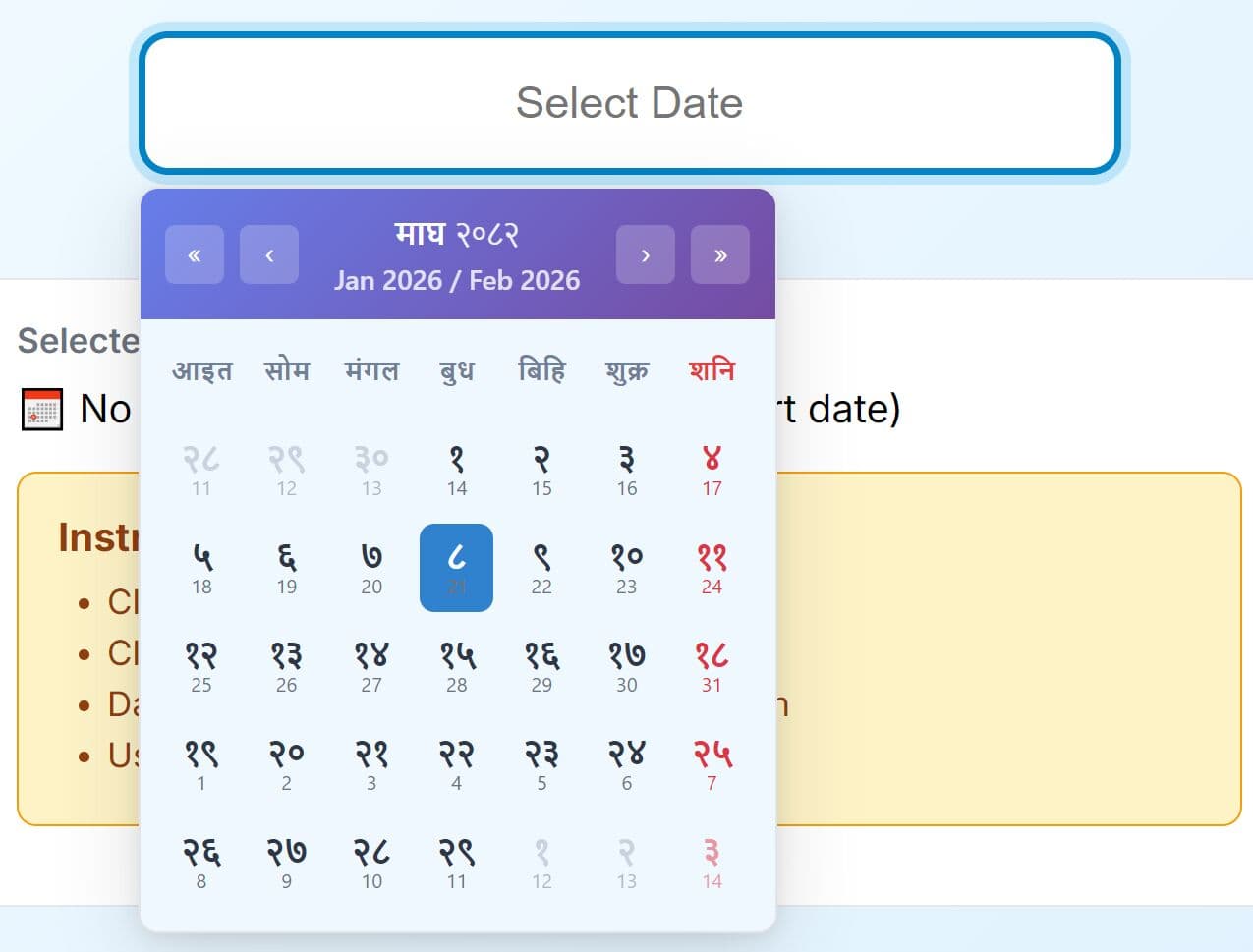
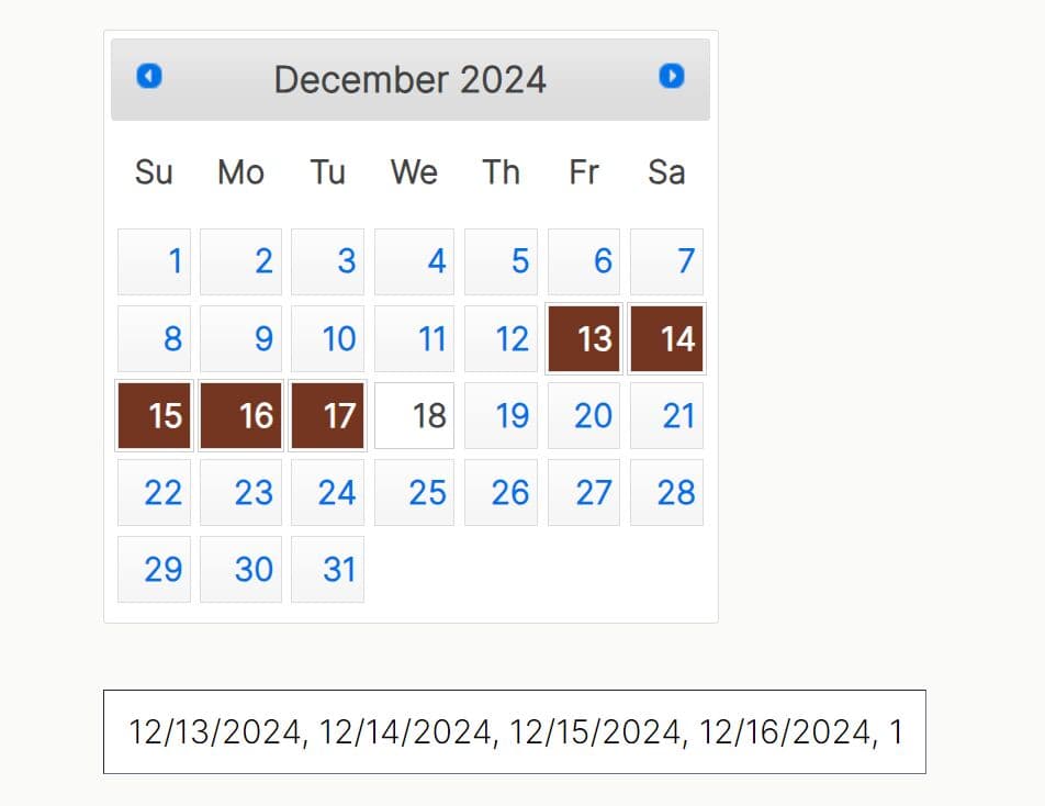
Feature-rich jQuery Datetime Range Picker
| File Size: | 18.3 KB |
|---|---|
| Views Total: | 48212 |
| Last Update: | |
| Publish Date: | |
| Official Website: | Go to website |
| License: | MIT |

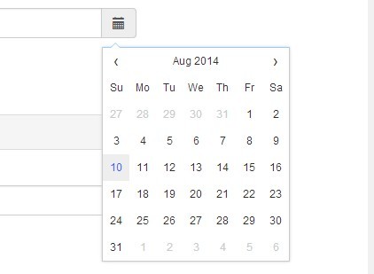
A feature-rich Datetime range picker jQuery plugin for selecting a date range from a nice-looking calendar interface.
More Features:
- Supports time selection.
- Supports single date picker mode.
- Predefined date ranges.
- Multiple languages.
See also:
- jQuery Date and Time Picker Plugin - Simple Datetimepicker
- jQuery Plugin for Simple Date Picker Widget - simpledatepicker
- Android-Style Date Picker For jQuery Mobile - Mobi Pick
- Customizable and Lightweight Date Picker Plugin For jQuery - glDatePicker
- Cool Time Picker For Twitter Bootstrap
- Simple Date Picker for Bootstrap
- Customizable jQuery Timepicker Plugin - timepicker
- Lightweight jQuery Date Input Picker - pickadate
How to use it:
1. Include the necessary jQuery library and moment.js on the page.
<script src="/path/to/cdn/jquery.min.js"></script>
<script src="/path/to/cdn/moment.min.js"></script>
2. Include the Daterangepicker plugin's files.
<link rel="stylesheet" href="daterangepicker.css" />
<script src="daterangepicker.js"></script>
3. Attach a basic date range picker to the input field.
<input type="text" name="basic" id="basic" value="07/01/2021 - 07/27/2021" />
$(function(){
  $('#basic').daterangepicker();
});
4. Create your own predefined date ranges.
$('#myInput').daterangepicker({
  ranges: {
     'Today': [moment(), moment()],
     'Yesterday': [moment().subtract(1, 'days'), moment().subtract(1, 'days')],
     'Last 7 Days': [moment().subtract(6, 'days'), moment()],
     'Last 30 Days': [moment().subtract(29, 'days'), moment()],
     'This Month': [moment().startOf('month'), moment().endOf('month')],
     'Last Month': [moment().subtract(1, 'month').startOf('month'), moment().subtract(1, 'month').endOf('month')]
  }
});
5. Execute a callback function after you've selected a date range.
$('#myInput').daterangepicker({
  // options here
},function(start, end, label) {
  console.log("A new date selection was made: " + start.format('YYYY-MM-DD') + ' to ' + end.format('YYYY-MM-DD'));
});
6. Default plugin options.
$('#myInput').daterangepicker({

  // The start of the initially selected date range
  startDate: moment().startOf('day'),

  // The end of the initially selected date range
  endDate: moment().endOf('day'),

  // The earliest date a user may select
  minDate: false,

  // The latest date a user may select
  maxDate: false,

  // min/max years
  minYear: moment().subtract(100, 'year').format('YYYY');
  maxYear: moment().add(100, 'year').format('YYYY');

  // The maximum span between the selected start and end dates.
  // Can have any property you can add to a moment object (i.e. days, months)
  dateLimit: false,

  // Hide the apply and cancel buttons, and automatically apply a new date range as soon as two dates or a predefined range is selected
  autoApply: false,

  // Show only a single calendar to choose one date, instead of a range picker with two calendars, the start and end dates provided to your callback will be the same single date chosen
  singleDatePicker: false,

  // Show year and month select boxes above calendars to jump to a specific month and year
  showDropdowns: false,

  // Show localized week numbers at the start of each week on the calendars
  showWeekNumbers: false,

  // Show ISO week numbers at the start of each week on the calendars
  showISOWeekNumbers: false,

  // Display "Custom Range" at the end of the list of predefined ranges, when the ranges option is used.
  // This option will be highlighted whenever the current date range selection does not match one of the predefined ranges.
  // Clicking it will display the calendars to select a new range.
  showCustomRangeLabel: true,

  // Allow selection of dates with times, not just dates
  timePicker: false,

  // Use 24-hour instead of 12-hour times, removing the AM/PM selection
  timePicker24Hour: false,

  // Increment of the minutes selection list for times (i.e. 30 to allow only selection of times ending in 0 or 30)
  timePickerIncrement: 1,

  // Show seconds in the timePicker
  timePickerSeconds: false,

  // When enabled, the two calendars displayed will always be for two sequential months (i.e. January and February), and both will be advanced when clicking the left or right arrows above the calendars.
  // When disabled, the two calendars can be individually advanced and display any month/year.
  linkedCalendars: true,

  // Indicates whether the date range picker should automatically update the value of an <input type="text" /> element it's attached to at initialization and when the selected dates change.
  autoUpdateInput: true,

  // Normally, if you use the ranges option to specify pre-defined date ranges, calendars for choosing a custom date range are not shown until the user clicks "Custom Range". When this option is set to true, the calendars for choosing a custom date range are always shown instead.
  alwaysShowCalendars: false,

  // Set predefined date ranges the user can select from.
  // Each key is the label for the range, and its value an array with two dates representing the bounds of the range
  ranges: {},

  // 'left'/'right'/'center'
  // Whether the picker appears aligned to the left, to the right, or centered under the HTML element it's attached to
  opens: 'right',

  // string: 'down' or 'up'
  // Whether the picker appears below (default) or above the HTML element it's attached to
  drops: 'down',

  // CSS class names that will be added to all buttons in the picker
  buttonClasses: 'btn btn-sm',

  // CSS class string that will be added to the apply button
  applyButtonClasses: 'btn-primary',

  // CSS class string that will be added to the cancel button
  cancelButtonClasses: 'btn-default',

  // Allows you to provide localized strings for buttons and labels, customize the date display format, and change the first day of week for the calendars
  locale: {
    direction: 'ltr',
    format: moment.localeData().longDateFormat('L'),
    separator: ' - ',
    applyLabel: 'Apply',
    cancelLabel: 'Cancel',
    weekLabel: 'W',
    customRangeLabel: 'Custom Range',
    daysOfWeek: moment.weekdaysMin(),
    monthNames: moment.monthsShort(),
    firstDay: moment.localeData().firstDayOfWeek()
  },

})
7. Set start/end dates.
$('#myInput').data('daterangepicker').setStartDate('07/01/2021');
$('#myInput').data('daterangepicker').setEndDate('07/31/2021');
8. Available events.
$('#myInput').on('show.daterangepicker', function(ev, picker) {
  // do something
});

$('#myInput').on('hide.daterangepicker', function(ev, picker) {
  // do something
});

$('#myInput').on('showCalendar.daterangepicker', function(ev, picker) {
  // do something
});

$('#myInput').on('hideCalendar.daterangepicker', function(ev, picker) {
  // do something
});

$('#myInput').on('apply.daterangepicker', function(ev, picker) {
  // do something
});

$('#myInput').on('cancel.daterangepicker', function(ev, picker) {
  // do something
});
Changelog:
v3.1.0 (2021-07-31)
- Added more options.
- Fixed demo.
2019-06-19
- v3.0.5: Bugfix
2018-05-23
- v3.0.3
2018-04-06
- Clone start/end dates before passing to callback
2017-12-14
- v2.1.30
2016-11-19
- Change 'background' to 'background-color' to preserve Bootstrap 'background-clip'.
2016-07-16
- v2.1.24: bugfix
2016-07-01
- v2.1.23: bugfix
2016-06-17
- v2.1.22: Experimental: Clicking on the right-hand text input in the UI allows re-selection of the end of the current date range without first re-selecting the beginning on the calendar
2016-06-01
- v2.1.21
2016-02-29
- v2.1.18
2015-12-12
- v2.1.14
This awesome jQuery plugin is developed by dangrossman. For more Advanced Usages, please check the demo page or visit the official website.