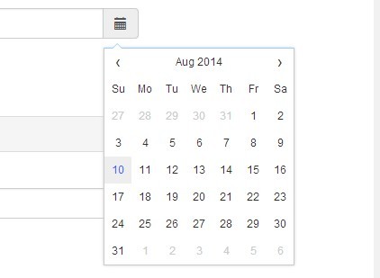
Customizable Date & Time Picker For Bootstrap 4
| File Size: | 489 KB |
|---|---|
| Views Total: | 44456 |
| Last Update: | |
| Publish Date: | |
| Official Website: | Go to website |
| License: | MIT |
A simple-to-implement and highly customizable jQuery date & time picker plugin for the latest Bootstrap 4 framework.
The latest Vanilla JavaScript & jQuery version (Compatible with Bootstrap 5) is now available here:
Main features:
- Multiple languages and timezone support.
- Date only and Time only modes.
- Min/max dates.
- Custom trigger icons.
- Enables/disables specific dates.
- Supports year/week view.
- 'decades','years','months','days' views.
- Allows to disable days of the week.
- Custom datetime format.
- Lots of options, API methods and events.
How to use it:
1. Load the necessary jQuery library, moment.js and Bootstrap 4's stylesheet in the document.
<link rel="stylesheet" href="/path/to/bootstrap.min.css">
<script src="/path/to/jquery.min.js"></script>
<script src="/path/to/moment-with-locales.min.js"></script>
2. Load Font Awesome iconic font for the necessary icons.
<link rel="stylesheet" href="/path/to/fontawesome.min.css">
3. Load the Tempus Dominus Bootstrap 4 plugin's files in the document.
<link href="build/css/tempusdominus-bootstrap-4.css" rel="stylesheet">
<script src="build/js/tempusdominus-bootstrap-4.js"></script>
4. The HTML structure for the date & time picker.
<div class="input-group date" id="datetimepicker-demo" data-target-input="nearest">
  <input type="text" class="form-control datetimepicker-input" data-target="#datetimepicker-demo"/>
  <div class="input-group-append" data-target="#datetimepicker-demo" data-toggle="datetimepicker">
    <div class="input-group-text"><i class="fa fa-calendar"></i></div>
  </div>
</div>
5. Initialize the plugin to generate a default date & time picker for the input field.
$('#datetimepicker-demo').datetimepicker();
6. Customize the date & time picker by overriding the default options as displayed below:
$('#datetimepicker-demo').datetimepicker({

  // requires moment-timezone.js
  timeZone: '',

  // date format
  // http://momentjs.com/docs/#/displaying/format/
  format: false,
  dayViewHeaderFormat: 'MMMM YYYY',
  extraFormats: false,

  // step size
  stepping: 1,

  // min/max dates
  minDate: false,
  maxDate: false,

  // uses current date/time
  useCurrent: true,

  // uses Bootstraps collapse to switch between date/time pickers
  collapse: true,

  // https://github.com/moment/moment/tree/develop/locale
  locale: moment.locale(),

  // default date
  defaultDate: false,

  // disabled dates
  // array of [date, moment, string]
  disabledDates: false,

  // enabled dates
  // array of [date, moment, string]
  enabledDates: false,

  // default icons
  icons: {
    time: 'fa fa-clock-o',
    date: 'fa fa-calendar',
    up: 'fa fa-arrow-up',
    down: 'fa fa-arrow-down',
    previous: 'fa fa-chevron-left',
    next: 'fa fa-chevron-right',
    today: 'fa fa-calendar-check-o',
    clear: 'fa fa-delete',
    close: 'fa fa-times'
  },

  // tooltip options
  tooltips: {
    today: 'Go to today',
    clear: 'Clear selection',
    close: 'Close the picker',
    selectMonth: 'Select Month',
    prevMonth: 'Previous Month',
    nextMonth: 'Next Month',
    selectYear: 'Select Year',
    prevYear: 'Previous Year',
    nextYear: 'Next Year',
    selectDecade: 'Select Decade',
    prevDecade: 'Previous Decade',
    nextDecade: 'Next Decade',
    prevCentury: 'Previous Century',
    nextCentury: 'Next Century',
    pickHour: 'Pick Hour',
    incrementHour: 'Increment Hour',
    decrementHour: 'Decrement Hour',
    pickMinute: 'Pick Minute',
    incrementMinute: 'Increment Minute',
    decrementMinute: 'Decrement Minute',
    pickSecond: 'Pick Second',
    incrementSecond: 'Increment Second',
    decrementSecond: 'Decrement Second',
    togglePeriod: 'Toggle Period',
    selectTime: 'Select Time',
    selectDate: 'Select Date'
  },

  // uses strict
  useStrict: false,

  // displays side by side
  sideBySide: false,

  // disabled days of the week
  daysOfWeekDisabled: false,

  // shows the week of the year
  calendarWeeks: false,

  // 'decades','years','months','days'
  viewMode: 'days',

  // toolbar placement
  toolbarPlacement: 'default',

  // enable/disable buttons
  buttons: {
    showToday: false,
    showClear: false,
    showClose: false
  },

  // widget position
  widgetPositioning: {
    horizontal: 'auto',
    vertical: 'auto'
  },

  // string or jQuery object
  widgetParent: null,

  // ignore read only input
  ignoreReadonly: false,

  // always keep open
  keepOpen: false,

  // shows on focus
  focusOnShow: true,

  // inline mode
  inline: false,

  // makes the date picker not revert or overwrite invalid dates
  keepInvalid: false,

  // debug mode
  debug: false,

  // shows on focus and icon click
  allowInputToggle: false,

  // disables time selection
  disabledTimeIntervals: false,

  // disables/enables hours
  disabledHours: false,
  enabledHours: false,

  // changes the viewDate without changing or setting the selected date
  viewDate: false,

  // allows multiple dates
  allowMultidate: false,

  // custom separator
  multidateSeparator: ','

});
7. API methods.
// shows the date/time picker
$('#datetimepicker-demo').datetimepicker('show');

// hides the date/time picker
$('#datetimepicker-demo').datetimepicker('hide');

// toggles the date/time picker
$('#datetimepicker-demo').datetimepicker('toggle');

// destroys the date/time picker
$('#datetimepicker-demo').datetimepicker('destroy');

// enables the date/time picker
$('#datetimepicker-demo').datetimepicker('enable');

// disables the date/time picker
$('#datetimepicker-demo').datetimepicker('disable');

// clears the date/time picker
$('#datetimepicker-demo').datetimepicker('clear');

// returns a moment variable with the currently set options
$('#datetimepicker-demo').datetimepicker('viewDate');
8. Event handlers.
$('#datetimepicker-demo').datetimepicker()
.on('hide.datetimepicker', function(date){
  // after hidden
})

.on('show.datetimepicker', function(date){
  // after shown
})

.on('change.datetimepicker', function(date,oldDate){
  // when the date is changed
})

.on('error.datetimepicker', function(date,oldDate){
  // when a selected date fails to pass validation
})

.on('update.datetimepicker', function(date,viewDate){
  // when the viewDate changes
})
Changelog:
2020-11-21
- Bugfix
2020-11-12
- fix audit warnings
2018-07-13
- Updated
This awesome jQuery plugin is developed by tempusdominus. For more Advanced Usages, please check the demo page or visit the official website.