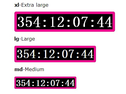
Responsive Flip Countdown Clock In jQuery - ResponsiveFlipper
| File Size: | 21.1 KB |
|---|---|
| Views Total: | 29328 |
| Last Update: | |
| Publish Date: | |
| Official Website: | Go to website |
| License: | MIT |
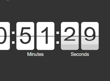
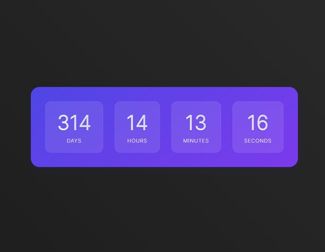
A fully responsive, jQuery & CSS3 powered flip clock plugin to display a digital countdown timer in a custom Datetime format.
See Also:
How to use it:
1. Build the HTML for the flip countdown clock.
- data-datetime: date time
- data-template: custom format
- data-labels: custom labels
- data-reverse: true = countdown mode
<div class="flipper"
     data-datetime="2020-01-01 00:00:00"
     data-template="ddd|HH|ii|ss"
     data-labels="Days|Hours|Minutes|Seconds"
     data-reverse="true"
     id="myFlipper">
</div>
2. Include the JavaScript file jquery.flipper-responsive.js after loading jQuery library.
<script src="/path/to/jquery.slim.min.js"></script>
<script src="/path/to/jquery.flipper-responsive.js"></script>
3. Initialize the flip countdown clock.
$(function(){
  $('#myFlipper').flipper('init');
});
4. The needed CSS/CSS3 styles.
.flipper {
  color: #333;
  display: block;
  font-size: 50px;
  line-height: 100%;
  padding: 0;
  margin: 0;
  height: 1.7em;
}
.flipper.flipper-invisible {
  font-size: 0px !important;
}

.flipper-group {
  position: relative;
  white-space: nowrap;
  display: block;
  float: left;
  padding: 0;
  margin: 0;
}
.flipper-group label {
  position: absolute;
  color: #fff;
  font-size: 20%;
  top: 100%;
  line-height: 1em;
  left: 50%;
  -webkit-transform: translate(-50%, 0);
          transform: translate(-50%, 0);
  text-align: center;
  padding-top: .5em;
}

.flipper-digit {
  white-space: nowrap;
  position: relative;
  padding: 0;
  margin: 0;
  display: inline-block;
  float: left;
  height: 1.2em;
  overflow-y: hidden;
}
.flipper-digit span {
  font-size: 25%;
}

.flipper-delimiter {
  white-space: nowrap;
  display: block;
  float: left;
  padding: 0;
  margin: 0;
  color: #fff;
  min-width: .1em;
  white-space: nowrap;
  display: block;
  padding-top: 0.1em;
  padding-bottom: 0.1em;
  line-height: 1em;
}

.digit-face {
  display: block;
  visibility: hidden;
  position: relative;
  border-radius: 0.1em;
  top: 0;
  left: 0;
  right: 0;
  bottom: 0;
  z-index: 8;
  padding-top: 0.1em;
  padding-bottom: 0.1em;
  padding-left: 0.1em;
  padding-right: 0.1em;
  box-sizing: border-box;
  text-align: center;
}

.digit-next {
  display: block;
  position: relative;
  border-radius: 0.1em;
  top: 0;
  left: 0;
  right: 0;
  bottom: 0;
  z-index: 8;
  height: 1.2em;
  background: #fff;
  padding-top: 0.1em;
  padding-bottom: 0.1em;
  padding-left: 0.1em;
  padding-right: 0.1em;
  box-sizing: border-box;
  text-align: center;
  -webkit-user-select: none;
     -moz-user-select: none;
      -ms-user-select: none;
          user-select: none;
}

.digit-top {
  z-index: 10;
  top: 0;
  left: 0;
  right: 0;
  height: 50%;
  -webkit-backface-visibility: hidden;
          backface-visibility: hidden;
  pointer-events: none;
  overflow: hidden;
  position: absolute;
  background: #fff;
  padding-top: 0.1em;
  padding-bottom: 0;
  padding-left: 0.1em;
  padding-right: 0.1em;
  border-top-left-radius: 0.1em;
  border-top-right-radius: 0.1em;
  box-sizing: border-box;
  text-align: center;
  -webkit-user-select: none;
     -moz-user-select: none;
      -ms-user-select: none;
          user-select: none;
  transition: background 0s linear, -webkit-transform 0s linear;
  transition: transform 0s linear, background 0s linear;
  transition: transform 0s linear, background 0s linear, -webkit-transform 0s linear;
  -webkit-transform-origin: 0 0.6em 0 !important;
          transform-origin: 0 0.6em 0 !important;
  -webkit-transform-style: preserve-3d !important;
          transform-style: preserve-3d !important;
  z-index: 20;
}
.digit-top.r {
  transition: background 0.2s linear, -webkit-transform 0.2s linear;
  transition: transform 0.2s linear, background 0.2s linear;
  transition: transform 0.2s linear, background 0.2s linear, -webkit-transform 0.2s linear;
  -webkit-transform: rotateX(90deg);
          transform: rotateX(90deg);
  background: #cccccc;
}

.digit-top2 {
  visibility: hidden;
  position: absolute;
  height: 50%;
  left: 0;
  right: 0;
  background: #cccccc;
  transition: -webkit-transform 0.2s linear;
  transition: transform 0.2s linear;
  transition: transform 0.2s linear, -webkit-transform 0.2s linear;
  line-height: 0em !important;
  top: 50% !important;
  bottom: auto !important;
  padding-top: 0;
  padding-bottom: 0.1em;
  padding-left: 0.1em;
  padding-right: 0.1em;
  border-bottom-left-radius: 0.1em;
  border-bottom-right-radius: 0.1em;
  overflow: hidden;
  text-align: center;
  -webkit-user-select: none;
     -moz-user-select: none;
      -ms-user-select: none;
          user-select: none;
  transition: background 0s linear, -webkit-transform 0s linear;
  transition: transform 0s linear, background 0s linear;
  transition: transform 0s linear, background 0s linear, -webkit-transform 0s linear;
  -webkit-transform: rotateX(-90deg);
          transform: rotateX(-90deg);
  -webkit-transform-style: preserve-3d !important;
          transform-style: preserve-3d !important;
  -webkit-transform-origin: 0 0 0 !important;
          transform-origin: 0 0 0 !important;
  z-index: 20;
}
.digit-top2.r {
  visibility: visible;
  transition: background 0.2s linear 0.2s, -webkit-transform 0.2s linear 0.2s;
  transition: transform 0.2s linear 0.2s, background 0.2s linear 0.2s;
  transition: transform 0.2s linear 0.2s, background 0.2s linear 0.2s, -webkit-transform 0.2s linear 0.2s;
  -webkit-transform: rotateX(0deg);
          transform: rotateX(0deg);
  background: #fff;
}

.digit-bottom {
  -webkit-backface-visibility: hidden;
          backface-visibility: hidden;
  pointer-events: none;
  position: absolute;
  overflow: hidden;
  background: #fff;
  height: 50%;
  left: 0;
  right: 0;
  bottom: 0;
  z-index: 9;
  line-height: 0em;
  padding-top: 0;
  padding-bottom: 0.1em;
  padding-left: 0.1em;
  padding-right: 0.1em;
  border-bottom-left-radius: 0.1em;
  border-bottom-right-radius: 0.1em;
  box-sizing: border-box;
  text-align: center;
  transition: none;
}
.digit-bottom.r {
  transition: background 0.2s linear;
  background: #cccccc;
}

.flipper-digit:after {
  content: "";
  position: absolute;
  height: 2px;
  background: rgba(0, 0, 0, 0.5);
  top: 50%;
  display: block;
  z-index: 30;
  left: 0;
  right: 0;
}
Changelog:
2021-12-08
- Update jquery.flipper-responsive.js
This awesome jQuery plugin is developed by ArthurShlain. For more Advanced Usages, please check the demo page or visit the official website.