Beautiful Pure CSS3 Buttons
| File Size: | 198 KB |
|---|---|
| Views Total: | 2499 |
| Last Update: | |
| Publish Date: | |
| Official Website: | Go to website |
| License: | MIT |
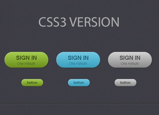
In this article we’ll show you how to create Beautiful Buttons only with CSS3.
1. Create 3 links with the class of ‘button’
<a href="#" class="button green">button</a>

<a href="#" class="button blue">button</a>

<a href="#" class="button gray">button</a>
2. CSS Styling;
.button {
    display: inline-block;
    position: relative;
    margin: 10px;
    padding: 0 20px;
    text-align: center;
    text-decoration: none;
    font: bold 12px/25px Arial, sans-serif;
}

.green {
    color: #3e5706;
    background: #a5cd4e;
}

/* Blue Color */

.blue {
    color: #19667d;
    background: #70c9e3;
}

/* Gray Color */

.gray {
    color: #515151;
    background: #d3d3d3;
}

.button {
    display: inline-block;
    position: relative;
    margin: 10px;
    padding: 0 20px;
    text-align: center;
    text-decoration: none;
    font: bold 12px/25px Arial, sans-serif;

    text-shadow: 1px 1px 1px rgba(255,255,255, .22);

    -webkit-border-radius: 30px;
    -moz-border-radius: 30px;
    border-radius: 30px;

    -webkit-box-shadow: 1px 1px 1px rgba(0,0,0, .29), inset 1px 1px 1px rgba(255,255,255, .44);
    -moz-box-shadow: 1px 1px 1px rgba(0,0,0, .29), inset 1px 1px 1px rgba(255,255,255, .44);
    box-shadow: 1px 1px 1px rgba(0,0,0, .29), inset 1px 1px 1px rgba(255,255,255, .44);

    -webkit-transition: all 0.15s ease;
    -moz-transition: all 0.15s ease;
    -o-transition: all 0.15s ease;
    -ms-transition: all 0.15s ease;
    transition: all 0.15s ease;
}

/* Green Color */

.green {
    color: #3e5706;

    background: #a5cd4e; /* Old browsers */
    background: -moz-linear-gradient(top,  #a5cd4e 0%, #6b8f1a 100%); /* FF3.6+ */
    background: -webkit-gradient(linear, left top, left bottom, color-stop(0%,#a5cd4e), color-stop(100%,#6b8f1a)); /* Chrome,Safari4+ */
    background: -webkit-linear-gradient(top,  #a5cd4e 0%,#6b8f1a 100%); /* Chrome10+,Safari5.1+ */
    background: -o-linear-gradient(top,  #a5cd4e 0%,#6b8f1a 100%); /* Opera 11.10+ */
    background: -ms-linear-gradient(top,  #a5cd4e 0%,#6b8f1a 100%); /* IE10+ */
    background: linear-gradient(top,  #a5cd4e 0%,#6b8f1a 100%); /* W3C */
}

/* Blue Color */

.blue {
    color: #19667d;

    background: #70c9e3; /* Old browsers */
    background: -moz-linear-gradient(top,  #70c9e3 0%, #39a0be 100%); /* FF3.6+ */
    background: -webkit-gradient(linear, left top, left bottom, color-stop(0%,#70c9e3), color-stop(100%,#39a0be)); /* Chrome,Safari4+ */
    background: -webkit-linear-gradient(top,  #70c9e3 0%,#39a0be 100%); /* Chrome10+,Safari5.1+ */
    background: -o-linear-gradient(top,  #70c9e3 0%,#39a0be 100%); /* Opera 11.10+ */
    background: -ms-linear-gradient(top,  #70c9e3 0%,#39a0be 100%); /* IE10+ */
    background: linear-gradient(top,  #70c9e3 0%,#39a0be 100%); /* W3C */
}

/* Gray Color */

.gray {
    color: #515151;

    background: #d3d3d3; /* Old browsers */
    background: -moz-linear-gradient(top,  #d3d3d3 0%, #8a8a8a 100%); /* FF3.6+ */
    background: -webkit-gradient(linear, left top, left bottom, color-stop(0%,#d3d3d3), color-stop(100%,#8a8a8a)); /* Chrome,Safari4+ */
    background: -webkit-linear-gradient(top,  #d3d3d3 0%,#8a8a8a 100%); /* Chrome10+,Safari5.1+ */
    background: -o-linear-gradient(top,  #d3d3d3 0%,#8a8a8a 100%); /* Opera 11.10+ */
    background: -ms-linear-gradient(top,  #d3d3d3 0%,#8a8a8a 100%); /* IE10+ */
    background: linear-gradient(top,  #d3d3d3 0%,#8a8a8a 100%); /* W3C */
}

.button:hover {
    -webkit-box-shadow: 1px 1px 1px rgba(0,0,0,.29), inset 0px 0px 2px rgba(0,0,0, .5);
    -moz-box-shadow: 1px 1px 1px rgba(0,0,0,.29), inset 0px 0px 2px rgba(0,0,0, .5);
    box-shadow: 1px 1px 1px rgba(0,0,0,.29), inset 0px 0px 2px rgba(0,0,0, .5);
}
This awesome jQuery plugin is developed by designmodo. For more Advanced Usages, please check the demo page or visit the official website.
- Prev: None
- Next: Pure CSS3 Animation Effects

