responsive & Mobile-Aware jQuery Dropdown Navigation Plugin - responsiveNav
- Menu - 5954 ViewsJust another jQuery mobile menu plugin that turns a horizontal multi-level navigation into a mobile friendly toggle menu on small screen devices.
Just another jQuery mobile menu plugin that turns a horizontal multi-level navigation into a mobile friendly toggle menu on small screen devices.
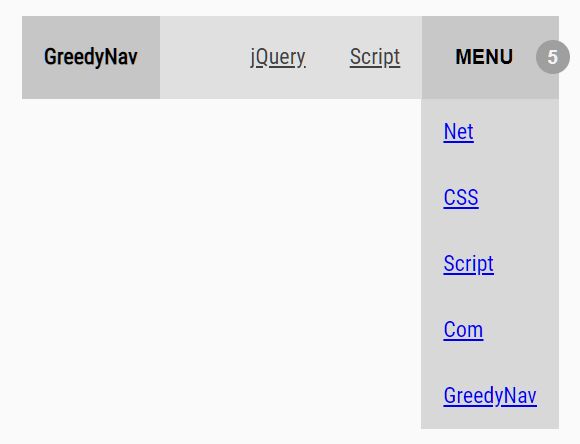
GreedyNav is a tiny jQuery based responsive menu solution that automatically shrinks nav items into a dropdown in case the nav container has no enough space on small screens.
A user- and mobile-friendly responsive dropdown navigation plugin that is perfectly compatible with Desktop, Tablet, and Mobile devices.
A lightweight, flexible, cross-browser, multi-level, mobile-friendly jQuery responsive menu plugin for your modern web project.
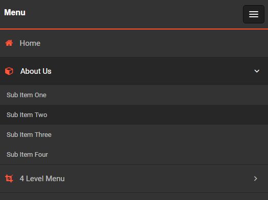
A lightweight jQuery plugin which generates a responsive, sticky, customizable, mobile-compatible, SEO-friendly, multi-column mega menu from nested HTML lists.
A mobile-friendly dropdown navigation that automatically switches between a horizontal list of menu links and a hamburger toggle menu.
A responsive, mobile-compatible navigation system that transforms the regular horizontal header navigation into a dropdown menu triggered by a hamburger toggle button.
A modern responsive navigation concept that automatically collapses the horizontal header menu into a hamburger navigation on small screen devices.
Sliding menu is a fully responsive jQuery plugin used to create a mobile App style sliding navigation menu that has nested ul based multi-level functionality.
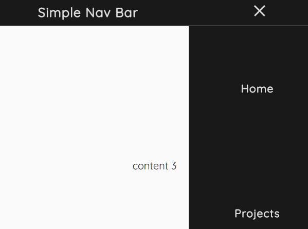
A responsive, mobile-friendly navigation system for your cross-platform web app which turns the regular navbar into an off-canvas side menu with a hamburger toggle button on the mobile device.