jQuery Based Text Switcher With Awesome CSS3 Animations
| File Size: | 10.9 KB |
|---|---|
| Views Total: | 2247 |
| Last Update: | |
| Publish Date: | |
| Official Website: | Go to website |
| License: | MIT |
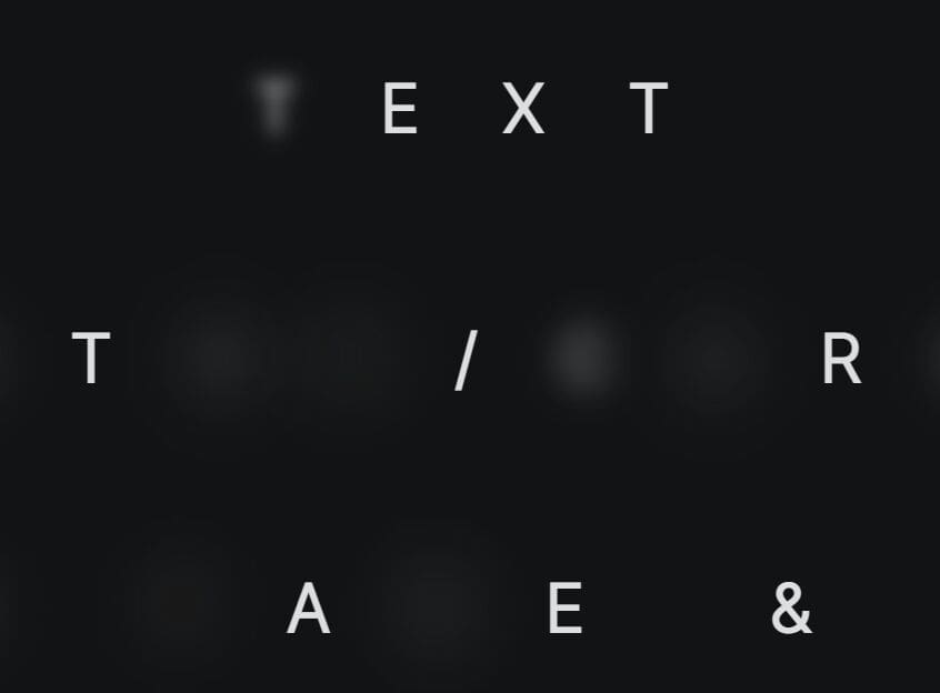
Text Switcher is an extremely lightweight jQuery text rotator plugin which lets you rotate text with cool animation effects using CSS3 transform property.
How to use it:
1. Create the text you want to rotate through.
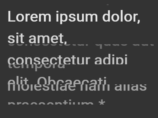
<div class="text-switcher" data-js="text-switcher">
  <div class="tc__line"><span>Lorem ipsum dolor,</span> <span class="tc__bottom">Provident illo ipsum</span></div>
  <div class="tc__line"><span>sit amet,</span> <span class="tc__bottom">autem laudantium</span></div>
  <div class="tc__line"><span>consectetur adipi</span> <span class="tc__bottom">consectetur quas aut</span></div>
  <div class="tc__line"><span>elit. Obcaecati</span> <span class="tc__bottom">tempora</span></div>
  <div class="tc__line"><span>praesentium.*</span> <span class="tc__bottom">molestiae nam alias</span></div>
</div>
2. Download and place the jQuery text switcher plugin's script after jQuery.
<script src="//code.jquery.com/jquery.min.js"></script>
<script src="assets/js/text-switcher.js"></script>
3. The main CSS for the text switcher. Modify or override the CSS styles as displayed below to create your own animations when rotating between text.
.text-switcher {
  color: #fff;
  max-width: 600px;
  margin: 0 auto;
  top: 300px;
  right: 20px;
  font-size: 3rem;
  line-height: 1.3;
  font-weight: bold;
}

.tc__line {
  position: relative;
  overflow: hidden;
  height: 4rem;
}

.tc__line span {
  display: block;
  -webkit-transform: translate3d(0, 0, 0);
  transform: translate3d(0, 0, 0);
}

.tc__line span.tc__bottom {
  position: absolute;
  top: 0;
  left: 0;
  -webkit-transform: translateY(100%);
  -ms-transform: translateY(100%);
  transform: translateY(100%);
  opacity: 0;
}

.tc__line span.tc__in {
  -webkit-animation-name: tc-switch-in;
  animation-name: tc-switch-in;
  -webkit-animation-duration: 500ms;
  animation-duration: 500ms;
  -webkit-animation-timing-function: ease-out;
  animation-timing-function: ease-out;
  -webkit-animation-direction: normal;
  animation-direction: normal;
  -webkit-animation-iteration-count: 1;
  animation-iteration-count: 1;
  -webkit-animation-fill-mode: forwards;
  animation-fill-mode: forwards;
}

.tc__line span.tc__out {
  -webkit-animation-name: tc-switch-out;
  animation-name: tc-switch-out;
  -webkit-animation-duration: 500ms;
  animation-duration: 500ms;
  -webkit-animation-timing-function: ease-out;
  animation-timing-function: ease-out;
  -webkit-animation-direction: normal;
  animation-direction: normal;
  -webkit-animation-iteration-count: 1;
  animation-iteration-count: 1;
  -webkit-animation-fill-mode: forwards;
  animation-fill-mode: forwards;
}

.tc__line:nth-child(2) span {
  -webkit-animation-delay: 50ms;
  animation-delay: 50ms;
}

.tc__line:nth-child(3) span {
  -webkit-animation-delay: 100ms;
  animation-delay: 100ms;
}

.tc__line:nth-child(4) span {
  -webkit-animation-delay: 150ms;
  animation-delay: 150ms;
}

.tc__line:nth-child(5) span {
  -webkit-animation-delay: 200ms;
  animation-delay: 200ms;
}

/* Move in */
@-webkit-keyframes
tc-switch-in {  to {
 -webkit-transform: translate3d(0, 0, 0);
 transform: translate3d(0, 0, 0);
 opacity: 1;
}
}
@keyframes
tc-switch-in {  to {
 -webkit-transform: translate3d(0, 0, 0);
 transform: translate3d(0, 0, 0);
 opacity: 1;
}
}

/* Move out */
@-webkit-keyframes
tc-switch-out {  to {
 -webkit-transform: translate3d(0, -100%, 0);
 transform: translate3d(0, -100%, 0);
 opacity: 0;
}
}
@keyframes
tc-switch-out {  to {
 -webkit-transform: translate3d(0, -100%, 0);
 transform: translate3d(0, -100%, 0);
 opacity: 0;
}
}
This awesome jQuery plugin is developed by cyril-lamotte. For more Advanced Usages, please check the demo page or visit the official website.