Animated Hover Over Effect with CSS3 Transitions
| File Size: | 11.2 KB |
|---|---|
| Views Total: | 5556 |
| Last Update: | |
| Publish Date: | |
| Official Website: | Go to website |
| License: | MIT |
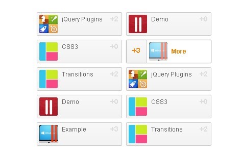
In this tutorial we will create a content list with a smooth animation effect when mouse hovers over it. The animaition effect uses CSS3 transitions and only supports modern browsers like Chrome, Firefox, Safari, IE10, etc.
How to use it:
1. The CSS
.readers-list {
line-height: 18px;
text-align: left;
overflow: hidden;
_zoom: 1;
width: 400px;
margin: 20px auto;
}
.readers-list li {
width: 175px;
float: left;
}
.readers-list a, .readers-list a:hover strong {
background-color: #f2f2f2;
background-image: -webkit-linear-gradient(#f8f8f8, #f2f2f2);
background-image: -moz-linear-gradient(#f8f8f8, #f2f2f2);
background-image: -ms-linear-gradient(#f8f8f8, #f2f2f2);
background-image: -o-linear-gradient(#f8f8f8, #f2f2f2);
background-image: linear-gradient(#f8f8f8, #f2f2f2)
}
.readers-list a {
font-size: 12px;
position: relative;
display: block;
height: 36px;
margin: 4px;
padding: 4px 4px 4px 44px;
color: #999;
overflow: hidden;
border: #ccc 1px solid;
-webkit-border-radius: 2px;
-moz-border-radius: 2px;
border-radius: 2px;
-webkit-box-shadow: #eee 0 0 2px;
-moz-box-shadow: #eee 0 0 2px;
box-shadow: #eee 0 0 2px
}
.readers-list img, .readers-list em, .readers-list strong {
-webkit-transition: all .2s ease-out;
-moz-transition: all .2s ease-out;
-ms-transition: all .2s ease-out;
-o-transition: all .2s ease-out;
transition: all .2s ease-out
}
.readers-list img {
width: 36px;
height: 36px;
float: left;
margin: 0 8px 0 -40px;
-webkit-border-radius: 2px;
-moz-border-radius: 2px;
border-radius: 2px
}
.readers-list em {
color: #666;
font-style: normal;
margin-right: 10px
}
.readers-list strong {
color: #ddd;
width: 40px;
text-align: right;
position: absolute;
right: 6px;
top: 4px;
font-weight: bold;
font-size: 14px;
line-height: 16px
}
.readers-list a:hover {
text-decoration: none;
border-color: #bbb;
-webkit-box-shadow: #ccc 0 0 2px;
-moz-box-shadow: #ccc 0 0 2px;
box-shadow: #ccc 0 0 2px;
background-color: #fff;
background-image: none
}
.readers-list a:hover img {
opacity: .6;
margin-left: 0
}
.readers-list a:hover em {
color: #EE8B17;
line-height: 36px;
font-weight: bold
}
.readers-list a:hover strong {
color: #EE8B17;
right: 125px;
top: 0;
text-align: center;
border-right: #ccc 1px solid;
height: 44px;
line-height: 40px
}
2. Markup
<ul class="readers-list">

<li>
    <a href="http://www.jQueryScript.Net">
    <img alt="jQuery Plugins" src="images/01.gif" height="36" width="36">
    <em>jQuery Plugins</em>
    <strong>+2</strong>
    </a>
</li>
...

<li>
    ...
</li>
</ul>
3. Done
This awesome jQuery plugin is developed by unknown. For more Advanced Usages, please check the demo page or visit the official website.