Pure CSS3 Navigation Menu with Animated Effect
| File Size: | 59.5 KB |
|---|---|
| Views Total: | 6497 |
| Last Update: | |
| Publish Date: | |
| Official Website: | Go to website |
| License: | MIT |
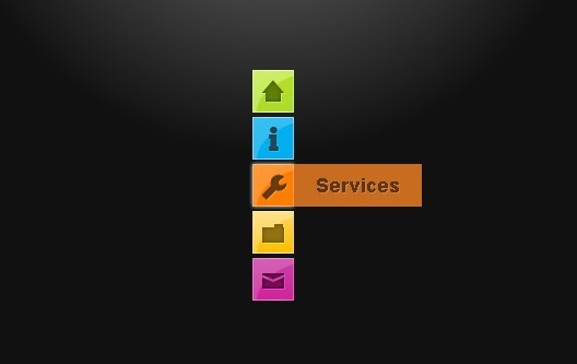
A simple navigation menu with pure CSS that make it easy to create your own Animated navigation menu for your website.
Usage:
1. Markup
<div id="main">
<ul id="navigationMenu">
<li> <a class="home" href="#"> <span>Home</span> </a> </li>
<li> <a class="about" href="#"> <span>About</span> </a> </li>
<li> <a class="services" href="#"> <span>Services</span> </a> </li>
<li> <a class="portfolio" href="#"> <span>Portfolio</span> </a> </li>
<li> <a class="contact" href="#"> <span>Contact us</span> </a> </li>
</ul>
</div>
2. CSS
*{
	/* A universal CSS reset */
	margin:0;
	padding:0;
}

body{
	font-size:14px;
	color:#666;
	background:#111 no-repeat;

	/* CSS3 Radial Gradients */
	background-image:-moz-radial-gradient(center -100px 45deg, circle farthest-corner, #444 150px, #111 300px);
	background-image:-webkit-gradient(radial, 50% 0, 150, 50% 0, 300, from(#444), to(#111));

	font-family:Arial, Helvetica, sans-serif;
}

#navigationMenu li{
	list-style:none;
	height:39px;
	padding:2px;
	width:40px;
}

#navigationMenu span{
	/* Container properties */
	width:0;
	left:38px;
	padding:0;
	position:absolute;
	overflow:hidden;

	/* Text properties */
	font-family:'Myriad Pro',Arial, Helvetica, sans-serif;
	font-size:18px;
	font-weight:bold;
	letter-spacing:0.6px;
	white-space:nowrap;
	line-height:39px;

	/* CSS3 Transition: */
	-webkit-transition: 0.25s;

	/* Future proofing (these do not work yet): */
	-moz-transition: 0.25s;
	transition: 0.25s;
}

#navigationMenu a{
	background:url('img/navigation.jpg') no-repeat;

	height:39px;
	width:38px;
	display:block;
	position:relative;
}

/* General hover styles */

#navigationMenu a:hover span{ width:auto; padding:0 20px;overflow:visible; }
#navigationMenu a:hover{
	text-decoration:none;

	/* CSS outer glow with the box-shadow property */
	-moz-box-shadow:0 0 5px #9ddff5;
	-webkit-box-shadow:0 0 5px #9ddff5;
	box-shadow:0 0 5px #9ddff5;
}

/* Green Button */

#navigationMenu .home {	background-position:0 0;}
#navigationMenu .home:hover {	background-position:0 -39px;}
#navigationMenu .home span{
	background-color:#7da315;
	color:#3d4f0c;
	text-shadow:1px 1px 0 #99bf31;
}

/* Blue Button */

#navigationMenu .about { background-position:-38px 0;}
#navigationMenu .about:hover { background-position:-38px -39px;}
#navigationMenu .about span{
	background-color:#1e8bb4;
	color:#223a44;
	text-shadow:1px 1px 0 #44a8d0;
}

/* Orange Button */

#navigationMenu .services { background-position:-76px 0;}
#navigationMenu .services:hover { background-position:-76px -39px;}
#navigationMenu .services span{
	background-color:#c86c1f;
	color:#5a3517;
	text-shadow:1px 1px 0 #d28344;
}

/* Yellow Button */

#navigationMenu .portfolio { background-position:-114px 0;}
#navigationMenu .portfolio:hover{ background-position:-114px -39px;}
#navigationMenu .portfolio span{
	background-color:#d0a525;
	color:#604e18;
	text-shadow:1px 1px 0 #d8b54b;
}

/* Purple Button */

#navigationMenu .contact { background-position:-152px 0;}
#navigationMenu .contact:hover { background-position:-152px -39px;}
#navigationMenu .contact span{
	background-color:#af1e83;
	color:#460f35;
	text-shadow:1px 1px 0 #d244a6;
}

/* The styles below are only needed for the demo page */

#main{
	margin:80px auto;
	position:relative;
	width:40px;
}


h1{
	color:#fff;
	font-size:30px;
	font-weight:normal;
	padding:60px 0 20px;
	text-align:center;
}

h2{
	font-weight:normal;
	text-align:center;
}

h1,h2{
	font-family:"Myriad Pro",Arial,Helvetica,sans-serif;
}

a, a:visited,a:active {
	color:#0196e3;
	text-decoration:none;
	outline:none;
}

a:hover{
	text-decoration:underline;
}

a img{
	border:none;
}

p.note{
	color:#707070;
	font-size:10px;
	text-align:center;
	margin:50px;
}
This awesome jQuery plugin is developed by unknown. For more Advanced Usages, please check the demo page or visit the official website.