Cross-platform Element Full Height Solution with jQuery - FullHeight
| File Size: | 14.8 KB |
|---|---|
| Views Total: | 615 |
| Last Update: | |
| Publish Date: | |
| Official Website: | Go to website |
| License: | MIT |

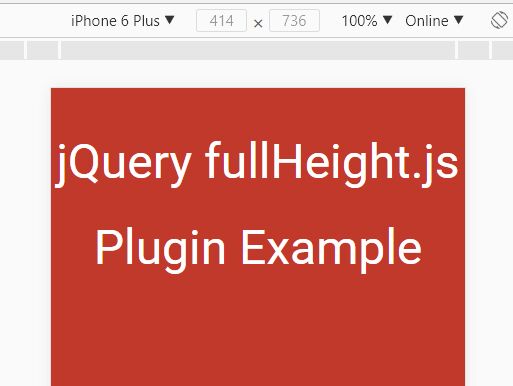
FullHeight is a jQuery based cross-browser and cross-platform full height solution to dynamically make any elements full window (fullscreen) that works perfectly with window resize event.
How to use it:
1. Download and include the jQuery FullHeight plugin after you've included jQuery JavaScript library.
<script src="//code.jquery.com/jquery-2.1.4.min.js"></script>
<script src="dist/jquery-fullheight.min.js"></script>
2. Call the fullheight() function on an html element to make it full height whatever you resize the browser window.
$('#selector').fullheight();
3. Options and defaults.
$('#selector').fullheight({

  // enable debug mode
  debug: false,

  // Scroll fix for some mobile devices
  allowDeviceHeightResize: false,

  // Parent container
  container: window,

  // Element css property to change on container resize
  property: 'min-height'

});
This awesome jQuery plugin is developed by yrkup3. For more Advanced Usages, please check the demo page or visit the official website.