jQuery Plugin To Load Proper Image Based On Screen Size - Data Img
| File Size: | 429 KB |
|---|---|
| Views Total: | 2777 |
| Last Update: | |
| Publish Date: | |
| Official Website: | Go to website |
| License: | MIT |

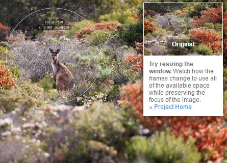
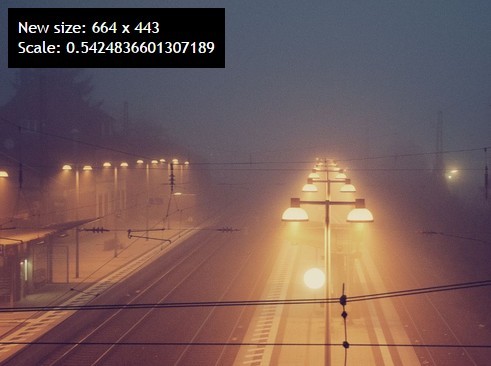
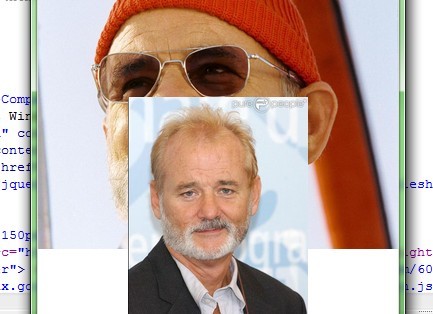
Data Img is a smart jQuery plugin that loads and displays the proper image when the screen size reaches a corresponding breakpoint. Good for responsive design project to save the bandwidth and reduce the page load time.
See also:
- Easy Responsive Image Replacement Plugin - Responsive Images
- Easy jQuery Responsive Image Plugin - Respify
- jQuery Responsive Image Plugin - Responsive Img
- Responsive Images Replacement with jQuery and HTML5 - Mimeo
How to use it:
1. Load the jQuery library and jQuery data img plugin at the bottom of your page.
<script src="//ajax.googleapis.com/ajax/libs/jquery/1.11.1/jquery.min.js"></script>
<script src="data-img.js"></script>
2. Insert an image with CSS class of 'data-img' into your web page. Use data-* attributes to specify a list of images for different screen sizes.
<img
  class="data-img"
  src="placeholder.jpg"
  data-sml="img/400x320.jpg"
  data-med="img/800x640.jpg"
  data-lrg="img/1000x800.jpg"
>
3. Call the plugin on the image and set the breakpoint options.
$(function(){
$('.data-img').dataImg({
  sml: 400, // The breakpoint at which the small file will be shown
  med: 800, // The breakpoint at which the medium file will be shown
  lrg: 1000, // The breakpoint at which the largest file will be shown, this size will load if screen width is above this
  resize: true, // true/false as to whether this will work on browser resize
  bgImg: true
});
});
This awesome jQuery plugin is developed by twoblokes. For more Advanced Usages, please check the demo page or visit the official website.