jQuery Plugin To Auto Resize Images For Responsive Design - Image Fit Window
| File Size: | 5.66 KB |
|---|---|
| Views Total: | 8738 |
| Last Update: | |
| Publish Date: | |
| Official Website: | Go to website |
| License: | MIT |
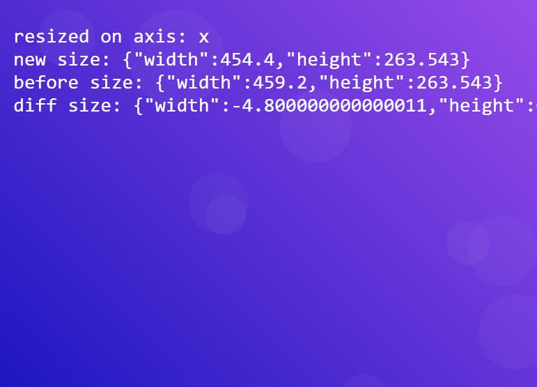
Image Fit Window is another jQuery responsive image resolution to automatically resize image to fit within its parent container while the window's size changed.
If you're looking for a jQuery plugin which replaces the large image with the appropriate image when the window's size reduced, take a look at these:
- Easy Responsive Image Replacement Plugin - Responsive Images
- Responsive Images Replacement with jQuery and HTML5 - Mimeo
- Easy jQuery Responsive Image Plugin - Respify
See also:
- Dynamic Image Resizing Plugin with jQuery
- Resize Images To Fit In A Container - imgLiquid
- jQuery Plugin for Client Side Image Resizing - canvasResize
Basic Usage:
1. Create a container and insert an image into it.
<div class="my-container">
<img id="demo" src="1.jpg" width="600" height="900" />
</div>
2. Set the max-width of the image to 100% via CSS.
img {
max-width:100%;
height:auto;
}
3. Load the jQuery javsscript library and jQuery Image Fit Window plugin in the footer of your page.
<script src="http://ajax.googleapis.com/ajax/libs/jquery/1.11.0/jquery.min.js"></script>
<script src="jquery.image-fit-window.js"></script>
4. Call the plugin and specify the image's parent container.
$(function(){
$('#demo').imageFitWindow({
container: $('.my-container')
});
})
5. Available options and API callbacks.
$(function(){
$('#demo').imageFitWindow({
auto: 1,
container: window,
offsetY: 0,
wrapperClass: "fit-wrapper",
toggleClass: "fit-toggle",
allowUpscaling: false,
onFit: undefined,
onUnfit: undefined,
onMaxed: undefined
});
})
Change log:
2014-09-14
- Update jquery.image-fit-window.js
2014-02-15
- Double checking calculations are possible before trying them
This awesome jQuery plugin is developed by davecranwell. For more Advanced Usages, please check the demo page or visit the official website.