Minimal Responsive Masonry Layout Plugin - jQuery column-sorter.js
| File Size: | 3.01 KB |
|---|---|
| Views Total: | 1944 |
| Last Update: | |
| Publish Date: | |
| Official Website: | Go to website |
| License: | MIT |
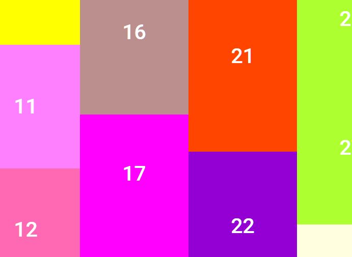
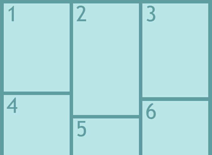
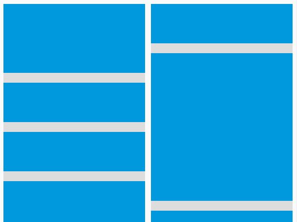
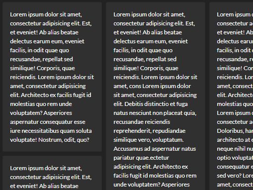
Masonry layout is a popular approach to creating vertical rhythms on the web. It arranges elements in increasing order from top to bottom, and almost every front-end developer has used or seen it.
This lightweight (less than 1kb) jQuery plugin allows you to easily convert elements with different heights in your page into a responsive masonry layout that mimics Pinterest's page layout. It is built on top of CSS flexbox and can be used easily in any kind of project, small or large, as a basic plugin that will fit anyone's needs even without any customization.
See Also:
How to use it:
1. Load the stylesheet column-sorter.css and JavaScript column-sorter.js in the document.
<link href="/path/to/column-sorter.css" rel="stylesheet" />
<script src="/path/to/cdn/jquery.slim.min.js"></script>
<script src="/path/to/column-sorter.js"></script>
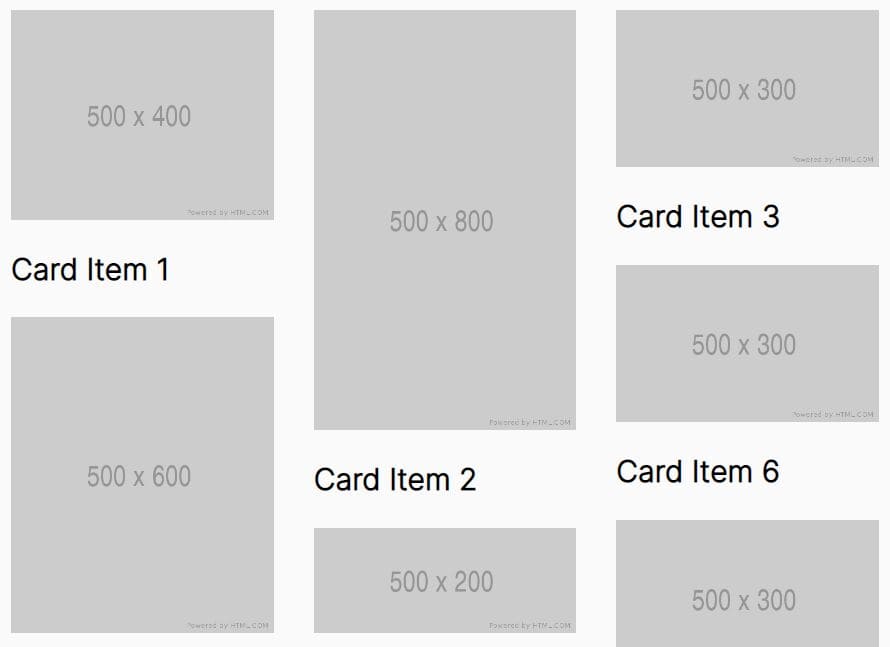
2. Add grid items to the Masonry layout and specify the number of columns in the data-cols attribute. That's it.
<div class="cols" data-cols="3">
  <div class="item">
    <img src="1.jpg" />
    <h2>Card Item 1</h2>
  </div>
  <div class="item">
    <img src="2.jpg" />
    <h2>Card Item 2</h2>
  </div>
  <div class="item">
    <img src="3.jpg" />
    <h2>Card Item 3</h2>
  </div>
  ...
</div>
This awesome jQuery plugin is developed by thomEpps. For more Advanced Usages, please check the demo page or visit the official website.