10 Best Masonry Layout JS Libraries & jQuery Plugins (2026)
Masonry grids work well for galleries, portfolios, and card feeds where item heights vary and rigid rows leave empty vertical gaps. JavaScript layout engines can pack those items into columns, recalculate positions after images or content change, and handle filtering or drag behavior when the grid is interactive.
This collection introduces 10 jQuery-compatible and vanilla JavaScript masonry libraries for responsive grids, image galleries, and dynamic card layouts. It also has three CSS masonry-style libraries for static pages that do not need JavaScript-driven packing.
Quick Comparison
| Library | Technology | Key Features |
|---|---|---|
| Wookmark | Vanilla JS | Filtering, sorting, resize relayout |
| Elastic Columns | jQuery | Column count, margins, refresh |
| column-sorter.js | jQuery | Data-attribute columns, simple card grids |
| MasonryGrid | Vanilla JS | ResizeObserver, gap filling, balanced mode |
| Masonry | Vanilla JS | Cascading layout, sizing, gutters, stamps |
| Adaptive Image Gallery | Vanilla JS | Shortest-column photo placement |
| simple-masonry.js | Vanilla JS | Breakpoint columns, custom selectors |
| Mason-it.js | Vanilla JS | Grid-aware stacking, dynamic refresh |
| Muuri | Vanilla JS | Filter, sort, drag, item management |
| MiniMasonry.js | Vanilla JS | Responsive sizing, RTL, compact packing |
What Is a Masonry Layout?
A masonry layout places mixed-height items into vertical columns and fills space left by shorter content. The pattern is common in photo galleries, portfolio cards, article feeds, inspiration boards, and Pinterest-style grids.
A JavaScript masonry engine measures or tracks item positions and places each new item into available column space. This keeps uneven cards packed vertically even when image heights, text lengths, or loaded content differ.
Masonry Layout vs CSS Grid
A regular CSS Grid aligns items to row and column tracks. Masonry packing removes strict row alignment on the stacking axis, which is useful when cards or images have very different heights.
CSS Grid Level 3 defines grid lanes through display: grid-lanes and inline-grid-lanes. The feature is experimental and does not yet have Baseline browser availability. JavaScript libraries handle cross-browser masonry packing plus filtering, sorting, dragging, and dynamic recalculation.
Best jQuery-Compatible Masonry Plugins
Pinterest-Like Dynamic Grid Layout In JavaScript - Wookmark

Wookmark 2.x works as a vanilla JavaScript library and also keeps a jQuery plugin API for older projects. It arranges mixed-height items into responsive columns and includes filtering, custom sorting, resize relayout, and manual layout refresh.
- Vanilla JavaScript and jQuery initialization.
- Automatic relayout on browser resize.
- Grid filtering and custom comparator sorting.
- Configurable item width, offsets, and alignment.
- Optional ImagesLoaded integration for image-heavy grids.
Create A Dynamic Responsive Masonry Layout In jQuery - Elastic Columns
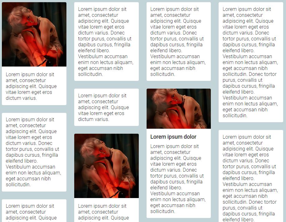
Elastic Columns is a jQuery plugin for equal-width masonry-style columns. Its public controls focus on column count, inner and outer margins, layout refresh, runtime setting changes, and instance cleanup.
- Configurable equal-width columns.
- Inner and outer margin controls.
- Responsive rearrangement.
- Runtime settings through the
setmethod. refreshanddestroycontrols.
Minimal Responsive Masonry Layout Plugin - jQuery column-sorter.js
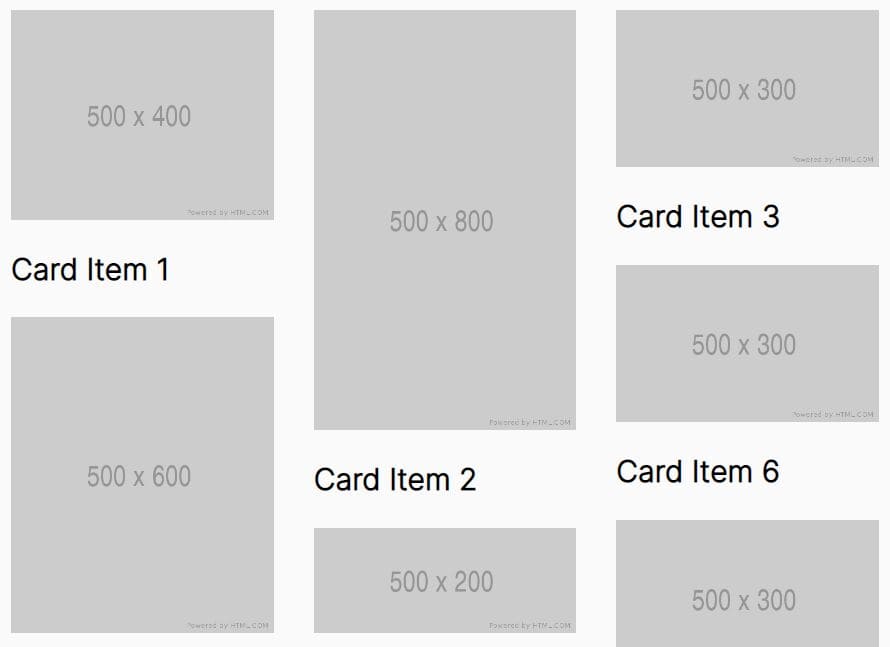
column-sorter.js turns uneven-height items into a multi-column layout with jQuery and Flexbox. A data-cols attribute controls the number of columns, which keeps setup compact for simple card and image grids.
- Flexbox-based multi-column layout.
data-colscolumn configuration.- Responsive item rearrangement.
- Simple card or list markup.
Best JavaScript Masonry Libraries
Responsive Masonry Layout Library for Vanilla JS & React - MasonryGrid

MasonryGrid provides a zero-dependency Vanilla JavaScript package for responsive masonry-style grids. It watches container size changes with ResizeObserver, tracks inserted or removed items with MutationObserver, and provides standard gap-filling and balanced layout modes.
- 1.4KB minified Vanilla JavaScript package.
- Automatic container resize handling.
- Dynamic item recalculation after DOM changes.
- Standard gap-filling mode that preserves DOM order.
- Balanced mode that reduces unused vertical space.
- TypeScript definitions and a separate React package.
Pinterest Style Dynamic Layout jQuery Plugin - Masonry
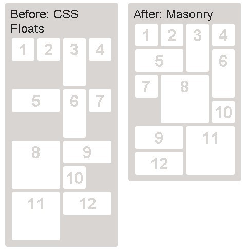
Masonry is the category-defining cascading grid layout library from David DeSandro. Masonry v4 works through its Vanilla JavaScript constructor, its jQuery plugin API, or HTML data attributes, and it positions items according to available vertical space.
- Vanilla JavaScript, jQuery, and data-attribute initialization.
itemSelector,columnWidth, and gutter controls.- Percentage positioning and fit-width layouts.
- Stamped elements that affect item placement.
- Transition duration and stagger controls.
masonry-layoutnpm package.
Adaptive Image Gallery With Masonry Grid Layout

Adaptive Image Gallery focuses on photo collections. It calculates display height from stored image dimensions, places each image into the shortest column, changes the column count for different screen widths, and rebuilds the layout after resize.
- Shortest-column image placement.
- Responsive column changes.
- Image height calculation from width and height values.
- Resize-driven layout updates.
- DOM output generated from an image array.
Simple Masonry Grid Layout With Flexbox - simple-masonry.js

simple-masonry.js creates responsive masonry-style columns on top of Flexbox. Its configuration centers on column counts for different breakpoints plus custom container, list, item, and active-class selectors.
- Flexbox-based masonry-style columns.
- Configurable default column count.
- Breakpoint-specific column settings.
- Custom container and item selectors.
- Custom active class.
Responsive Masonry Layouts with CSS Grid and Mason-it.js

Mason-it.js adds vertical masonry stacking to an existing CSS Grid container and preserves grid-template-columns and gap. It detects inserted and removed items, recalculates through requestAnimationFrame, and exposes refresh and cleanup methods for dynamic pages.
- CSS Grid-based item stacking.
- Existing grid columns and gap values preserved.
MutationObserverhandling for dynamic items.- Data-attribute or JavaScript initialization.
refresh,destroy,debug,version, andcountmethods.
Responsive, Draggable, Filterable Grid Layout - Muuri

Muuri is a JavaScript grid engine for layouts that need interaction as well as packing. It provides filtering, sorting, drag sorting, animated show and hide operations, item movement between grids, and lifecycle events.
- Responsive grid layout.
- Filtering and sorting.
- Drag and drag-sort behavior.
- Animated item visibility changes.
- Add, remove, move, and send methods.
- Layout, filter, sort, move, drag, and destroy events.
Minimal Masonry Web Layout In Pure JavaScript - MiniMasonry.js

MiniMasonry.js is a dependency-free JavaScript library for compact responsive masonry grids. It uses a configurable base item width and gutter values, provides compact or ordered placement behavior, supports left-to-right and right-to-left layouts, and exposes methods for relayout and cleanup.
- Approximately 3KB JavaScript footprint.
- Configurable
baseWidthand gutter values. - Compact placement through the
minifyoption. - LTR and RTL directions.
- ES module build.
layout()anddestroy()methods.
Bonus: CSS Masonry-Style Layouts
These CSS libraries recreate masonry-style packing or mosaic compositions with CSS Grid and explicit placement rules. They suit static presentation. JavaScript libraries handle the measurement and interaction APIs used by the entries above.
Minimalist Masonry Gallery Layout With CSS Grid - mm-masonry.css

mm-masonry.css builds a fluid masonry-style image gallery with CSS Grid and custom properties. Per-item width and height values control tile dimensions. Grid-level variables set column width and gaps.
- CSS Grid masonry-style gallery.
- Custom properties for item width and height.
- Configurable column width and gaps.
- Inline overrides for individual items.
Responsive CSS Masonry Grid Layout - Grid Overflow

Grid Overflow uses CSS classes and variables to build masonry-style and mosaic grids. It includes several tile shapes, captions, optional action icons, hover effects, and responsive row controls.
go-masonrylayout class.- Horizontal, vertical, square, and centered tile classes.
- Captions and optional action icons.
- CSS variables for dimensions, gap, aspect ratio, and rounding.
- Optional 3D hover effects.
Fluid Masonry Layout Using CSS Grid

Fluid Masonry Layout is a planned CSS Grid mosaic with explicit row and column placement. It uses gap rules, media queries, and object-fit: cover for image tiles, which suits fixed editorial compositions where tile positions are known in advance.
- Explicit CSS Grid row and column placement.
- Configurable grid gaps.
- Responsive media-query layout changes.
object-fit: coverimage sizing.
FAQ
Does Masonry require jQuery?
No. DeSandro Masonry works with Vanilla JavaScript and also provides a jQuery plugin API. Wookmark 2.0+ does not require jQuery. Elastic Columns and column-sorter.js are the jQuery-specific entries.
Can CSS create a native masonry layout?
CSS Grid Level 3 defines grid lanes for masonry-style packing. The feature is experimental and does not yet have Baseline browser availability. The CSS resources above use established Grid techniques to reproduce related layouts on production pages.
Why can a masonry grid break after images load?
A layout can calculate item positions before final image dimensions are known. Image-aware measurement, a resize or refresh method, or explicit image dimensions prevent stale positions after images finish loading.
Related Resources
- Find More jQuery Masonry Layout Plugins
- Download More JavaScript/CSS Masonry Layout Libraries
- 10 Best Grid Layout Systems In JavaScript And CSS
- 10 Best JavaScript & CSS Responsive Grid Layouts