Small Responsive Masonry Grid In jQuery
| File Size: | 4.93 KB |
|---|---|
| Views Total: | 10402 |
| Last Update: | |
| Publish Date: | |
| Official Website: | Go to website |
| License: | MIT |
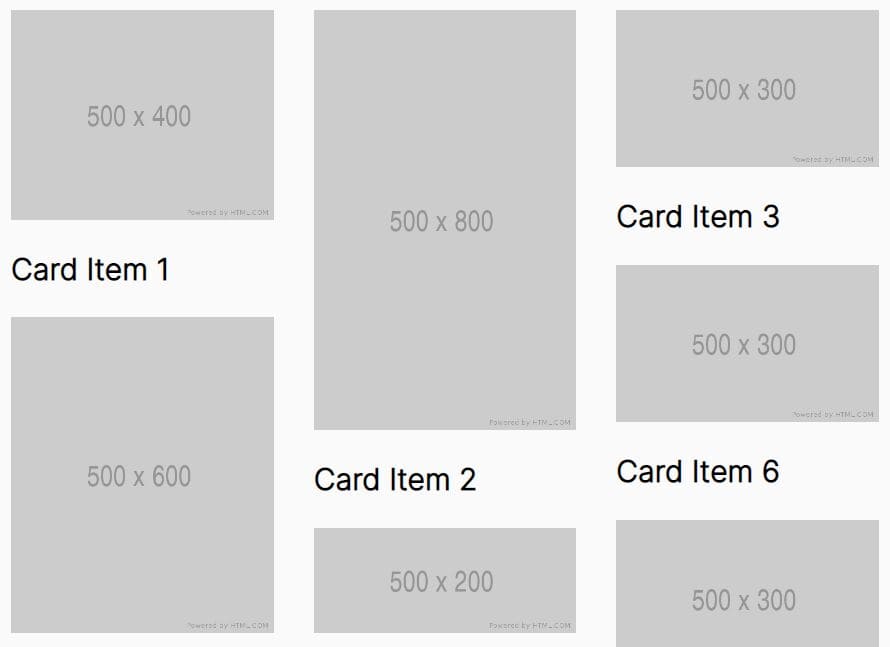
Masonry Grid is a tiny and responsive jQuery grid layout plugin that places elements of varying heights in a column-based fluid grid as you've seen on Pinterest.com.
See Also:
- Best JavaScript & CSS Responsive Grid Layouts
- Best jQuery/JavaScript Masonry Layout Plugins
- Best Grid Layout Systems In JavaScript And CSS
How to use it:
1. Add as many grid items to the masonry layout.
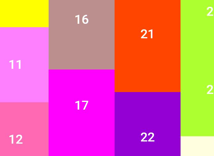
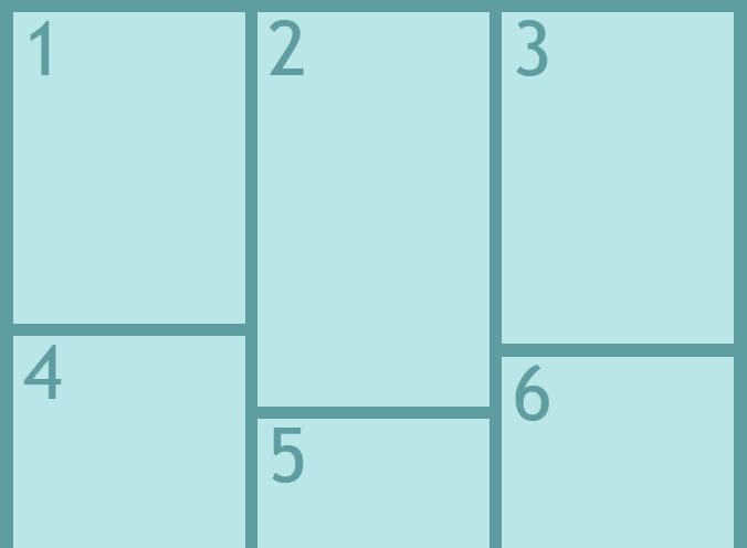
<div class="my-masonry-grid">
  <div class="my-masonry-grid-item" style="height: 300px;">1</div>
  <div class="my-masonry-grid-item" style="height: 380px;">2</div>
  <div class="my-masonry-grid-item" style="height: 320px;">3</div>
  <div class="my-masonry-grid-item" style="height: 340px;">4</div>
  <div class="my-masonry-grid-item" style="height: 320px;">5</div>
  ...
</div>
2. Load the main JavaScript file jquery.masonryGrid.js after loading jQuery library.
<script src="/path/to/cdn/jquery.min.js"></script>
<script src="/path/to/dist/jquery.masonryGrid.js"></script>
3. Initialize the masonry grid and specify the number of columns to generate. Default: 3.
$(function(){
  $('.my-masonry-grid').masonryGrid({
    'columns': 5
  });
});
4. Determine the screen size at which breakpoint the grid items will be stretched into full width. Default: '767'
$(function(){
  $('.my-masonry-grid').masonryGrid({
    'columns': 5,
    'breakpoint': 467
  });
});
Changelog:
2021-02-19
- Update jquery.masonryGrid.js
This awesome jQuery plugin is developed by ny64. For more Advanced Usages, please check the demo page or visit the official website.