Responsive Vertical Centering Plugin with jQuery
| File Size: | 4.64 KB |
|---|---|
| Views Total: | 1209 |
| Last Update: | |
| Publish Date: | |
| Official Website: | Go to website |
| License: | MIT |
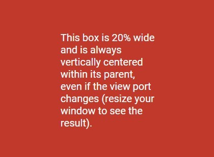
A simple, flexible, responsive jQuery vertical centering plugin that makes any element always vertically centered within its parent, even if the view port changes.
How to use it:
1. Load the jQuery Flex Vertical Center plugin after you have jQuery library loaded.
<script src="//code.jquery.com/jquery-1.11.3.min.js"></script>
<script src="jquery.flexverticalcenter.js"></script>
2. Create an html element that will always stay in the middle of its parent container no matter how the viewport size changes.
<div class="box">
  <p class="centered-item">
    This box is always vertically centered within its parent.
  </p>
</div>
3. Call the function and we're done. This will align vertically the HTML element according to its parent's height in the DOM document.
$('.centered-item').flexVerticalCenter();
4. Configuration options.
$('.centered-item').flexVerticalCenter({

  // the attribute to apply the calculated value to
  cssAttribute:   'margin-top',

  // the number of pixels to offset the vertical alignment by
  verticalOffset: 0,

  // a selector representing the parent to vertically center this element within
  parentSelector: null,

  // a default debounce timeout in milliseconds
  debounceTimeout: 25,

  // if true, nothing will take effect until the $(window).load event
  deferTilWindowLoad: false

});
Change log:
2016-08-02
- fixed for jQuery 3
2015-10-24
- Fix complete callback if no options are pass
This awesome jQuery plugin is developed by PaulSpr. For more Advanced Usages, please check the demo page or visit the official website.