jQuery Plugin To Create Responsive Elements Without CSS - Inline Responsive
| File Size: | 3.69 KB |
|---|---|
| Views Total: | 4254 |
| Last Update: | |
| Publish Date: | |
| Official Website: | Go to website |
| License: | MIT |
Inline Responsive is a very small jQuery plugin which helps you create responsive html elements using HTML5 data attributes instead of CSS3 media queries.
How to use it:
1. Put jQuery library and the jQuery inline responsive plugin into your html document.
<script src="jquery.min.js"></script>
<script src="inline-responsive.js"></script>
2. Use "data-max-width" instead of @Media(max-width: "value"). You can use em, rem etc whatever you want.
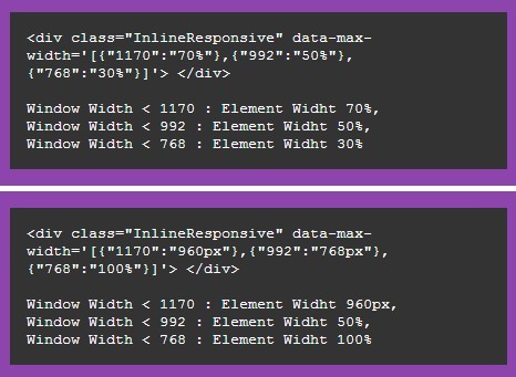
- Window Width < 1170: Element width 70%,
- Window Width < 992: Element width 50%,
- Window Width < 768: Element width 30%
<div class="InlineResponsive"
     data-max-width='[{"1170":"70%"},{"992":"50%"},{"768":"30%"}]'>
</div>
3. Use "data-min-width" instead of @Media(min-width: "value"). You can use em, rem etc whatever you want.
- Window Width > 768: Element Width 50%,
- Window Width > 992: Element Width 60%,
- Window Width > 1200: Element Width 80%
<div class="InlineResponsive"
     data-min-width='[{"768":"50%"},{"992":"60%"},{"1200":"80%"}]'>
</div>
4. Initialize the plugin and done.
$.fn.InlineResponsive({
  "class": ".InlineResponsive"
});
This awesome jQuery plugin is developed by ismailfarooq. For more Advanced Usages, please check the demo page or visit the official website.