Slider-Like Horizontal Sliding Layout with Javascript and CSS3
| File Size: | 127KB |
|---|---|
| Views Total: | 2634 |
| Last Update: | |
| Publish Date: | |
| Official Website: | Go to website |
| License: | MIT |
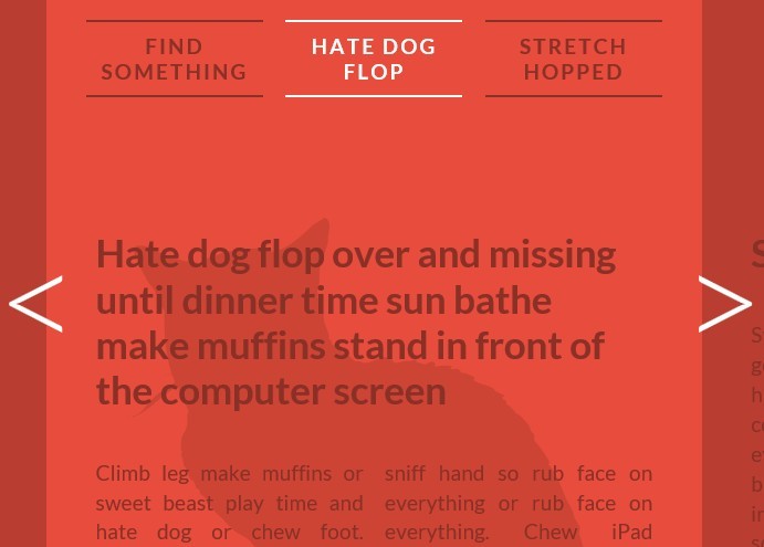
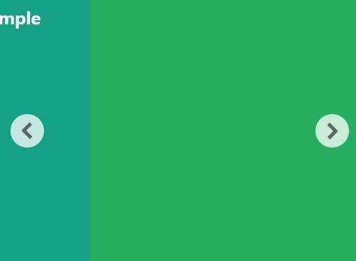
In this tutorial written by MARY LOU we're going to create a responsive and attractive layout that allows to smoothly slide content between sections with javascript and CSS3 transforms. When clicking on one of the sides or on one of the lateral navigation items, the sections will slide to the respective side, showing the next or previous section. The same happens to the navigation.
1. Markup html structure
<div id="vs-container" class="vs-container">
<header class="vs-header">
<h1>Sliding Triple View Layout <span>with Visible Adjoining Sections</span></h1>
<ul class="vs-nav">
<li><a href="#section-1">Hate dog flop</a></li>
<li><a href="#section-2">Stretch hopped</a></li>
<li><a href="#section-3">Inspect anything</a></li>
<li><!-- ... --></li>
<!-- ... -->
</ul>
</header>
<div class="vs-wrapper">
<section id="section-1">
<div class="vs-content">
<!-- content -->
</div>
</section>
<section id="section-2"><!-- ... --></section>
<section id="section-3"><!-- ... --></section>
<!-- ... -->
</div>
</div>
2. The CSS
*, *:after, *::before {
-webkit-box-sizing: border-box;
-moz-box-sizing: border-box;
box-sizing: border-box;
}
html, body, .vs-container {
position: relative;
width: 100%;
height: 100%;
}
.no-touch .vs-container {
overflow-x: hidden;
}
.vs-header {
z-index: 200;
margin: 0 auto;
padding: 2em;
position: absolute;
left: 10%;
width: 80%;
text-align: center;
-webkit-backface-visibility: hidden;
}
.vs-container > header h1 {
margin: 0 0 2em 0;
padding: 0 0 0.8em;
font-weight: 300;
font-size: 2.4em;
line-height: 1.4;
-webkit-backface-visibility: hidden;
}
.vs-container > header span {
display: block;
padding: 0 0 0.6em 0.1em;
font-size: 60%;
font-weight: 400;
color: #893027;
}
.vs-nav {
position: relative;
display: block;
margin: 0 auto;
padding: 0;
list-style: none;
}
.vs-triplelayout .vs-nav {
width: 33.33%;
height: 80px;
}
.vs-nav li {
display: inline-block;
margin-bottom: 10px;
text-align: center;
text-decoration: none;
}
.vs-triplelayout .vs-nav li {
position: absolute;
visibility: hidden;
width: 100%;
}
.vs-nav li a {
position: relative;
display: inline-block;
margin: 0 10px;
padding: 10px 0;
outline: none;
border-top: 2px solid #893027;
border-bottom: 2px solid #893027;
color: #893027;
text-decoration: none;
text-transform: uppercase;
letter-spacing: 2px;
font-weight: 700;
font-size: 1.5em;
-webkit-transition: border-color 0.3s, color 0.3s;
transition: border-color 0.3s, color 0.3s;
}
.vs-nav li a:hover, .vs-nav li a:focus, .vs-triplelayout .vs-nav .vs-nav-current a, .vs-container.vs-move-left .vs-nav-right a, .vs-container.vs-move-right .vs-nav-left a {
border-color: #fff;
color: #fff;
}
.vs-container.vs-move-left .vs-nav-current a, .vs-container.vs-move-right .vs-nav-current a {
border-color: #893027;
color: #893027;
}
.vs-triplelayout .vs-nav .vs-nav-left, .vs-triplelayout .vs-nav .vs-nav-right, .vs-triplelayout .vs-nav .vs-nav-left-outer, .vs-triplelayout .vs-nav .vs-nav-right-outer, .vs-triplelayout .vs-nav .vs-nav-current {
visibility: visible;
}
.vs-triplelayout .vs-nav .vs-nav-current {
left: 0%;
}
.vs-triplelayout .vs-nav .vs-nav-left {
left: -100%;
}
.vs-triplelayout .vs-nav .vs-nav-right {
left: 100%;
}
.vs-triplelayout .vs-nav .vs-nav-right-outer {
left: 200%;
}
.vs-triplelayout .vs-nav .vs-nav-left-outer {
left: -200%;
}
.vs-container.vs-move-left .vs-nav-left, .vs-container.vs-move-left .vs-nav-left-outer, .vs-container.vs-move-left .vs-nav-current, .vs-container.vs-move-left .vs-nav-right, .vs-container.vs-move-left .vs-nav-right-outer {
-webkit-transition: -webkit-transform 0.5s, opacity 0.5s;
transition: transform 0.5s, opacity 0.5s;
-webkit-transform: translate3d(-100%, 0, 0);
transform: translate3d(-100%, 0, 0);
}
.vs-container.vs-move-right .vs-nav-left, .vs-container.vs-move-right .vs-nav-left-outer, .vs-container.vs-move-right .vs-nav-current, .vs-container.vs-move-right .vs-nav-right, .vs-container.vs-move-right .vs-nav-right-outer {
-webkit-transition: -webkit-transform 0.5s, opacity 0.5s;
transition: transform 0.5s, opacity 0.5s;
-webkit-transform: translate3d(100%, 0, 0);
transform: translate3d(100%, 0, 0);
}
.vs-container.vs-move-left .vs-nav-left, .vs-container.vs-move-right .vs-nav-right {
opacity: 0;
}
.vs-wrapper {
position: relative;
display: block;
overflow: hidden;
min-height: 100%;
width: 100%;
}
.vs-wrapper > section {
z-index: 1;
min-height: 100%;
background-position: 100% 26em;
background-repeat: no-repeat;
}
#section-1 {
background-image: url(../images/cat1.png);
}
#section-2 {
background-image: url(../images/cat2.png);
}
#section-3 {
background-image: url(../images/cat3.png);
}
#section-4 {
background-image: url(../images/cat4.png);
}
#section-5 {
background-image: url(../images/cat5.png);
}
.vs-triplelayout .vs-wrapper > section {
position: absolute;
top: 0;
left: 10%;
visibility: hidden;
padding: 26em 0 100px;
width: 80%;
-webkit-backface-visibility: hidden;
}
.vs-triplelayout .vs-wrapper > section:not(.vs-current) {
overflow: hidden;
height: 100%;
}
.vs-triplelayout .vs-wrapper .vs-left, .vs-triplelayout .vs-wrapper .vs-left-outer, .vs-triplelayout .vs-wrapper .vs-current, .vs-triplelayout .vs-wrapper .vs-right, .vs-triplelayout .vs-wrapper .vs-right-outer {
visibility: visible;
background-color: rgba(0,0,0,0.2)
}
.vs-triplelayout .vs-wrapper .vs-left {
left: -70%; /* 80 - 10 */
}
.vs-triplelayout .vs-wrapper .vs-left-outer {
left: -150%; /* - 70 - 80 */
}
.vs-triplelayout .vs-wrapper .vs-current {
position: relative;
z-index: 100;
background-color: rgba(0,0,0,0)
}
.vs-triplelayout .vs-wrapper .vs-right {
left: 90%; /* 80 + 10 */
}
.vs-triplelayout .vs-wrapper .vs-right-outer {
left: 170%; /* 90 + 80 */
}
.vs-container.vs-move-left .vs-left, .vs-container.vs-move-left .vs-current, .vs-container.vs-move-left .vs-right, .vs-container.vs-move-left .vs-right-outer {
-webkit-transition: -webkit-transform 0.5s, background-color 0.5s;
transition: transform 0.5s, background-color 0.5s;
-webkit-transform: translate3d(-100%, 0, 0);
transform: translate3d(-100%, 0, 0);
background-color: rgba(0,0,0,0);
}
.vs-container.vs-move-right .vs-left, .vs-container.vs-move-right .vs-left-outer, .vs-container.vs-move-right .vs-current, .vs-container.vs-move-right .vs-right {
-webkit-transition: -webkit-transform 0.5s, background-color 0.5s;
transition: transform 0.5s, background-color 0.5s;
-webkit-transform: translate3d(100%, 0, 0);
transform: translate3d(100%, 0, 0);
background-color: rgba(0,0,0,0);
}
.vs-container.vs-move-left .vs-right-outer, .vs-container.vs-move-left .vs-current, .vs-container.vs-move-right .vs-current, .vs-container.vs-move-right .vs-left-outer {
background-color: rgba(0,0,0,0.2);
}
.vs-sidenav div {
position: fixed;
top: 50%;
z-index: 500;
width: 80px;
height: 80px;
cursor: pointer;
}
.vs-sidenav div:after {
position: absolute;
left: 0;
top: 0;
line-height: 0.5;
font-size: 8em;
font-weight: 300;
}
.vs-sidenav .vs-sidenav-left {
left: 30px;
}
.vs-sidenav .vs-sidenav-right {
right: 30px;
}
.vs-sidenav .vs-sidenav-left:after {
content: '<';
}
.vs-sidenav .vs-sidenav-right:after {
content: '>';
}
/* inner content */
.vs-content {
position: relative;
margin: auto;
padding: 1em 0;
width: 95%;
text-align: left;
font-size: 1.5em;
}
.vs-content h2 {
position: relative;
margin: 30px 0 40px;
color: #893027;
font-weight: 700;
font-size: 3em;
}
.vs-content .col {
margin: 0 auto;
color: #893027;
text-align: justify;
line-height: 1.4;
-webkit-column-width: 30%;
-moz-column-width: 30%;
column-width: 30%;
-webkit-column-count: 3;
-moz-column-count: 3;
column-count: 3;
-webkit-column-gap: 1%;
-moz-column-gap: 1%;
column-gap: 1%;
}
.vs-content p {
margin: 0 0 20px 0;
padding: 0;
}

/* Media queries */
@media screen and (max-width: 72.875em) {
.vs-header,  .vs-wrapper {
font-size: 80%;
}
.vs-content {
width: 85%;
}
.vs-content h2 {
font-size: 1.8em;
}
.vs-nav li a {
width: 160px;
}
.vs-content .col {
-webkit-column-width: 50%;
-moz-column-width: 50%;
column-width: 50%;
-webkit-column-count: 2;
-moz-column-count: 2;
column-count: 2;
}
}
 @media screen and (max-width: 45.25em) {
.vs-container > header h1 {
margin-bottom: 0;
}
.vs-content h2 {
margin: 0 0 1em;
}
.vs-wrapper {
font-size: 80%;
}
.vs-triplelayout .vs-nav li a {
width: auto;
font-size: 70%;
}
.vs-wrapper > section {
background-position: 0 28em;
background-size: 100%;
}
.vs-content .col {
-webkit-column-width: auto;
-moz-column-width: auto;
column-width: auto;
-webkit-column-count: auto;
-moz-column-count: auto;
column-count: auto;
}
}
Load the necessary javascript files in the bottom
<script src="js/classie.js"></script>
<script src="js/hammer.min.js"></script>
<script src="js/main.js"></script>
This awesome jQuery plugin is developed by MARY LOU. For more Advanced Usages, please check the demo page or visit the official website.