3 Column Off Canvas Reponsive Layout with jQuery and CSS3
| File Size: | 2.8 KB |
|---|---|
| Views Total: | 2308 |
| Last Update: | |
| Publish Date: | |
| Official Website: | Go to website |
| License: | MIT |
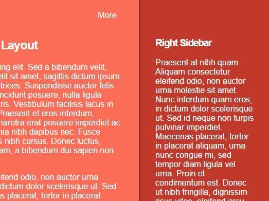
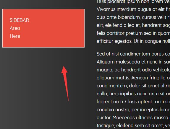
A 3 column responsive layout that automatically transforms left and right sidebars into toggleable off-canvas panels in mobile view. Built using jQuery, Html, CSS, CSS3 transitions and media queries.
How to use it:
1. Build the Html structure for the responsive layout with two sidebars.
<div class="wrapper">

  <!-- Main content section -->
  <div class="main">

  <!-- Toggle links -->
  <a href="#" class="btn left"><span class="entypo-left-open"></span>More </a>
  <a href="#" class="btn right"><span class="entypo-right-open"></span>More </a>

  <!-- Main content -->
  ...

  </div>

  <!-- Left sidebar -->
  <div class="sidebar left">
  ...
  </div>

  <!-- Right sidebar -->
  <div class="sidebar right">
  ...
  </div>

</div>
2. Primary CSS styles for the 3 Column layout.
html,
body {
  margin: 0;
  padding: 0
}

* { box-sizing: border-box; }

html {
  min-height: 100%;
  height: 100%;
}

body,
.wrapper {
  height: 100%;
  overflow: hidden;
}

.main,
.sidebar {
  position: relative;
  padding: 2em;
  float: left;
}

.main {
  position: relative;
  height: 100%;
  bottom: 0;
  top: 0;
  width: 50%;
  background: #f3f1ef;
  margin-left: 25%;
}

.sidebar {
  position: relative;
  height: 100%;
  width: 25%;
  background: #a39485;
  color: #fff;
}

.sidebar.left { margin-left: -75%; }

.sidebar.right { float: right; }

.btn {
  position: absolute;
  display: none;
  top: .5em;
  padding: 1em 1em 1em 1.2em;
  width: auto;
  line-height: 1;
  text-decoration: none;
  color: #004f97;
}

.btn span {
  display: block;
  position: absolute;
  left: .1em;
  top: 5px;
  font-size: 2.5em;
  line-height: .5;
}

.btn.right span {
  left: auto;
  right: 0;
}

.btn.left { left: 1.5em; }

.btn.right {
  right: 1.5em;
  padding-right: 1.2em;
  padding-left: 1em;
}
3. Use CSS media queries to style the off-canvas sidebar in mobile view.
@media all and (max-width: 750px) {

.main,
.sidebar { padding: 3.5em 2em; }

.btn { display: block; }

.main {
  position: relative;
  width: 100%;
  float: none;
  right: 0;
  margin: 0;
  transition: .5s left ease, .5s right ease;
  box-shadow: 0 0 10px rgba(0,0,0,.5);
  z-index: 5;
}

.right .main,
.right .sidebar.left {
  right: 16em;
  left: auto;
}

.left .main,
.left .sidebar.right {
  left: 16em;
  right: auto;
}

.sidebar {
  position: absolute;
  float: none;
  width: 16em;
  height: 100%;
  margin: 0;
  right: 0;
  top: 0;
  z-index: 1;
  transition: .5s right ease .5s left ease;
}

.sidebar.left {
  left: 0;
  right: auto;
  margin-left: 0;
}
}
4. Include the necessary jQuery library at the end of the document.
<script src="//code.jquery.com/jquery-1.11.2.min.js"></script>
5. The core JavaScript to toggle CSS classes based on the breakpoint specified in the CSS media queries.
jQuery(function ($) {
  $('.btn.left').click(function (event) {
      event.preventDefault();
      $('body').toggleClass('left');
  });
  $('.btn.right').click(function (event) {
      event.preventDefault();
      $('body').toggleClass('right');
  });
});
This awesome jQuery plugin is developed by AyhanALTINOK. For more Advanced Usages, please check the demo page or visit the official website.