Lazy Loading and Multi-serving Image Plugin with jQuery - lazyResp
| File Size: | 7.82 KB |
|---|---|
| Views Total: | 1204 |
| Last Update: | |
| Publish Date: | |
| Official Website: | Go to website |
| License: | MIT |
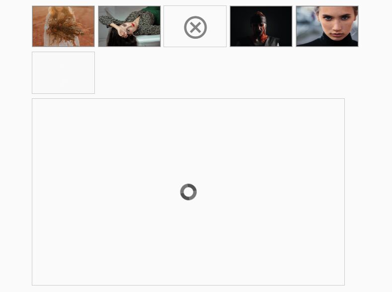
lazyResp is a jQuery plugin designed for responsive web layout that deals with responsive image delivery depending on screen width, with Retina and image lazy load support.
How to use it:
1. Load jQuery library and the jQuery lazyResp plugin in the document.
<script src="//code.jquery.com/jquery-1.11.1.min.js"></script>
<script src="jquery.lazyresp.min.js"></script>
2. Insert an image into your document and use data-* attributes to specify the image sources for different screen widths.
<img src="480x360.jpg" height="250" width="250" class="lazyResp"
     data-small-retina="960x720.jpg"
     data-medium="1024x768.jpg"
     data-medium-retina="2048x1536.jpg"
     data-large="1920x1440.jpg"
     data-large-retina="2560x1920.jpg"
>
3. Call the plugin on the image. The plugin will automatically swap out the src of the image depending on screen widths (breakpoints) defined in the plugin settings.
$(window).load( function() {
  $('img').lazyResp({
    medium: 640,
    large: 1024,
    retina: 1.01,
    tolerance: 0,
    lazy: true,
    beforeLoad: function (img, preloaded) {},
    afterLoad: function (img, preloaded) {}
});
});
Change logs:
2014-12-13
- Added a new call to getRightImageSize when the plugin is called more than once on the same element and lazyload set to false
- Added a new call to both beforeLoad and afterLoad with a custom preloaded attr when the image has already been loaded
2014-11-27
- multiple fix
This awesome jQuery plugin is developed by micc83. For more Advanced Usages, please check the demo page or visit the official website.