Minimal jQuery Content Rich Tooltip Plugin - Simple Tooltip
| File Size: | 6.35 KB |
|---|---|
| Views Total: | 1336 |
| Last Update: | |
| Publish Date: | |
| Official Website: | Go to website |
| License: | MIT |
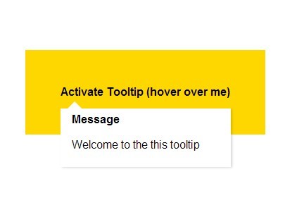
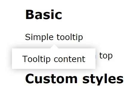
Simple Tooltip is a super tiny (~1kb) jQuery plugin that enables you to attach a content rich tooltip bubble to any Html element, with a subtle transition effect.
How to use it:
1. Load the jQuery library and jQuery simple tooltip plugin at the end of your document.
<script src="http://ajax.googleapis.com/ajax/libs/jquery/1.11.0/jquery.min.js"></script>
<script src="js/tooltip.js"></script>
2. Create the tooltip content after an Html element where you want to attach to.
<div id="tooltip" data-tooltip>
<span>Hover over me</span>

<div class="tooltip colour"> <strong>Message</strong>
<p>Welcome to the this tooltip</p>
</div>
</div>
3. The CSS to style the tooltip. Feel free to change the styles however you like.
.tooltip {
font-family: helvetica, arial;
position: absolute;
display: none;
top: auto;
z-index: 1;
min-width: 210px;
max-width: 450px;
opacity: 0;
-webkit-transition: opacity 0.25s ease-in-out;
-moz-transition: opacity 0.25s ease-in-out;
-o-transition: opacity 0.25s ease-in-out;
transition: opacity 0.25s ease-in-out;
bottom: auto;
padding: 6px 16px;
background-color: #FFF;
margin-top: 13px;
-webkit-box-shadow: 2px 1px 3px rgba(0, 0, 0, 0.15);
-moz-box-shadow: 2px 1px 3px rgba(0, 0, 0, 0.15);
box-shadow: 2px 1px 3px rgba(0, 0, 0, 0.15);
cursor: default;
}
.tooltip:before {
content: "";
position: absolute;
bottom: 100%;
left: 50%;
margin-left: -10px;
width: 0;
height: 0;
border: 10px solid transparent;
border-bottom-color: #cccccc;
z-index: 1;
left: 20px;
}
.tooltip:after {
content: "";
position: absolute;
bottom: 100%;
left: 50%;
margin-left: -9px;
width: 0;
height: 0;
border: 9px solid transparent;
border-bottom-color: white;
z-index: 2;
left: 20px;
}
.tooltip.fade {
opacity: 1;
}
.tooltip.show {
display: block;
}
.tooltip.colour {
color: white;
background-color: grey;
}
.tooltip.colour:before, .tooltip.colour:after {
border-bottom-color: grey;
border-bottom-color: grey;
}
.tooltip.top {
-webkit-box-shadow: -2px -1px 3px rgba(0, 0, 0, 0.15);
-moz-box-shadow: -2px -1px 3px rgba(0, 0, 0, 0.15);
box-shadow: -2px -1px 3px rgba(0, 0, 0, 0.15);
position: relative;
position: relative;
position: absolute;
bottom: 1.8em;
}
.tooltip.top:before {
content: "";
position: absolute;
top: 100%;
left: 50%;
margin-left: -10px;
width: 0;
height: 0;
border: 10px solid transparent;
border-top-color: #cccccc;
z-index: 1;
left: 40px;
}
.tooltip.top:after {
content: "";
position: absolute;
top: 100%;
left: 50%;
margin-left: -9px;
width: 0;
height: 0;
border: 9px solid transparent;
border-top-color: white;
z-index: 2;
left: 40px;
}
This awesome jQuery plugin is developed by cjbloc. For more Advanced Usages, please check the demo page or visit the official website.