Lightweight and Highly Customizable jQuery Tooltip Plugin - Zebra_Tooltips
| File Size: | 748 KB |
|---|---|
| Views Total: | 9600 |
| Last Update: | |
| Publish Date: | |
| Official Website: | Go to website |
| License: | MIT |
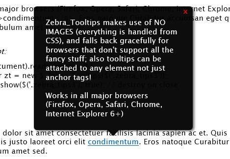
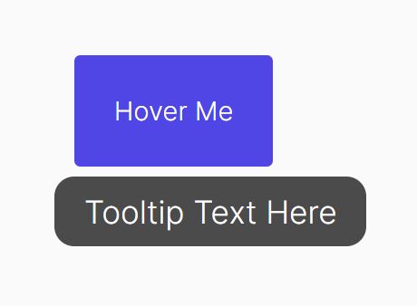
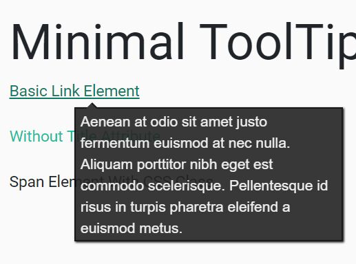
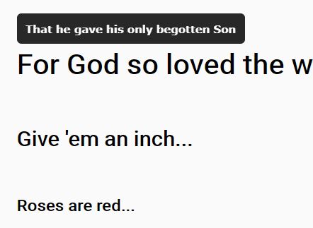
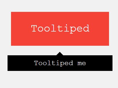
Zebra_Tooltips is a lightweight, highly customizable and cross-browser jQuery plugin for creating simple, but smart and visually attractive tooltips, featuring nice transitions and offering a lot of configuration options.
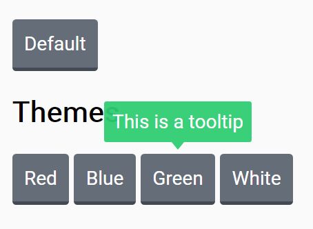
Appearance can be easily customized both through JavaScript and/or CSS. Also, tooltips can be aligned left, center or right relative to the parent element.
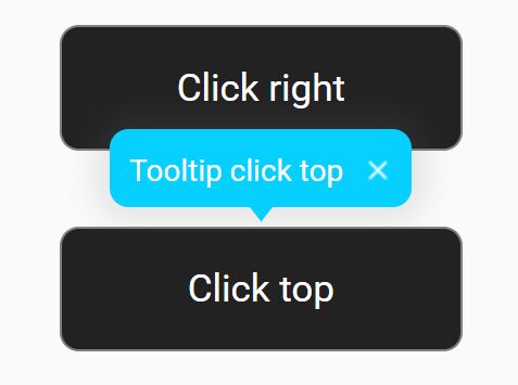
Zebra_Tooltips makes use of NO IMAGES (everything is handled from CSS), and falls back gracefully for browsers that don't support all the fancy stuff; also tooltips can be attached to any element not just anchor tags!
Basic Usage:
1. Include required CSS file on the page
<link rel="stylesheet" href="css/zebra_tooltips.css" type="text/css">
2. Include jQuery library and Zebra_Tooltips plugin on your web page
<script type="text/javascript" src="jquery.min.js"></script>
<script type="text/javascript" src="zebra_tooltips.js"></script>
3. The Html
a href="#" class="demo" title="One of the BEST jQuery websites that provide web designers and developers with a simple way to preview and download a variety of Free jQuery Plugins.">jQueryScript.Net</a>
4. Call the plugin on document ready and done.
$(document).ready(function() {

  new $.Zebra_Tooltips($('.demo'));

});
5. All available options with default values.
//  The speed (in milliseconds) of the animation used to show/hide tooltips.
animation_speed: 250,

//  The number of pixels the tooltips should use to "slide" into position.
//  Set to 0 for no sliding.
animation_offset: 20,

//  By default, if the users clicks when over a tooltip, the tooltip will
//  close (if the tooltip was not open using the API, that is)
//  Set this property to FALSE to prevent this behavior.
close_on_click: true,

//  The content of the tooltip.
//  By default, the content of the tooltip is taken from the "title"
//  attribute of the element the tooltip is attached to and has priority
//  over this property (meaning that if the "title" attribute is set,
//  the value of this property is ignored).
//  Use this property to set the content of the tooltip when you can't
//  or don't want to use the "title" attribute.
content: false,

//  The delay (in milliseconds) after which to hide the tooltip once the
//  mouse moves away from the trigger element or the tooltip.
hide_delay: 100,

//  Should tooltips remain visible also when the mouse cursor is over
//  the tooltips or should the tooltips be visible strictly when the mouse
//  cursor is over the parent elements.
keep_visible: true,

//  Maximum width of the tooltip's content;
max_width: 250,

//  The tooltip's opacity.
//  Must be a value between 0 (completely transparent) and 1 (completely
//  opaque)
opacity: '.95',


//  The tooltip's position, relative to the trigger element.
//  Can be 'center', 'left' or 'right'.
position: 'center',

//  If set to TRUE, tooltips will be created on document load, rather than
//  only when needed.
prerender: false,

//  The delay (in milliseconds) after which to show the tooltip once the
//  mouse is over the trigger element.
show_delay: 100,

//  By default, tooltips are shown above the elements they are attached to
//  and are shown below only if there isn't enough space above.
//  Set the value of this property to "below" if you want to reverse the
//  default behavior so that tooltips will be shown below the elements
//  they are attached to and will be shown above only there isn't enough
//  space below.
//  Possible values are "above" and "below".
vertical_alignment: 'above',

//  How close (in pixels) should the tip of the tooltip be relative to
//  the parent element.
vertical_offset: 0
6. Callback functions.
//  Event fired before a tooltip is hidden.
//
//  The callback function receives as arguments the element the
//  tooltip is attached to, and the tooltip element.
//
//  If the callback function returns boolean FALSE, the tooltip will
//  not be hidden.
onBeforeHide: null,

//  Event fired after a tooltip is hidden.
//
//  The callback function receives as arguments the element the
//  tooltip is attached to, and the tooltip element.
onHide: null,

//  Event fired before a tooltip is shown.
//
//  The callback function receives as arguments the element the
//  tooltip is attached to, and the tooltip element.
//
//  If the callback function returns boolean FALSE, the tooltip will
//  not be shown.
onBeforeShow: null,

//  Event fired after a tooltip is shown.
//
//  The callback function receives as arguments the element the
//  tooltip is attached to, and the tooltip element.
onShow: null
7. API methods.
var myTooltip = new $.Zebra_Tooltips($('.demo'));

// shows the tooltip
myTooltip.show(element, [destroy = FALSE])

// hides the tooltip
hide(element, [destroy = FALSE])
Changelog:
v2.4.1 (2025-12-17)
- updates required by latest versions of SASS
v2.4.0 (2025-02-01)
- implemented updates required by latest versions of SASS which is moving away from global functions
v2.3.2 (2024-05-15)
- minor maintenance release
v2.3.0 (2023-01-22)
- fixed a long standing issue where wrapping would occur for no apparent reason, mostly happening for tooltips with short messages
v2.2.0 (2021-10-06)
- bind focus events to the parent element to get the tooltip to open and close when using the TAB key, making the tooltips more accessible;
- added support for jQuery in noConflict mode;
v2.2.0 (2021-10-06)
- bind focus events to the parent element to get the tooltip to open and close when using the TAB key, making the tooltips more accessible;
- added support for jQuery in noConflict mode;
v2.1.1 (2020-07-20)
- added SASS files to dist folder
v2.1.0 (2020-03-16)
- bugs fixed
v2.0.5 (2018-10-14)
- reduced CSS size by using Clean CSS
- fixed bug where multiple tooltips would all use the same content
- fixed an issue where the options passed to the constructor were not being applied anymore, since the previous commit; thanks Gianluca Finocchiaro!
v2.0.2 (2018-07-09)
- added version number as a public property - useful to find out the version number even if all you have is the minified source code
- properties can now also be set through data attributes
v2.0.1 (2018-07-09)
- Performance tweaks
v2.0.0 (2018-07-08)
- removed the background-color and color properties
- using × for the close button instead of x
- renamed property default_position to vertical_alignment
- if the callback functions attached to the onBeforeShow and onBeforeHide events return boolean FALSE, the respective actions will be cancelled
- the tooltip's style has been updated and 3 more themes have been added
v1.3.1 (2017-12-18)
- ported CSS to SASS
- minor source code tweaks
- Explicitly state that RGBA values may be used for background color
- some style updates
- Don't set font size anymore
- Bugfix
v1.2.4 (2017-05-17)
- Minor source code tweaks
v1.2.3 (2016-01-17)
- Added "use strict"
v1.2.2 (2015-01-16)
- the “title” attribute is not removed anymore
- updated jQuery to 1.12.0 in examples
- added Grunt integration for automating JSHint & Uglify processes
- added integration with Bower
v1.2.1 (2013-11-26)
- Added a new "default_position" property
v1.2.0 (2013-10-19)
- Updated documentation and reference
This awesome jQuery plugin is developed by stefangabos. For more Advanced Usages, please check the demo page or visit the official website.