Animated Customizable Tooltip Plugin For jQuery - new-tooltip
| File Size: | 8.58 KB |
|---|---|
| Views Total: | 1366 |
| Last Update: | |
| Publish Date: | |
| Official Website: | Go to website |
| License: | MIT |
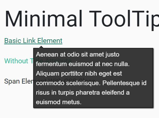
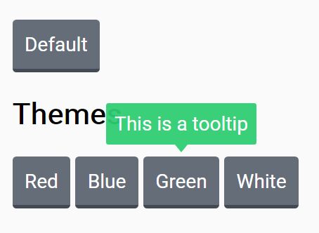
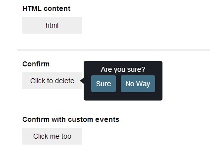
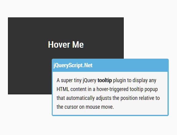
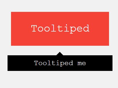
This is a fresh new jQuery tooltip plugin which helps you append customizable, CSS3 animated tooltip popups (triggered by hover or click) to any DOM element.
How to use it:
1. Place the JavaScript file jquery.tooltip.js after jQuery library.
<script src="https://code.jquery.com/jquery-3.3.1.slim.min.js"
        integrity="sha384-q8i/X+965DzO0rT7abK41JStQIAqVgRVzpbzo5smXKp4YfRvH+8abtTE1Pi6jizo"
        crossorigin="anonymous">
</script>
<script src="jquery.tooltip.js"></script>
2. Call the function on the target element where you want to display the tooltip on hover and set the custom layout & animation as these.
$('.demo').tooltip({
  layout: '<div class="tooltip-box"><div class="arrow"></div>Tooltip here</div>',
  animation: 'grow'
});

// or
var myTooltip = new Tooltip({
    elem: $('.demo'),
    layout: '<div class="tooltip-box"><div class="arrow"></div>Tooltip here</div>',
    animation: 'grow'
});
myTooltip.init();
3. Apply custom styles & animations to the tooltip.
.tooltip-box {
  position: absolute;
  background: #06d0ff;
  padding: 10px;
  border-radius: 10px;
  box-shadow: 0 0 25px 7px rgba(108, 108, 108, 0.16);
  text-align: center;
  font-size: 16px;
  color: #fff;
}

.arrow {
  width: 0;
  height: 0;
  position: absolute;
  border-left: 6px solid transparent;
  border-right: 6px solid transparent;
  border-bottom: 8px solid #06d0ff;
}

.tooltip-grow {
  -webkit-transform: scale(0,0);
  -moz-transform: scale(0,0);
  -o-transform: scale(0,0);
  -ms-transform: scale(0,0);
  transform: scale(0,0);
  -webkit-transition-property: -webkit-transform;
  -moz-transition-property: -moz-transform;
  -o-transition-property: -o-transform;
  -ms-transition-property: -ms-transform;
  transition-property: transform;
  -webkit-backface-visibility: hidden;
}
.tooltip-grow.tooltip-show {
  -webkit-transform: scale(1,1);
  -moz-transform: scale(1,1);
  -o-transform: scale(1,1);
  -ms-transform: scale(1,1);
  transform: scale(1,1);
  -webkit-transition-timing-function: cubic-bezier(0.175, 0.885, 0.320, 1);
  -webkit-transition-timing-function: cubic-bezier(0.175, 0.885, 0.320, 1.15);
  -moz-transition-timing-function: cubic-bezier(0.175, 0.885, 0.320, 1.15);
  -ms-transition-timing-function: cubic-bezier(0.175, 0.885, 0.320, 1.15);
  -o-transition-timing-function: cubic-bezier(0.175, 0.885, 0.320, 1.15);
  transition-timing-function: cubic-bezier(0.175, 0.885, 0.320, 1.15);
}
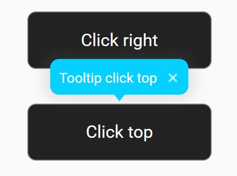
4. Set the trigger element.
$('.demo').tooltip({
  layout: '<div class="tooltip-box"><div class="arrow"></div>Tooltip here</div>',
  animation: 'grow',
  mode: 'hover' // hover or click
});
5. Set the position the tooltip should appear.
$('.demo').tooltip({
  layout: '<div class="tooltip-box"><div class="arrow"></div>Tooltip here</div>',
  animation: 'grow',
  position: 'bottom' // top, bottom, left, right
});
6. Set the space between the tooltip & trigger element.
$('.demo').tooltip({
  layout: '<div class="tooltip-box"><div class="arrow"></div>Tooltip here</div>',
  animation: 'grow',
  margin: 10
});
7. Set animation speed in milliseconds.
$('.demo').tooltip({
  layout: '<div class="tooltip-box"><div class="arrow"></div>Tooltip here</div>',
  animation: 'grow',
  animationDuration: 350
});
This awesome jQuery plugin is developed by olyaknyaz. For more Advanced Usages, please check the demo page or visit the official website.