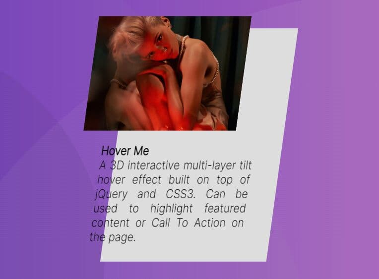
3D Interactive Image Hover Effect With jQuery And CSS3 - hover3d
| File Size: | 548 KB |
|---|---|
| Views Total: | 25656 |
| Last Update: | |
| Publish Date: | |
| Official Website: | Go to website |
| License: | MIT |
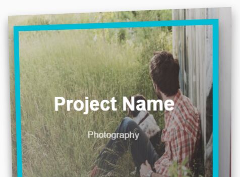
hover3d is a jQuery plugin that uses CSS3 3D transforms to create an Apple tvOS like, interactive parallax hover effect on your images.
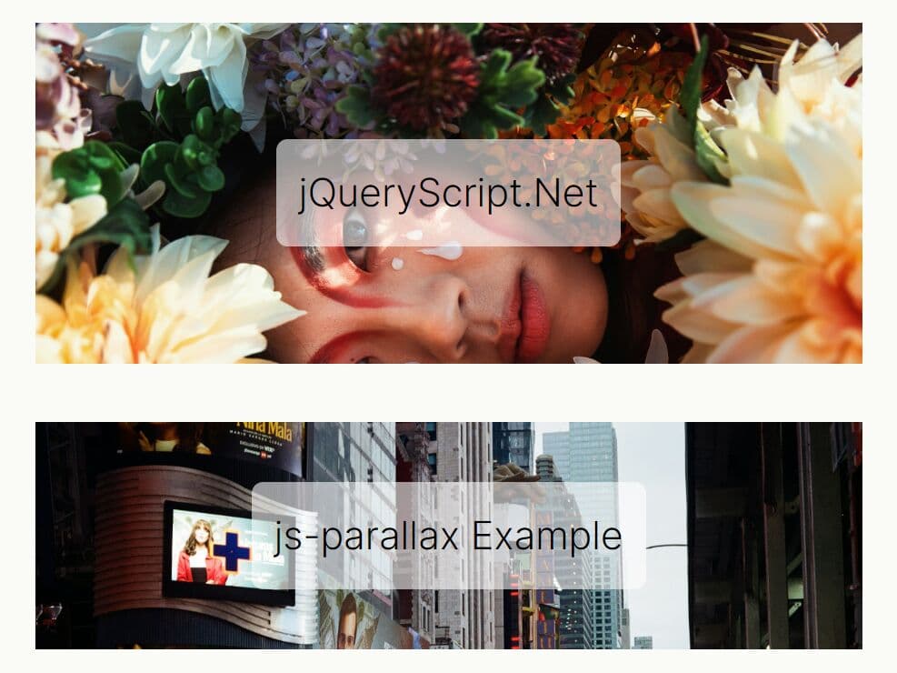
See also:
- Apple TV Poster Parallax Effect with jQuery and CSS3 - maximusParallaximus
- tvOS Hover Parallax Effect With jQuery and CSS3 - TVParallax
- tvOS Inspired Interactive Parallax Effect with jQuery and CSS3 - Media Poster
How to use it:
1. Place the latest version of jQuery library and the jQuery hover3d plugin at the end of the html document.
<script src="//code.jquery.com/jquery-2.2.1.min.js"></script>
<script src="js/jquery.hover3d.js" ></script>
2. Add an image with hover content to your webpage.
<div class="project">
  <div class="project__card">
    <a href="" class="project__image"><img src="1.jpg" width=600 height=400 alt=""></a>
    <div class="project__detail">
      <h2 class="project__title"><a href="#">Project Name</a></h2>
      <small class="project__category"><a href="#">Photography</a></small>
    </div>
  </div>
</div>
3. The required CSS styles.
.project {
  width: 100%;
  width: 45%;
  float: left;
  margin-right: 5%;
}

.project__image {
  display: block;
  position: relative;
}

.project__image img {
  width: 100%;
  max-width: 100%;
  display: block;
}

.project__image:after {
  content: " ";
  width: 100%;
  height: 100%;
  position: absolute;
  left: 0;
  top: 0;
  background: linear-gradient(rgba(0, 0, 0, 0.1), rgba(0, 0, 0, 0.4));
  transition: opacity .3s ease;
  opacity: 0;
}

.project__card {
  position: relative;
  will-change: transform;
  transition: box-shadow .3s ease;
  box-shadow: 0 10px 30px transparent;
}

.project__card.hover-in {
  transition: -webkit-transform .2s ease-out;
  transition: transform .2s ease-out;
  transition: transform .2s ease-out, -webkit-transform .2s ease-out;
}

.project__card.hover-out {
  transition: -webkit-transform .2s ease-in;
  transition: transform .2s ease-in;
  transition: transform .2s ease-in, -webkit-transform .2s ease-in;
}

.project:hover .project__card { box-shadow: 0 10px 30px rgba(0, 0, 0, 0.4); }

.project:hover .project__image:after { opacity: 1; }

.project:hover .project__detail {
  border-width: 10px;
  box-shadow: 0 10px 30px rgba(0, 0, 0, 0.4);
}

.project:hover .project__title, .project:hover .project__category {
  -webkit-transform: translateY(0) scale(1);
  -ms-transform: translateY(0) scale(1);
  transform: translateY(0) scale(1);
  opacity: 1;
}

.project__detail {
  position: absolute;
  left: 30px;
  right: 30px;
  top: 30px;
  bottom: 30px;
  display: -webkit-flex;
  display: -ms-flexbox;
  display: flex;
  -webkit-flex-direction: column;
  -ms-flex-direction: column;
  flex-direction: column;
  -webkit-justify-content: center;
  -ms-flex-pack: center;
  justify-content: center;
  text-align: center;
  pointer-events: none;
  -webkit-transform: translateZ(30px);
  transform: translateZ(30px);
  border: 0 solid #00BCD4;
  transition: border .4s ease;
}

.project__title {
  margin: 0 0 10px;
  font-size: 36px;
  font-weight: 700;
  transition: .4s ease;
  opacity: 0;
  -webkit-transform: translateY(40px) scale(0);
  -ms-transform: translateY(40px) scale(0);
  transform: translateY(40px) scale(0);
  will-change: transform;
}

.project__title a { color: white; }

.project__category {
  opacity: 0;
  transition: .4s ease;
  transition-delay: .1s;
  -webkit-transform: translateY(40px) scale(0);
  -ms-transform: translateY(40px) scale(0);
  transform: translateY(40px) scale(0);
  will-change: transform;
}

.project__category a {
  color: rgba(255, 255, 255, 0.8);
  font-size: 1.3em;
}
4. Initialize the plugin and active the shine effect.
$(".project").hover3d({
  selector: ".project__card",
  shine: true,
});
5. All configuration options with default values.
$(".project").hover3d({

  // selector for element
  selector      : null,

  // Perspective value for 3d space
  perspective   : 1000,

  // Mouse movement sensitivity
  sensitivity   : 20,

  // Default behavior is the element will follow the mouse, look like it facing the mouse
  invert        : false,

  // Add shining layer
  shine       : false,

  // Helper class when mouse hover in the element
  hoverInClass  : "hover-in",

  // Helper class when mouse hover Out the element
  hoverOutClass : "hover-out",

  // Helper class when the mouse is hovering the element
  hoverClass    : "hover-3d"

});
Change log:
2017-02-08
- Cleaning Up
2016-03-15
- Add hoverClass and shine default settings
This awesome jQuery plugin is developed by ariona. For more Advanced Usages, please check the demo page or visit the official website.