3D Multi-layer Tilt Hover Effect With jQuery And CSS3
| File Size: | 3.13 KB |
|---|---|
| Views Total: | 1396 |
| Last Update: | |
| Publish Date: | |
| Official Website: | Go to website |
| License: | MIT |
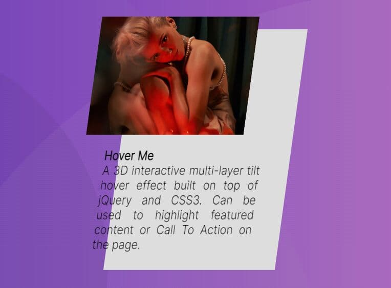
A 3D interactive multi-layer tilt hover effect built on top of jQuery and CSS3. Can be used to highlight featured content or Call To Action on the page, grabbing the user's attention and encouraging them to engage with your site.
It uses CSS3 3D transforms to rotate and translate a group of elements in response to cursor movements. By rotating elements in 3D space, you can create the illusion of depth and make your content feel more immersive and interactive.
See Also:
- Interactive Parallax Tilt Effect Using jQuery - Tilt.js
- Parallax Hover Tilt Effect With jQuery And CSS3 - universal-tilt.js
How to use it:
1. Add your content to the webpage.
<section class="section">
  <div class="card">
    <img src="1.jpg" class="card-image" class="card-image" />
    <h4 class="card-title">Hover Me</h4>
    <p class="card-text">This is a hover effect</p>
  </div>
</section>
2. The necessary CSS styles.
.section{
  width: 250px;
  margin:  40px auto;
  transform-style: preserve-3d;
  transform: translateZ(100px);
}

.card{
  width: 250px;
  padding:10px;
  text-align: justify;
  transform-style: preserve-3d;
  transform: translateZ(100px);
  -webkit-transform: translateZ(100px);
  -moz-transform: translateZ(100px);
  -ms-transform: translateZ(100px);
  -o-transform: translateZ(100px);
  background-color:#ddd;
}

.card-image{
  width: 230px;
  transform-style: preserve-3d;
  transform:translateZ(100px);
  -webkit-transform:translateZ(100px);
  -moz-transform:translateZ(100px);
  -ms-transform:translateZ(100px);
  -o-transform:translateZ(100px);
}

.card-text,
.card-title{
  transform-style: preserve-3d;
  transform:translateZ(50px);
  -webkit-transform:translateZ(50px);
  -moz-transform:translateZ(50px);
  -ms-transform:translateZ(50px);
  -o-transform:translateZ(50px);
}
3. Load the latest jQuery library at the end of the document.
<script src="/path/to/cdn/jquery.slim.min.js"></script>
4. Enable the hover effect on mousemove.
var card = $(".card");
$(document).on("mousemove",function(e) {
  var ax = -($(window).innerWidth()/2- e.pageX)/20;
  var ay = ($(window).innerHeight()/2- e.pageY)/10;
  card.attr("style", "transform: rotateY("+ax+"deg) rotateX("+ay+"deg);-webkit-transform: rotateY("+ax+"deg) rotateX("+ay+"deg);-moz-transform: rotateY("+ax+"deg) rotateX("+ay+"deg)");
});
This awesome jQuery plugin is developed by sobujmiah01. For more Advanced Usages, please check the demo page or visit the official website.