Animated Gauge Plugin In JavaScript - JustGage
| File Size: | 174 KB |
|---|---|
| Views Total: | 28336 |
| Last Update: | |
| Publish Date: | |
| Official Website: | Go to website |
| License: | MIT |
JustGage is a lightweight and easy-to-use JavaScript plugin that creates animated, customizable dashboard gauges using native SVG.
After years of depending on RaphaelJS, version 2.0 strips away external dependencies entirely, delivering a 76% smaller bundle while maintaining the clean, professional gauge visualizations developers rely on for admin panels, analytics dashboards, and monitoring interfaces.
Features:
- Zero Dependencies: Runs entirely on native browser SVG APIs without requiring RaphaelJS or any other external library.
- Multiple Gauge Styles: Supports standard arc gauges, full donut circles, and differential gauges that fill from center rather than minimum value.
- Dynamic Value Updates: Refresh gauge values with smooth animations and configurable easing functions.
- Customization Options: Control colors, fonts, shadows, pointer styles, target lines, and sector-based color ranges.
- Responsive Sizing: Gauges automatically adjust to container dimensions when relativeGaugeSize is enabled.
- Human-Friendly Number Formatting: Converts large numbers like 1,234,567 to readable formats like 1.23M.
- Out-of-Bounds Display: Shows values that exceed the configured min/max range without breaking the visualization.
See Also:
How to use it:
1. Install JustGage and import it into your project.
# Using npm
npm install justgage

# Using Yarn
yarn add justgage
import JustGage from 'justgage';
2. For quick prototyping or CDN usage, load the UMD build directly:
<script src="/path/to/dist/justgage.umd.js"></script>
<script src="https://unpkg.com/justgage@latest/dist/justgage.umd.js"></script>
3. Create a container element in your HTML where the gauge will render. The library scales to fit the container dimensions:
<div id="example"></div>
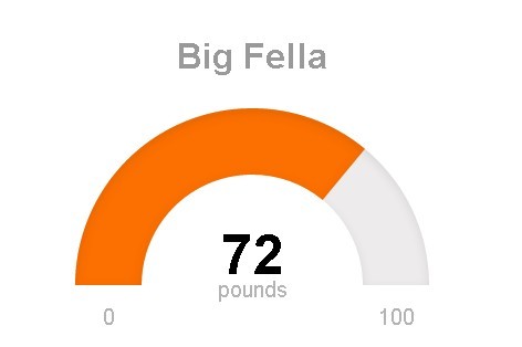
4. Initialize a gauge instance with your configuration. This creates a basic gauge showing 35 out of 100. The gauge automatically animates from zero to the specified value on initialization.
const gauge = new JustGage({
  id: 'example',
  value: 35,
  min: 0,
  max: 100,
});
5. All default configs to customize the gauge.
- id: The ID of the container element where the gauge will be rendered.
- parentNode: The container element object itself, used as an alternative if
idis not provided. - value: The current numerical value to be displayed on the gauge.
- min: The minimum value of the gauge's range.
- max: The maximum value of the gauge's range.
- minTxt: A string to override the default minimum value text.
- maxTxt: A string to override the default maximum value text.
- reverse: A boolean that, if true, reverses the positions of the min and max values.
- width: The width of the gauge in pixels.
- height: The height of the gauge in pixels.
- title: Text for a title displayed above or below the gauge.
- titleFontColor: The color of the title text.
- titleFontFamily: The font family for the title text.
- titleFontWeight: The font weight for the title text.
- titlePosition: Sets the title's position to either 'above' or 'below' the gauge.
- titleMinFontSize: The absolute minimum font size for the title.
- label: Text to display below the main value.
- labelFontColor: The color of the label text.
- labelFontFamily: The font family for the label text.
- labelFontWeight: The font weight for the label text.
- labelMinFontSize: The absolute minimum font size for the label.
- valueFontColor: The color of the value text.
- valueFontFamily: The font family for the value text.
- valueFontWeight: The font weight for the value text.
- valueMinFontSize: The absolute minimum font size for the value text.
- minLabelMinFontSize: The absolute minimum font size for the min label.
- maxLabelMinFontSize: The absolute minimum font size for the max label.
- symbol: A string for a symbol to show next to the value (e.g., '%').
- gaugeWidthScale: A factor to scale the thickness of the gauge arc.
- gaugeColor: The background color of the gauge arc.
- levelColors: An array of hex color strings for the value indicator, defining the gradient or sector colors.
- customSectors: An object to define custom colored ranges on the gauge.
- noGradient: A boolean that, if true, uses solid sector-based colors instead of a gradient.
- showSectorColors: A boolean that, if true, renders the custom sector colors as the gauge background.
- shadowOpacity: The opacity of the inner shadow (from 0 to 1).
- shadowSize: The size of the inner shadow.
- shadowVerticalOffset: The vertical offset of the inner shadow.
- showInnerShadow: A boolean to toggle the visibility of the inner shadow.
- startAnimationTime: The duration in milliseconds for the initial gauge animation.
- startAnimationType: The easing type for the initial animation (e.g., 'linear', 'bounce').
- refreshAnimationTime: The duration in milliseconds for the refresh animation.
- refreshAnimationType: The easing type for the refresh animation (e.g., 'linear', 'bounce').
- donut: A boolean that, if true, renders the gauge as a full circle.
- donutStartAngle: The angle in degrees where the donut gauge starts.
- hideValue: A boolean to hide the main value text.
- hideMinMax: A boolean to hide the min and max text labels.
- showMinMax: A boolean to explicitly show the min and max labels.
- humanFriendly: A boolean that, if true, converts large numbers to a compact format (e.g., 1.23M).
- humanFriendlyDecimal: The number of decimal places for human-friendly numbers.
- formatNumber: A boolean that, if true, formats numbers with commas.
- decimals: The number of decimal digits to display for the value.
- counter: A boolean that, if true, animates the numerical value change on refresh.
- differential: A boolean that, if true, makes the gauge fill from the center instead of the min value.
- relativeGaugeSize: A boolean that, if true, makes the gauge resize relative to its container.
- pointer: A boolean to enable a needle-style pointer.
- pointerOptions: An object to configure the pointer's appearance (e.g., color, width).
- displayRemaining: A boolean that, if true, shows the remaining value to reach max instead of the current value.
- targetLine: A numerical value at which to display a target line.
- targetLineColor: The color of the target line.
- targetLineWidth: The width of the target line.
- textRenderer: A function to apply custom formatting to text before it's rendered.
- onAnimationEnd: A callback function that executes after an animation completes.
- defaults: A configuration object to merge with the default settings.
const gauge = new JustGage({
  value: 0,
  min: 0,
  max: 100,
  reverse: false,
  gaugeWidthScale: 1.0,
  gaugeColor: '#edebeb',
  label: '',
  valueFontColor: '#010101',
  valueFontFamily: 'Arial',
  labelFontColor: '#b3b3b3',
  labelFontFamily: 'Arial',
  symbol: '',
  shadowOpacity: 0.2,
  shadowSize: 5,
  shadowVerticalOffset: 3,
  levelColors: ['#a9d70b', '#f9c802', '#ff0000'],
  startAnimationTime: 700,
  startAnimationType: '>',
  refreshAnimationTime: 700,
  refreshAnimationType: '>',
  donutStartAngle: 90,
  valueMinFontSize: 16,
  labelMinFontSize: 10,
  minLabelMinFontSize: 10,
  maxLabelMinFontSize: 10,
  titleMinFontSize: 10,
  hideValue: false,
  hideMinMax: false,
  showMinMax: true,
  showInnerShadow: false,
  humanFriendly: false,
  humanFriendlyDecimal: 0,
  noGradient: false,
  donut: false,
  differential: false,
  relativeGaugeSize: false,
  counter: false,
  decimals: 0,
  customSectors: {},
  formatNumber: false,
  pointer: false,
  pointerOptions: {},
  displayRemaining: false,
  targetLine: null,
  targetLineColor: '#000000',
  targetLineWidth: 1.5,
  textRenderer: null,
  onAnimationEnd: null,
  showSectorColors: false,
  minTxt: false,
  maxTxt: false,
  defaults: false,
  parentNode: null,
  width: null,
  height: null,
  title: '',
  titleFontColor: '#999999',
  titleFontFamily: 'Arial',
  titleFontWeight: 'bold',
  titlePosition: 'above', // above|below
  valueFontWeight: 'normal',
  labelFontWeight: 'normal',
});
6. API methods.
// refresh the gauge value
guage.refresh(val, max, min, label);

// update options
gauge.update({
  // new options
});

// destroy the instance
guage.destroy();
FAQs:
Q: Does JustGage work with React, Vue, or Angular?
A: Yes, JustGage integrates with all major frameworks. In React, create the gauge in a useEffect hook and store the instance in a ref. In Vue, initialize it in the mounted lifecycle hook and clean up in beforeUnmount. For Angular, use ngAfterViewInit for initialization and ngOnDestroy for cleanup. The library operates independently of virtual DOM systems, so you just need to ensure the container element exists before initialization and call destroy() when the component unmounts.
Q: Can I animate between values that exceed the configured min and max range?
A: Yes, version 2.0 added support for out-of-bounds values. The gauge displays values outside the min-max range by extending the visual indicator beyond the arc endpoints. This feature helps in scenarios where you want to maintain a fixed scale but occasionally need to display exceptional values. The value text updates correctly, and you can use the textRenderer callback to add special formatting for out-of-bounds cases.
Q: How do I implement custom sector colors for different value ranges?
A: Use the customSectors option with an array of objects defining range boundaries and colors. Each object needs a "lo" property for the lower bound, "hi" for the upper bound, and "color" for that range. Set noGradient to true to see sharp transitions between sectors. For example: customSectors: [{lo: 0, hi: 30, color: "#ff0000"}, {lo: 30, hi: 70, color: "#ffff00"}, {lo: 70, hi: 100, color: "#00ff00"}]. If you want these sector colors visible on the gauge background, also enable showSectorColors.
Q: Can I change gauge dimensions after initialization?
A: Set relativeGaugeSize to true when creating the gauge, then modify the container element's dimensions through CSS or JavaScript. The gauge automatically redraws to fit the new container size. If you need to set specific pixel dimensions programmatically, use the update() method with new width and height values. The gauge recalculates all internal positioning and scaling to match the updated dimensions.
Q: How do I make the value text update instantly without animation?
A: Set counter to false in your configuration. This disables the counting animation for the numeric value while preserving the gauge arc animation. If you want to disable all animation including the arc, set both startAnimationTime and refreshAnimationTime to 0. You can selectively apply these settings when creating the gauge or change them later using the update() method depending on your application's current state.
Q: Is there a way to add click handlers or tooltips to gauges?
A: Attach event listeners directly to the gauge container element after initialization. The SVG elements inside respond to standard DOM events like click, mouseenter, and mouseleave. For tooltips, add a mousemove listener that tracks cursor position and displays your tooltip element at the appropriate coordinates. You can also add title elements to the SVG for basic browser-native tooltips, though these offer limited styling control.
Changelog:
v2.0.1 (2025-10-14)
- Bugfix: sectors colors not handling negative values correctly
v2.0.0 (2025-10-08)
- Removed RaphaelJS - No more external dependencies!
- Native SVG APIs - Direct browser integration for lightning-fast rendering
- Smaller Bundle - ~76% smaller bundle size
- Better Performance - Native APIs mean faster execution
- ES6+ Codebase - Modern JavaScript features throughout
- Modular Design - Clean separation of concerns
- Class-Based - Organized, maintainable structure
- TypeScript Support - Full type definitions included
- Enhanced Build System
- esbuild - Lightning-fast compilation
- Multiple Formats - ESM and UMD outputs
- Tree-Shaking - Only ship what you use
- Modern Tooling - Better developer experience
- Better Title Positioning - Smart placement for donut and standard gauges
- Responsive Sizing - Improved relative gauge size behavior
- Sector Colors - Enhanced custom sector visualization
- Smooth Animations - Refined easing and timing
v1.7.0 (2024-07-16)
- bugfixes
v1.6.1 (2022-12-02)
- fix: make differential work with all intervals
v1.6.0 (2022-12-01)
- feat: differential gauge
v1.5.1 (2021-12-11)
- chore: bump path-parse from 1.0.6 to 1.0.7
- fix: style conflict with multiple gauges created using the "parentNode" method
v1.4.3/1.5.0 (2021-06-11)
- feat: use custom formats when textRenderer returns false
v1.4.2 (2021-02-16)
- fix: refresh with min/max 0
v1.4.1 (2021-02-10)
- Add labelFontFamily prop
v1.4.0 (2020-08-05)
- Update
This awesome jQuery plugin is developed by toorshia. For more Advanced Usages, please check the demo page or visit the official website.


