Trigger CSS Animations Based On Scroll Position - Animate.js
| File Size: | 3.18 KB |
|---|---|
| Views Total: | 1173 |
| Last Update: | |
| Publish Date: | |
| Official Website: | Go to website |
| License: | MIT |
Animate.js is an ultra-light (less than 1kb) jQuery AOS (Animate On Scroll) plugin that applies CSS-powered animations to elements when they appear in the viewport.
See Also:
How to use it:
1. Load the necessary jQuery JavaScript library in the document.
<script src="/path/to/cdn/jquery.min.js"></script>
2. The function to detect the position of the target element and applies certain CSS class to it when scrolled into view.
- targetClass: CSS selector of the target element
- animationClass: animation class
- resetOnScrollUp: reset the plugin on scroll up
$(window).on("load", function() {
  function AnimateOnScroll(targetClass, animationClass, resetOnScrollUp) {
    targetClass = "." + targetClass;
    jQuery(function($) {
      $(window).scroll(function() {
        var windowBottom = $(this).scrollTop() + $(this).innerHeight();
        $(targetClass).each(function() {
            /* Check the location of each desired element */
            var objectBottom = $(this).offset().top;
            if (objectBottom < windowBottom) {
                $(this).addClass(animationClass);
            } else if (resetOnScrollUp) {
                $(this).removeClass(animationClass);
            }
        });
      }).scroll();
    });
  };
  // override the settings here
  AnimateOnScroll("box", "rotate-scale-up", true)
});
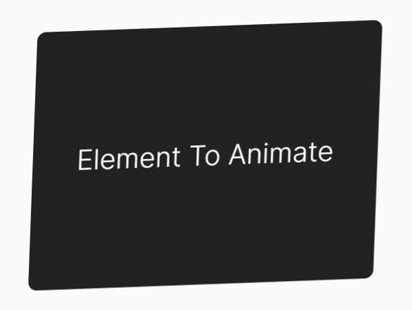
3. A real world example.
<div class="box">
  Element To Animate
</div>
.rotate-scale-up {
  -webkit-animation: rotate-scale-up .65s linear both;
  animation: rotate-scale-up .65s linear both
}

@-webkit-keyframes rotate-scale-up {
  0% {
    -webkit-transform: scale(1) rotateZ(0);
    transform: scale(1) rotateZ(0)
  }
  50% {
    -webkit-transform: scale(2) rotateZ(180deg);
    transform: scale(2) rotateZ(180deg)
  }
  100% {
    -webkit-transform: scale(1) rotateZ(360deg);
    transform: scale(1) rotateZ(360deg)
  }
}

@keyframes rotate-scale-up {
  0% {
    -webkit-transform: scale(1) rotateZ(0);
    transform: scale(1) rotateZ(0)
  }
  50% {
    -webkit-transform: scale(2) rotateZ(180deg);
    transform: scale(2) rotateZ(180deg)
  }
  100% {
    -webkit-transform: scale(1) rotateZ(360deg);
    transform: scale(1) rotateZ(360deg)
  }
}
This awesome jQuery plugin is developed by brock-eng. For more Advanced Usages, please check the demo page or visit the official website.