Responsive jQuery Equal Height Photo Gallery Plugin - Pycs Layout
| File Size: | 170 KB |
|---|---|
| Views Total: | 7843 |
| Last Update: | |
| Publish Date: | |
| Official Website: | Go to website |
| License: | MIT |
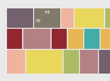
Pycs-Layout is a jQuery plugin for creating a responsive & compact image layout/gallery which distributes your images by preserving their aspect-ratios and filling the maximum amount of space.
Basic Usage:
1. Include the jQuery javascript library and jQuery Pycs-Layout plugin in the page.
<script src="/path/to/cdn/jquery.min.js"></script>
<script src="/path/to/js/pycs-layout.jquery.js"></script>
2. Include the other necessary javascript files in the page.
<script src="js/modernizr.min.js"></script>
<script src="js/foundation.min.js"></script>
3. Create an image layout/gallery following the markup structure:
<div class="photos-gallery">
<div class="picture"> <img src="assets/pictures/1.jpg" /> </div>
<div class="picture"> <img src="assets/pictures/2.jpg" /> </div>
<div class="picture"> <img src="assets/pictures/3.jpg" /> </div>

...
</div>
4. Initialize the plugin on page loaded.
$(window).load( function() {
  $(".photos-gallery").pycsLayout({
    gutter: 4,
    idealHeight: parseInt($(window).height()/2)
});
5. All default settings.
$(".photos-gallery").pycsLayout({

  /* the class of the elements we want to layout. */
  pictureContainer: ".picture",

  /* the height we want our elements to have. */
  idealHeight: 150,

  /* the horizontal and vertical margin between the elements (in px). */
  gutter: 6,

});
Changelog:
2023-04-04
- update for jQuery 3.6+
This awesome jQuery plugin is developed by ademonte. For more Advanced Usages, please check the demo page or visit the official website.
