Lucky Spin (Random Wheel) In jQuery
| File Size: | 358 KB |
|---|---|
| Views Total: | 40807 |
| Last Update: | |
| Publish Date: | |
| Official Website: | Go to website |
| License: | MIT |
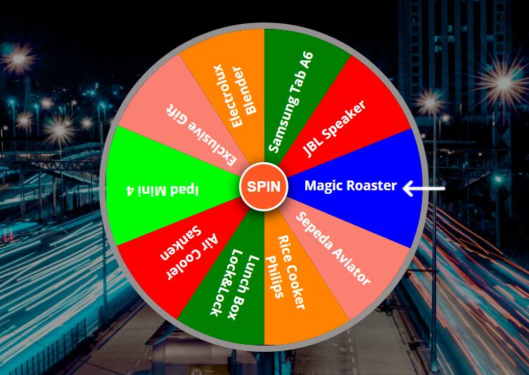
A free online lucky spin wheel app (also called wheels of fortune) written in jQuery, HTML, and CSS/CSS3.
Each time you spin the wheel, you will get a random reward.
How to use it:
1. Build the HTML structure for the lucky spin as follows:
<div class="mainbox" id="mainbox">
  <div class="box" id="box">
    <div class="box1">
      <span class="font span1"><b>Samsung Tab A6</b></span>
      <span class="font span2"><b>JBL Speaker</b></span>
      <span class="font span3"><b>Magic Roaster</b></span>
      <span class="font span4"><b>Sepeda Aviator</b></span>
      <span class="font span5"
        ><b
          >Rice Cooker <br />
          Philips</b
        ></span
      >
    </div>
    <div class="box2">
      <span class="font span1"><b>Lunch Box Lock&Lock</b></span>
      <span class="font span2"
        ><b
          >Air Cooler <br />
          Sanken</b
        ></span
      >
      <span class="font span3"><b>Ipad Mini 4</b></span>
      <span class="font span4"><b>Exclusive Gift</b></span>
      <span class="font span5"
        ><b
          >Electrolux <br />
          Blender</b
        ></span
      >
    </div>
  </div>
  <button class="spin" onclick="spin()">SPIN</button>
</div>
2. Add sound effects to the lucky spin if needed.
<audio
  controls="controls"
  id="applause"
  src="./applause.mp3"
  type="audio/mp3"
></audio>
<audio
  controls="controls"
  id="wheel"
  src="./wheel.mp3"
  type="audio/mp3"
></audio>
3. Add sound effects to the lucky spin if needed.
<audio
  controls="controls"
  id="applause"
  src="./applause.mp3"
  type="audio/mp3"
></audio>
<audio
  controls="controls"
  id="wheel"
  src="./wheel.mp3"
  type="audio/mp3"
></audio>
4. The necessary CSS styles.
.mainbox {
  position: relative;
  width: 500px;
  height: 500px;
}

.mainbox:after {
  position: absolute;
  content: "";
  width: 100%;
  height: 100%;
  background: url(./arrow-bottom.png) no-repeat;
  background-size: 5%;
  left: 5%;
  top: 48%;
  transform: rotate(90deg);
}

.box {
  width: 100%;
  height: 100%;
  position: relative;
  border-radius: 50%;
  border: 10px solid #949090;
  overflow: hidden;
  transition: all ease-in-out 5s;
  transform: rotate(90deg);
}

span {
  width: 100%;
  height: 100%;
  display: inline-block;
  position: absolute;
}

.span1 {
  clip-path: polygon(0 17%, 0 50%, 50% 50%);
  background-color: green;
}

.span2 {
  clip-path: polygon(0 17%, 30% 0, 50% 50%);
  background-color: red;
}

.span3 {
  clip-path: polygon(30% 0, 71% 0, 50% 50%);
  background-color: blue;
}

.span4 {
  clip-path: polygon(71% 0, 100% 18%, 50% 50%);
  background-color: salmon;
}

.span5 {
  clip-path: polygon(100% 18%, 100% 50%, 50% 50%);
  background: #ff8300;
}

.box2 .span3 {
  background-color: #00ff04;
}

.box2 {
  width: 100%;
  height: 100%;
  transform: rotate(180deg);
}

.font {
  color: white;
  font-size: 20px;
}

.box1 .span1 b {
  position: absolute;
  top: 39%;
  right: 60%;
  transform: rotate(200deg);
  text-align: center;
}

.box1 .span2 b {
  position: absolute;
  top: 25%;
  right: 57%;
  transform: rotate(-130deg);
}

.box1 .span3 b {
  position: absolute;
  top: 20%;
  right: 36%;
  transform: rotate(-90deg);
}

.box1 .span4 b {
  position: absolute;
  top: 25%;
  right: 15%;
  transform: rotate(-45deg);
}

.box1 .span5 b {
  position: absolute;
  top: 38%;
  right: 10%;
  transform: rotate(-15deg);
  text-align: center;
}

.box2 .span1 b {
  position: absolute;
  top: 34%;
  right: 70%;
  transform: rotate(200deg);
}

.box2 .span2 b {
  position: absolute;
  top: 20%;
  right: 60%;
  transform: rotate(-130deg);
  text-align: center;
}

.box2 .span3 b {
  position: absolute;
  top: 15%;
  right: 40%;
  transform: rotate(270deg);
}

.box2 .span4 b {
  position: absolute;
  top: 27%;
  right: 20%;
  transform: rotate(310deg);
}

.box2 .span5 b {
  position: absolute;
  top: 35%;
  right: 10%;
  transform: rotate(-20deg);
  text-align: center;
}

.spin {
  position: absolute;
  top: 50%;
  left: 50%;
  transform: translate(-50%, -50%);
  width: 75px;
  height: 75px;
  border-radius: 50%;
  border: 4px solid white;
  background-color: #ff5722;
  color: #fff;
  box-shadow: 0 5px 20px #000;
  font-weight: bold;
  font-size: 22px;
  cursor: pointer;
  z-index: 1000;
}

.spin:active {
  width: 70px;
  height: 70px;
  font-size: 20px;
}

.mainbox.animate:after {
  animation: animateArrow 0.7s ease infinite;
}

audio {
  display: none;
}

@keyframes animateArrow {
  50% {
    right: -50px;
  }
}

@media (max-width: 576px) {
  .mainbox {
    width: 100%;
    height: 50%;
  }
}
5. Load the needed jQuery, jQuery easing, and SweetAlert (for reward notification) libraries in the document.
<script src="https://code.jquery.com/jquery-3.6.0.min.js"></script>
<script src="https://cdnjs.cloudflare.com/ajax/libs/jquery-easing/1.4.1/jquery.easing.min.js"></script>
<script src="https://unpkg.com/sweetalert/dist/sweetalert.min.js"></script>
6. The main JavaScript (jQuery script) to activate the lucky spin.
function shuffle(array) {
  var currentIndex = array.length,
      randomIndex;

  while (0 !== currentIndex) {
    randomIndex = Math.floor(Math.random() * currentIndex);
    currentIndex--;

    [array[currentIndex], array[randomIndex]] = [
      array[randomIndex],
      array[currentIndex],
    ];
  }

  return array;
}

function spin() {

  // Play the sound
  wheel.play();

  const box = document.getElementById("box");
  const element = document.getElementById("mainbox");
  let SelectedItem = "";

  let MagicRoaster = shuffle([1890, 2250, 2610]);
  let Sepeda = shuffle([1850, 2210, 2570]); //Kemungkinan : 100%
  let RiceCooker = shuffle([1810, 2170, 2530]);
  let LunchBox = shuffle([1770, 2130, 2490]);
  let Sanken = shuffle([1750, 2110, 2470]);
  let Electrolux = shuffle([1630, 1990, 2350]);
  let JblSpeaker = shuffle([1570, 1930, 2290]);

  let Hasil = shuffle([
    MagicRoaster[0],
    Sepeda[0],
    RiceCooker[0],
    LunchBox[0],
    Sanken[0],
    Electrolux[0],
    JblSpeaker[0],
  ]);
  // console.log(Hasil[0]);

  // get the value of selected item
  if (MagicRoaster.includes(Hasil[0])) SelectedItem = "Magic Roaster";
  if (Sepeda.includes(Hasil[0])) SelectedItem = "Sepeda Aviator";
  if (RiceCooker.includes(Hasil[0])) SelectedItem = "Rice Cooker Philips";
  if (LunchBox.includes(Hasil[0])) SelectedItem = "Lunch Box Lock&Lock";
  if (Sanken.includes(Hasil[0])) SelectedItem = "Air Cooler Sanken";
  if (Electrolux.includes(Hasil[0])) SelectedItem = "Electrolux Blender";
  if (JblSpeaker.includes(Hasil[0])) SelectedItem = "JBL Speaker";

  // spin
  box.style.setProperty("transition", "all ease 5s");
  box.style.transform = "rotate(" + Hasil[0] + "deg)";
  element.classList.remove("animate");
  setTimeout(function () {
    element.classList.add("animate");
  }, 5000);

  // alert
  setTimeout(function () {
    applause.play();
    swal(
      "Congratulations",
      "You Won The " + SelectedItem + ".",
      "success"
    );
  }, 5500);

  // delay
  setTimeout(function () {
    box.style.setProperty("transition", "initial");
    box.style.transform = "rotate(90deg)";
  }, 6000);
}
This awesome jQuery plugin is developed by jackyhao97. For more Advanced Usages, please check the demo page or visit the official website.


