Powerful jQuery Dialog Box Plugin - Zebra_Dialog
| File Size: | 141 KB |
|---|---|
| Views Total: | 17533 |
| Last Update: | |
| Publish Date: | |
| Official Website: | Go to website |
| License: | MIT |
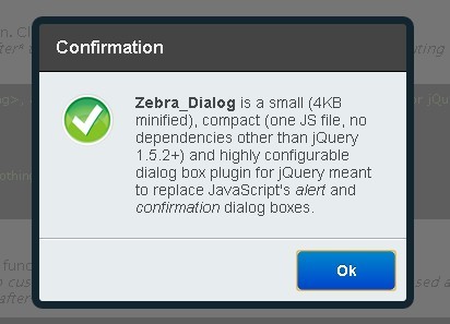
Zebra_Dialog is a small (4KB minified), compact (one JS file, no dependencies other than jQuery 1.5.2+) and highly configurable dialog box plugin for jQuery. It also can be used as a notification widget for your website or project.
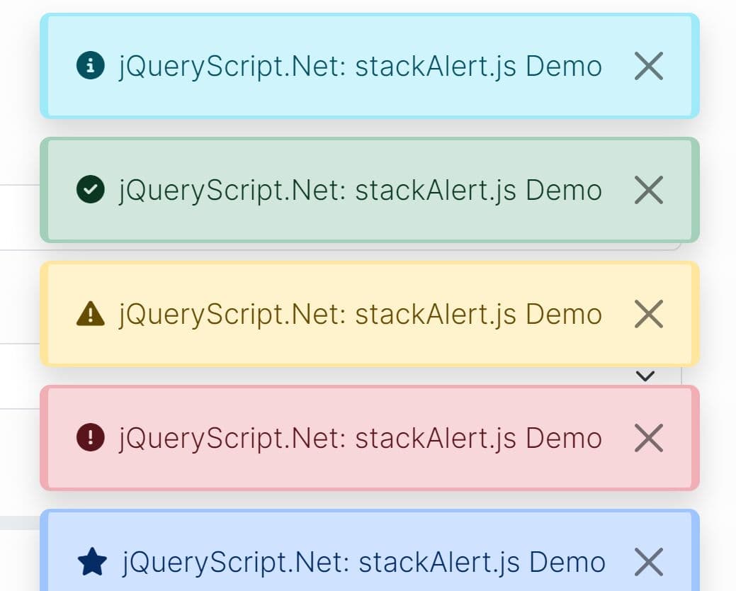
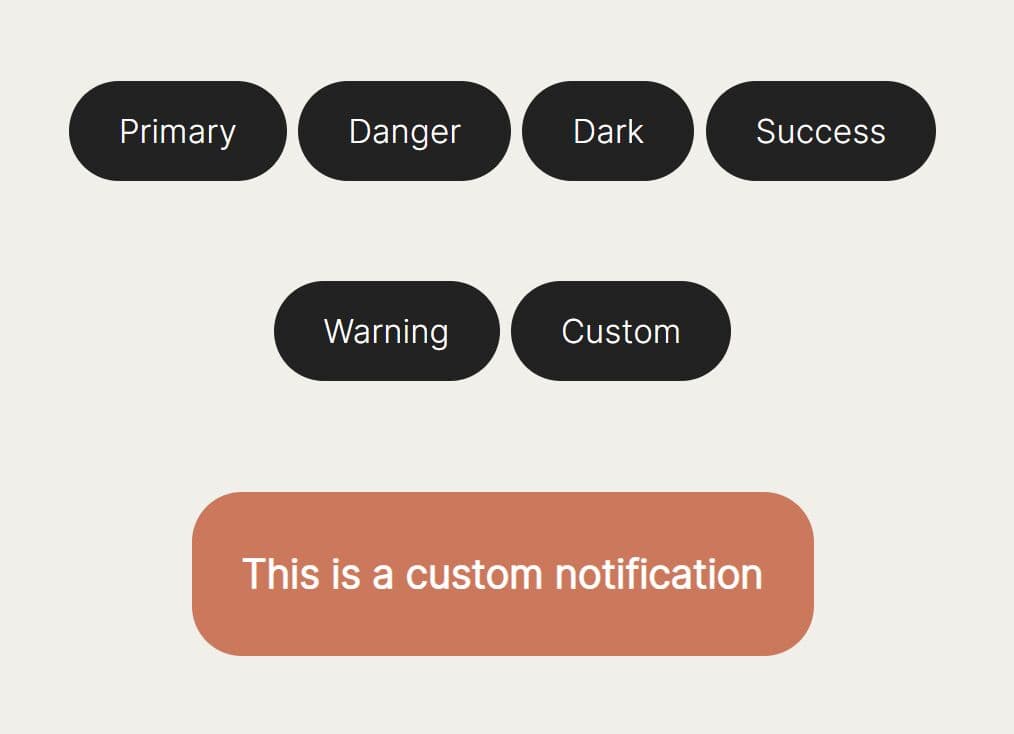
Zebra_Dialog can generate 6 types of dialog boxes: confirmation, information, warning, prompt, error and question. The appearance of the dialog boxes is easily customizable by changing the CSS file.
Zebra_Dialog dialog boxes can be positioned anywhere on the screen - not just in the middle! By default, dialog boxes can be closed by pressing the ESC key or by clicking anywhere on the overlay. It also can be used as a notification widget for your website or project.
Licensed under the GNU Lesser General Public License v3.0.
You might also like:
- jQuery Dialog Boxes Plugin for Bootstrap - Bootbox
- Modern Modal Dialogs - ModalBox
- Lightweight Modal Dialog Plugin - SimpleModal
- Modal Dialog Windows Plugin - leanModal
- SimpleModal - Beautiful Popup Window Plugin
Basic Usage:
1. Include jQuery library and jQuery Zebra_Dialog on your web page.
<script src="jquery.min.js"></script>
<script src="javascript/zebra_dialog.js"></script>
2. Include jQuery Zebra_Dialog to style your plugin.
<link rel="stylesheet" href="css/zebra_dialog.css" type="text/css">
3. The Html markup.
<a href="javascript:void(0)" id="example1">here</a>
4. Call the plugin and done.
// show a dialog box when clicking on a link
$('#example1').bind('click', function(e) {
  e.preventDefault();
  $.Zebra_Dialog('The link was clicked!');
});
5. Possible plugin options with default values.
//  The speed, in milliseconds, by which the overlay and the
//  dialog box will be animated when closing.
animation_speed_hide: 250,

//  The speed, in milliseconds, by which the dialog box will
//  fade in when appearing.
animation_speed_show: 0,

//  The number of milliseconds after which to automatically
//  close the dialog box or FALSE to not automatically close the dialog box.
auto_close: false,

//  The index (0-based) of the button (from left to right) to
//  place the focus on when a dialog box is first shown.
//
//  Set to FALSE to disable. When set to FALSE the focus will
//  be placed on the dialog box's content so that when the
//  users presses TAB, the focus will be set on the first
//  button.
//
//  Setting this to TRUE is equivalent to setting it to 0.
auto_focus_button: true,

//  Use this for localization and for adding custom buttons.
//
//  If set to TRUE, the default buttons will be used, depending
//  on the type of the dialog box: ['Yes', 'No'] for "question"
//  type and ['Ok'] for the other dialog box types.
//
//  For custom buttons, use an array containing the captions of
//  the buttons to display: ['My button 1', 'My button 2'].
//
//  Set to FALSE if you want no buttons.
//
//  Note that when the dialog box is closed as a result of clicking
//  a button, the "onClose" event is triggered and the callback
//  function (if any) receives as argument the caption of the
//  clicked button.
//
//  See the comments for the "onClose" event below for more
//  information.
//
//  You can also attach callback functions to individual buttons
//  by using objects in the form of:
//
//  [
//   {caption: 'My button 1', callback: function() { // code }},
//   {caption: 'My button 2', callback: function() { // code }}
//  ]
//
//  The main difference is that a callback function attached this
//  way is executed as soon as the button is clicked rather than
//  *after* the dialog box is closed, as it is the case with the
//  "onClose" event.
//
//  Callback functions attached to buttons get as argument the
//  entire dialog box jQuery object.
//
//  A callback function returning FALSE will prevent the dialog
//  box from closing.

//  When set to TRUE, the buttons will be centered instead of
//  right-aligned.
buttons: true,

//  When set to TRUE, the buttons will be centered instead of
//  right-aligned.
center_buttons: false,

//  An extra class to add to the dialog box's container. Useful
//  for customizing a dialog box elements' styles at runtime.
//
//  For example, setting this value to "mycustom" and in the
//  CSS file having something like
//  .mycustom .ZebraDialog_Title { background: red }
//  would set the dialog box title's background to red.
//
//  See the CSS file for what can be changed.
custom_class: false,

// Default value to show in the input box when the dialog
// box type is "prompt".
default_value: "",

//  Prevents scrolling of the page behind the dialog box, when the dialog box is open.
//  This has effect only when the "modal" property is set to TRUE.
disable_page_scrolling: true,

//  Whether the dialog box should be draggable or not.
//
//  Dialog boxes that have a title are draggable by default
//  unless this property is set to `false`.
//
//  For dialog boxes not having a title, set this property
//  to "force" for making them draggable.
//
//  Default is TRUE for dialog boxes that have a title.
draggable: true,

//  By default, the height of the dialog box is automatically
//  set and it is also influenced by the "max_height" property.
//
//  Use this to set a fixed height, in pixels, for the dialog
//  box.
height: 0,

//  When set to TRUE, pressing the ESC key will close the dialog
//  box.
keyboard: true,

//  Margin of the dialog box relative to the viewport's limits
//  (a single value, applied both horizontally and/or vertically)
//
//  This is used when the dialog box is stretched 100% horizontally
//  and/or vertically and "width" and "max_width" are not set
//  (when stretched horizontally) and "height" and "max_height"
//  are not set (when stretched vertically).
//
//  Can be specified as a numeric value (which will be interpreted
//  as a value in pixels) or as a percentage (of the viewport).
//
//  Default is "0" - when stretched, the dialog box sticks to
//  the viewport's limits.
margin: 0,

//  The maximum height, in pixels, before the content in the
//  dialog box is scrolled.
//
//  If set to "0" the dialog box's height will automatically
//  adjust to fit the entire content.
max_height: 0,

//  The maximum width of the dialog box.
//
//  Can be specified as a numeric value (which will be interpreted
//  as a value in pixels) or as a percentage (of the viewport).
//
//  If "max_width" is set to valid value greater than 0,
//  then the "width" property will be ignored.
max_width: 450,

//  Default value to show in the input box when the dialog
//  box type is "prompt".
default_value: '',

//  The text (or HTML) to be displayed in the dialog box.
//
//  See the "source" property on how to add content via AJAX,
//  iFrames or from inline elements.
message: '',

//  When set to TRUE there will be a semitransparent overlay
//  behind the dialog box, preventing users from clicking
//  the page's content.
modal: true,

//  Should the dialog box close when the overlay is clicked?
backdrop_close: true,

//  The opacity of the overlay (between 0 and 1)
backdrop_opacity: '.9',

//  Position of the dialog box.
//
//  Can be either "center" (which would center the dialog box) or
//  an array with 2 elements, in the form of
//  {'horizontal_position +/- offset', 'vertical_position +/- offset'}
//  (notice how everything is enclosed in quotes) where
//  "horizontal_position" can be "left", "right" or "center",
//  "vertical_position" can be "top", "bottom" or "middle", and
//  "offset" represents an optional number of pixels to add/substract
//  from the respective horizontal or vertical position.
//
//  Positions are relative to the viewport (the area of the
//  browser that is visible to the user)!
//
//  Examples:
//
//  ['left + 20', 'top + 20'] would position the dialog box in the
//  top-left corner, shifted 20 pixels inside.
//
//  ['right - 20', 'bottom - 20'] would position the dialog box
//  in the bottom-right corner, shifted 20 pixels inside.
//
//  ['center', 'top + 20'] would position the dialog box in
//  center-top, shifted 20 pixels down.
position: 'center',

//  The duration (in milliseconds) of the animation used to
//  reposition the dialog box when the browser window is resized.
reposition_speed:           500,

//  When set to TRUE, a "close" button (the little "x") will be
//  shown in the upper right corner of the dialog box.
//
//  If the dialog box has a title bar then the "close" button
//  will be shown in the title bar, vertically centered and
//  respecting the right padding.
//
//  If the dialog box does not have a title bar then the "close"
//  button will be shown in the upper right corner of the body
//  of the dialog box, respecting the position related properties
//  set in the stylesheet.
show_close_button: true,

//  Add content via AJAX, iFrames or from inline elements (together
//  with the already applied events).
//
//  This property can be any of the following:
//
//  - 'ajax': object - where "object" can be an object with any
//  of the properties you'd normally use to make an AJAX call in
//  jQuery (see the description for the "settings" argument at
//  http://api.jquery.com/jQuery.ajax/), or it can be a string
//  representing a valid URL whose content to be fetched via
//  AJAX and placed inside the dialog box.
//
//  Example:
//
//  source: {'ajax': 'http://myurl.com/'}
//
//  source: {'ajax': {
//      'url':      'http://myurl.com/',
//      'cache':    false
//  }}
//
//  Note that you cannot use the "success" property as it will
//  always be overwritten by the library; use the "complete"
//  property instead, if you have to!
//
//  - 'iframe': object - where "object" can be an object where
//  property names can be valid attributes of the <iframe> tag
//  (see https://developer.mozilla.org/en-US/docs/HTML/Element/iframe),
//  or it can be a string representing a valid URL to be loaded
//  inside an iFrame and placed inside the dialog box.
//
//  Example:
//
//  source: {'iframe': 'http://myurl.com/'}
//
//  source: {'iframe': {
//      'src':          'http://myurl.com/',
//      'width':        480,
//      'height':       320,
//      'scrolling':    'no'
//  }}
//
//  Note that you should always set the iFrame's width and height
//  and adjust the dialog box's "width" property accordingly!
//
//  - 'inline': selector - where "element" is a jQuery element
//  from the page; the element will be copied and placed inside
//  the dialog box together with any attached events! if you just
//  want the element's inner HTML, use $('#element').html().
//
//  Example:
//
//  source: {'inline': $('#myelement')}
source: false,

//  Title of the dialog box
title: '',

//  Dialog box type.
//
//  Can be any of the following:
//
//  - confirmation
//  - error
//  - information
//  - question
//  - warning
//  - prompt
//  If you don't want an icon, set the "type" property to FALSE.
//
//  By default, all types except "question" have a single button
//  with the caption "Ok"; type "question" has two buttons, with
//  the captions "Ok" and "Cancel" respectively.
type: 'information',

//  Should short messages be vertically centered?
vcenter_short_message:      true,

//  By default, the width of the dialog box is set in the CSS
//  file. Use this property to override the default width at
//  runtime.
//
//  Must be an integer, greater than 0. Anything else will instruct
//  the script to use the default value, as set in the CSS file.
//  Value should be no less than 200 for optimal output.
width: 0,

//  Event fired when *after* the dialog box is closed.
//
//  For executing functions *before* the closing of the dialog
//  box, see the "buttons" attribute.
//
//  The callback function (if any) receives as argument the
//  caption of the clicked button or boolean FALSE if the dialog
//  box is closed by pressing the ESC key or by clicking on the
//  overlay.
onClose: null
6. Available event handlers.
//  Event fired when *after* the dialog box is opened.
//
//  The callback function (if any) receives as unique argument
//  the dialog box, as a jQuery object.
onOpen: null,

//  Event fired when *before* the dialog box is closed.
//
//  The main difference when compared to the "onClose" event
//  is that, with this event, by returning `false` from the
//  callback function you can prevent the closing of the
//  dialog box - useful for validating user input.
//
//  For executing functions *before* the closing of the dialog
//  box, see the "buttons" attribute.
//
//  The callback function (if any) receives as first argument
//  the caption of the clicked button or boolean FALSE if the
//  dialog box is closed by pressing the ESC key, by clicking
//  the dialog box's "x" button, or by clicking the backdrop.
//  The argument can also be boolean TRUE when the dialog box
//  type is "prompt" and the ENTER key is pressed while inside
//  the input box.
//
//  As second argument, the callback function receives the value
//  entered in the input box when the dialog box type is
//  "prompt" and a button was clicked or the ENTER key was
//  pressed while inside the input box, or undefined for any
//  other case.
//
//  All this is important when expecting user input as you
//  can say that you have user input *only* when the value
//  of the first argument is boolean TRUE or the value it's
//  the same as the label of the button considered as confirmation
//  (i.e. "Ok"), and the value of the second argument is
//  !== undefined.
//
//  See the "buttons" property for another way of handling
//  user input.
onBeforeClose: null,

//  Event fired when *after* the dialog box is closed.
//
//  For executing functions *before* the closing of the dialog
//  box, see the "buttons" attribute.
//
//  The callback function (if any) receives as first argument
//  the caption of the clicked button or boolean FALSE if the
//  dialog box is closed by pressing the ESC key, by clicking
//  the dialog box's "x" button, or by clicking the backdrop.
//  The argument can also be boolean TRUE when the dialog box
//  type is "prompt" and the ENTER key is pressed while inside
//  the input box.
//
//  As second argument, the callback function receives the value
//  entered in the input box when the dialog box type is
//  "prompt" and a button was clicked or the ENTER key was
//  pressed while inside the input box, or undefined for any
//  other case.
//
//  All this is important when expecting user input as you
//  can say that you have user input *only* when the value
//  of the first argument is boolean TRUE or the value it's
//  the same as the label of the button considered as confirmation
//  (i.e. "Ok"), and the value of the second argument is
//  !== undefined.
//
//  See the "buttons" property or the "onBeforeClose" event for
//  other ways of handling user input.
onClose: null
7. Hide/update the dialog programmatically.
var dialog = new $.Zebra_Dialog('This is some information');

dialog.close();
dialog.update();
Changelog:
v3.1.0 (2024-10-22)
- dialog boxes are now draggable by default; see the newly added draggable property
- added the onOpen event which triggers after the dialog box is made visible;
- added the onBeforeClose event which triggers before the dialog is hidden; useful for validating input prompts and not closing the dialog box in case the input is not valid
- added placeholder property to be used with prompt type dialog boxes
- added prompt_rows which when set to a value greater than 1 will turn the input element in a prompt dialog box to a textarea
- fixed bug where page scrolling was not disabled when opening modal dialog boxes even though disable_page_scrolling was set to true by default
v3.0.7 (2024-10-22)
- minor maintenance release
v3.0.6 (2024-04-22)
- minor maintenance release
2021-11-24
- Code formatting
v3.0.5 (2020-08-19)
- fixed bugs when working with iFrames
v3.0.4 (2020-08-18)
- fixed bug where the disable_page_scrolling property introduced in 3.0.0 had an undesired effect on pages where there was no scroll
v3.0.3 (2020-07-19)
- SASS files are now available in the dist folder
- fixed broken example for overlapping dialogs
v3.0.2 (2020-04-26)
- minor release which only adds screenshots to the examples
v3.0.1 (2020-03-31)
- Fixed 'center_buttons' property not centering buttons in latest build
v3.0.0 (2019-09-04)
- page scrolling behind an open dialog box is now disabled by default
- added margin property to prevent the dialog box from touching the viewport's limits when stretched 100% horizontally and/or vertically
- added max_width property which, together with the existing max_height property, can now be specified as percentage
- added the default_value property to be used for prompt type dialog boxes
- width and height properties can now be specified as percentages, too
- custom_class is now also added to the overlay, not just to the dialog box
- the word center can also be used when specifying vertical position (alongside middle)
- when using iFrames, the width and height is now automatically computed to fit those of the dialog box; additionally, now a spinner is also shown while the iFrame content is loading
- the library now automatically does backdrop management when opening multiple modal dialog boxes
- dropped IE6 support
- fixed bug where the positioning of the dialog box was incorrect it had borders
- removed the backdrop_container property
- minor tweaks to all the templates
v2.1.1 (2019-06-04)
- added prompt dialog box type
- added height property for setting custom heights to dialog boxes
- added update method for adjusting the dialog box's position when content is changed dynamically, at run-time
- the overlay can now have a different parent than the body element, via the newly added overlay_container property
v2.1.0 (2019-06-04)
- fixed height broken in previous commits
v2.0.0 (2018-08-01)
- added a new "auto_focus_button" property for indicating the button to place the focus on when a dialog box is first shown
- simplified dialogs' HTML markup and all the classes indicating various states/setups of the dialog box are now added to the main container
- some of the alignments done previously from JavaScript are now done from CSS - but still working in IE6 :)
- completely rewritten the CSS for the themes and we're now using clean-css to optimize CSS output, resulting in a reduction of 0.5KB for the flat theme and 1.8KB for the classic theme
- added a new materialize theme, inspired by Google Material Design
v1.6.0 (2018-07-26)
- "warning" dialog boxes now have "Yes" and "No" buttons instead of just the "Ok" button
- changed the labels for the buttons on "confirmation" dialog boxes from "Yes" and "No" to "Ok" and "Cancel"
- revamped example pages
v1.5.0 (2018-07-05)
- fixed bug where inputs in dialog box could never receive focus on mobile devices
- fixed the plugin was not working in IE8
- custom classes can now be added to buttons
- added version number as a public property - useful to find out the version number even if all you have is the minified source code
2018-07-04
- Custom classes can now be added to buttons
v1.4.1 (2017-10-14)
- fixed bug where dialog box height could exceed viewport height
- fixed scrolling on iPhone
v1.4.0 (2016-06-28)
- performance improvements and source code tweaks
- new folder structure
- The dialog boxes have now 100% width on small screens.
v1.3.12 (2016-06-01)
- Fixed issues with positioning of the "close" button
v1.3.8 (2013-12-21)
- Fixed a bug
v1.3.7 (2013-11-26)
- Added new "flat" theme
v1.3.6 (2013-10-17)
- Fixed reference
- Fixed 2 bugs
v1.3.3 (2013-05-29)
- The z-index value for the overlay and the dialog box can now be set from CSS. Previously these were set in the JavaScript code and would require hacking the source code in order to change them;
v1.3.2 (2013-05-27)
- fixed a bug where if the "reposition_speed" property was > 0 and the browser window was manually resized, the animations for repositioning the window would queue up and slow down the process to almost a complete halt;
- changed the name of the "animaton_speed" property to "animation_speed_hide" and added a new "animation_speed_show" used to set the speed by which the dialog box will fade in when appearing;
v1.3.1 (2013-05-07)
- Fixed a bug with "box-sizing" set to "border-box"
This awesome jQuery plugin is developed by stefangabos. For more Advanced Usages, please check the demo page or visit the official website.