3D Transforms Based jQuery Image Carousel / Rotator
| File Size: | 9 KB |
|---|---|
| Views Total: | 3253 |
| Last Update: | |
| Publish Date: | |
| Official Website: | Go to website |
| License: | MIT |
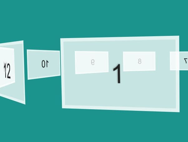
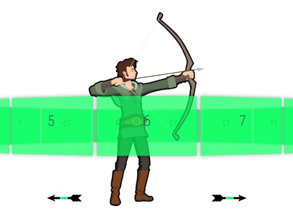
jQuery CSS Carousel uses CSS3 3D transforms to render a 3D perspective hexagon image carousel / rotator with next / prev navigation buttons on your webpage.
How to use it:
1. Add images and navigation buttons into the carousel following the markup structure as follows:
<div id="carousel">
  <div id="container" tcc-rotation="0">
    <item tc-rotation="120" style="transform: rotateY(120deg) translateZ(200px)"><img src="1.jpg"></item>
    <item tc-rotation="240" style="transform: rotateY(240deg) translateZ(200px)"><img src="2.jpg"></item>
    <item tc-rotation="180" style="transform: rotateY(180deg) translateZ(200px)"><img src="3.jpg"></item>
    <item tc-rotation="0" style="transform: rotateY(0deg)   translateZ(200px)"><img src="4.jpg"></item>
    <item tc-rotation="-60" style="transform: rotateY(-60deg) translateZ(200px)"><img src="5.jpg"></item>
    <item tc-rotation="60" style="transform: rotateY(60deg)  translateZ(200px)"><img src="6.jpg"></item>
  </div>
  <nav class="tc-btn-container">
    <div class="tc-next">NEXT</div>
    <div class="tc-prev">PREV</div>
  </nav>
</div>
2. The required CSS / CSS3 styles for the carousel.
#carousel {
  display: block;
  height: auto;
  margin: 0 auto;
  -webkit-perspective: 80px;
  perspective: 800px;
  position: relative;
  top: 200px;
  width: 800px;
}

#container {
  display: block;
  height: 200px;
  margin: 0 auto;
  transform: rotateY(0deg);
  -webkit-transform-origin: center bottom 0;
  transform-origin: center bottom 0;
  -webkit-transform-style: preserve-3d;
  transform-style: preserve-3d;
  -webkit-transition: all 1s ease-in-out;
  transition: all 1s ease-in-out;
  width: 200px;
}

item {
  display: block;
  margin: 0;
  padding: 0;
  width: 200px;
  transform: translateZ(400px);
  position: absolute;
}

item img { width: 100%; }

.tc-btn-container {
  display: block;
  float: left;
  height: 35px;
  margin-top: -12.5px;
  position: absolute;
  top: 50%;
  width: 100%;
}

.tc-next {
  background-color: #333;
  color: white;
  display: block;
  float: right;
  font-size: 12px;
  padding: 10px;
  width: auto;
  cursor: pointer;
}

.tc-prev {
  background-color: #333;
  color: white;
  display: block;
  float: left;
  font-size: 12px;
  padding: 10px;
  width: auto;
  cursor: pointer;
}
3. Put the necessary jQuery JavaScript library at the end of the document.
<script src="//code.jquery.com/jquery-2.2.1.min.js"></script>
4. The main JavaScript to active the 3D image carousel.
$(document).ready(function($){

  var crotation;
  var rotateto = 0;
  var halfrotation = 180;

  function tcRotate(deg){
      $('#container').css({
          'transform'         : 'rotateY('+ deg +'deg)',
          '-webkit-transform' : 'rotateY('+ deg +'deg)'
      });
  }

  $('item').on('click', function(e){
      e.preventDefault();

      crotation = $('#container').attr('tcc-rotation');
      rotation = $(this).attr('tc-rotation');
      rotateto = crotation - rotation;
      tcRotate(rotateto);
      crotation = rotateto;

  });

  $('.tc-next').on('click', function(e){
      e.preventDefault();
      rotateto -= 60;
      tcRotate(rotateto);
  });
  $('.tc-prev').on('click', function(e){
      e.preventDefault();
      rotateto += 60;
      tcRotate(rotateto);
  });

});
Change log:
2016-06-11
- added a parallax demo & js
2016-03-01
- minor fixes.
2016-02-29
- minor fixes.
This awesome jQuery plugin is developed by marffinn. For more Advanced Usages, please check the demo page or visit the official website.