Animated 3D Image Rotator with jQuery And CSS3 Transforms
| File Size: | 6.32 KB |
|---|---|
| Views Total: | 1128 |
| Last Update: | |
| Publish Date: | |
| Official Website: | Go to website |
| License: | MIT |
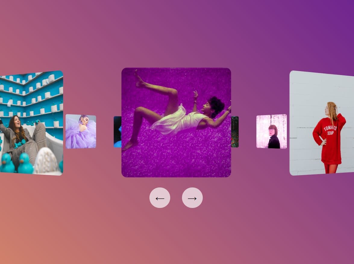
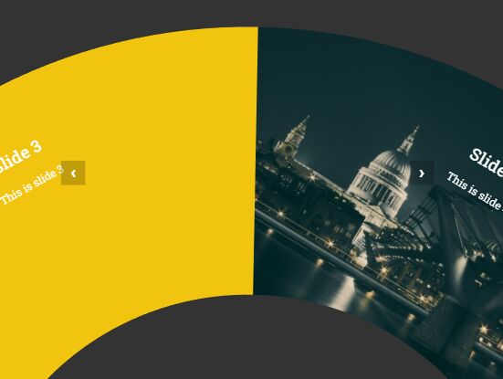
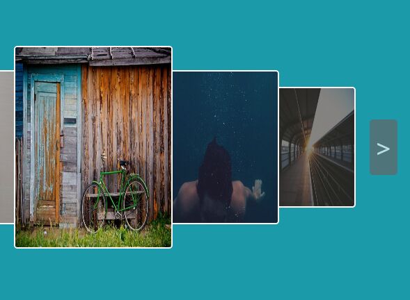
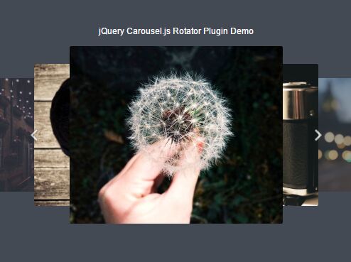
This fancy 3D image rotator allows you to smoothly rotate through a series of images with next/prev buttons.
Built with JavaScript (jQuery) and CSS3 3D transforms, it rotates each image in an animated 3D view, creating a more dynamic experience compared to a flat image slider.
Works well showcasing a portfolio, presenting product galleries, or creating an interactive presentation on your sites.
How to use it:
1. Add images as backgrounds to the 3D rotator.
<div class="rotator">
  <div class="spinner">
    <div class="panel a"></div>
    <div class="panel b"></div>
    <div class="panel c"></div>
    ... more images here ...
    <div class="fade"></div>
  </div>
</div>
.a {
  background-image: url(1.jpg);
}

.b {
  background-image: url(2.webp);
}

.c {
  background-image: url(3.png);
}

...
2. Add navigation controls next to the 3D rotator.
<div class="pagination"> <button type="button" id="prev">←</button> <button type="button" id="next">→</button> </div>
3. The necessary CSS/CSS3 styles.
* {
  --ang: 0;
}

.spinner {
  transform-style: preserve-3d;
  position: relative;
  display: flex;
  align-items: center;
  justify-content: center;
  transform: rotateY(calc(var(--ang) * 1deg)) translateY(-12px);
  transition: all 0.5s ease-in-out;
}

.rotator {
  width: 600px;
  height: 200px;
  display: flex;
  justify-content: center;
  align-items: center;
  perspective: 700px;
  perspective-origin: center;
}

.panel {
  border-radius: 5px;
  width: 100px;
  height: 100px;
  position: absolute;
  background-size: cover;
  background-position: 50% 50%;
}

.panel:nth-child(1) {
  transform: rotateY(0deg) translateZ(400px);
}

.panel:nth-child(2) {
  transform: rotateY(22.5deg) translateZ(400px);
}

.panel:nth-child(3) {
  transform: rotateY(45deg) translateZ(400px);
}

/* more image(panel) styles here */

/* navigation styles */
.pagination {
  width: 600px;
  height: 44px;
  margin-top: 10px;
  text-align: center;
}

.pagination button {
  padding: 0;
  border: none;
  cursor: pointer;
  width: 44px;
  color: black;
  background: #fffa;
  height: 44px;
  margin: 0 10px;
  font-family: "Roboto", sans-serif;
  font-size: 20px;
  border-radius: 100%;
  transition: all 0.2s ease-in-out;
}

.pagination button:hover {
  background: #fffc;
}

.pagination button:active {
  background: #ffff;
}

@keyframes spin {
  0% {
    transform: rotateY(0deg);
  }
  100% {
    transform: rotateY(360deg);
  }
}
.fade {
  background: #0006;
  background: linear-gradient(90deg, rgba(0, 0, 0, 0) 0%, rgba(0, 0, 0, 0.4) 30%, rgba(0, 0, 0, 0.4) 70%, rgba(0, 0, 0, 0) 100%);
  width: 860px;
  height: 200px;
  position: absolute;
  transform: rotateY(calc(var(--ang) * -1deg)) translateZ(110px);
  transition: all 0.5s ease-in-out;
}
4. Load the needed jQuery library at the bottom of the web page.
<script src="/path/to/cdn/jquery.slim.min.js"></script>
5. Enable the 3D rotator.
var ang = 0;

$("#prev").click(function(){
  ang = ang + 22.5;
  $("*").css("--ang", ang);
});

$("#next").click(function(){
  ang = ang - 22.5;
  $("*").css("--ang", ang);
});
This awesome jQuery plugin is developed by OastOne. For more Advanced Usages, please check the demo page or visit the official website.
- Prev: Text Rotator/Carousel With Fade & Blur Effects
- Next: None