Basic Responsive Fullscreen Slideshow with jQuery - extendo
| File Size: | 4.09 MB |
|---|---|
| Views Total: | 1041 |
| Last Update: | |
| Publish Date: | |
| Official Website: | Go to website |
| License: | MIT |
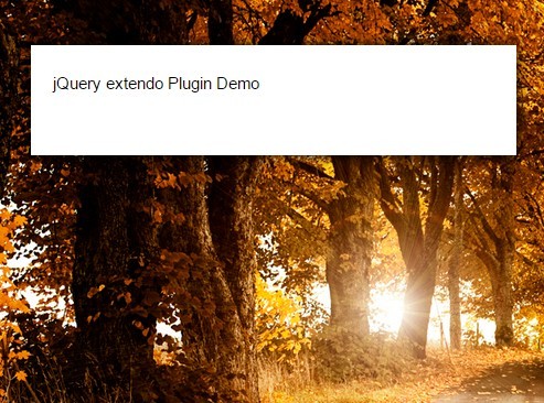
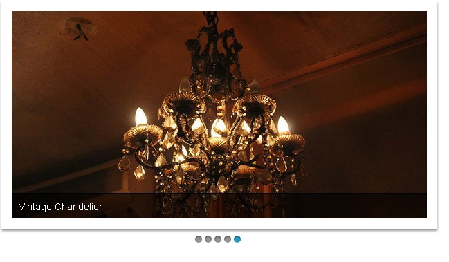
extendo is a very small (~1kb minified) jQuery plugin to create a responsive fullscreen slideshow that automatically resizes & crops the images to fit your window's size.
How to use it:
1. Add any number of images into a container element.
<div id="slideshow">
  <img src="1.jpg" alt="Slideshow 1" class="active">
  <img src="2.jpg" alt="Slideshow 2">
  <img src="3.jpg" alt="Slideshow 3">
  <img src="4.jpg" alt="Slideshow 4">
  <img src="5.jpg" alt="Slideshow 5">
</div>
2. Include jQuery library and the jQuery extendo plugin on your webpage.
<script src="jquery.min.js"></script>
<script src="jquery.extendo.min.js"></script>
3. Call the plugin on the container.
$("#slideshow").extendo({
  order: "list" // or 'random'
});
4. The core CSS styles to make the slideshow responsive.
#slideshow {
  position: relative;
  height: 350px;
  z-index: -1;
}

#slideshow img {
  position: absolute;
  top: 0;
  left: 0;
  z-index: 8;
  opacity: 0.0;
}

#slideshow img.active {
  z-index: 10;
  opacity: 1.0;
}

#slideshow img.last-active { z-index: 9; }

#slideshow img {
  /* Set rules to fill background */
  min-height: 100%;
  min-width: 1024px;
  /* Set up proportionate scaling */
  width: 100%;
  height: auto;
  /* Set up positioning */
  position: fixed;
  top: 0;
  left: 0;
}

@media screen and (max-width: 1024px) {

img.bg {
  left: 50%;
  margin-left: -512px;
}
}
This awesome jQuery plugin is developed by aleksnyder. For more Advanced Usages, please check the demo page or visit the official website.