Fullscreen Responsive Image Slideshow with jQuery - Phoenix Slider
| File Size: | 1.83 MB |
|---|---|
| Views Total: | 4929 |
| Last Update: | |
| Publish Date: | |
| Official Website: | Go to website |
| License: | MIT |

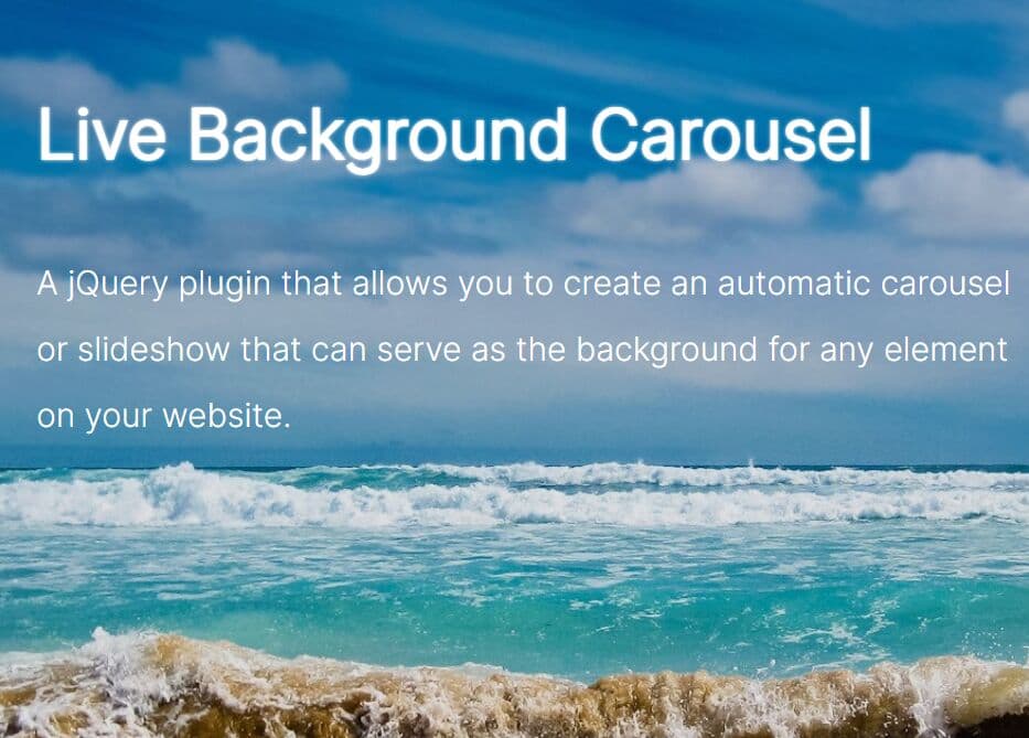
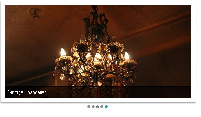
A simple jQuery slideshow plugin for creating a full screen, responsive image carousel that has the ability to automatically scale images to fit the slideshow container while maintaining aspect ratio and maintaining centering.
How to use it:
1. Wrap your images into DIV elements as follows.
<div class="phoenix-slider">

  <div class="phoenix-feather">
    <img src="img/1.jpg" alt="" />
  </div>

  <div class="phoenix-feather">
    <img src="img/2.jpg" alt="" />
  </div>

  <div class="phoenix-feather">
    <img src="img/3.jpg" alt="" />
  </div>

  <div class="phoenix-feather">
    <img src="img/4.jpg" alt="" />
  </div>

  <div class="phoenix-feather">
    <img src="img/5.jpg" alt="" />
  </div>

  <div class="phoenix-feather">
    <img src="img/6.jpg" alt="" />
  </div>

</div>
2. Add custom CSS styles to the jQuery Phoenix Slider or include the style.css directly in the head section.
.phoenix-slider {
  overflow: hidden;
  width: 100%;
  height: 630px;
  position: relative;
  background: #f5f5f5;
  -webkit-backface-visibility: hidden;
  -moz-backface-visibility: hidden;
  -ms-backface-visibility: hidden;
}

.phoenix-slider .phoenix-feather {
  background: transparent none scroll no-repeat center top;
  -webkit-background-size: cover;
  -moz-background-size: cover;
  -o-background-size: cover;
  background-size: cover;
  position: absolute;
  width: 100%;
  height: 100%;
  min-height: 100%;
  overflow: hidden;
  display: table;
  width: 100%;
  z-index: 2;
  opacity: 0;
}

.phoenix-slider .reborn { z-index: 4; }

.phoenix-slider .phoenix-feather > img {
  position: absolute;
  width: 100%;
  height: auto;
  min-height: 100%;
  overflow: hidden;
  display: none;
}
3. The CSS to style the slider dots navigation.
.container-dots-wrapper {
  position: absolute;
  top: 0;
  right: 10px;
  height: 100%;
  z-index: 9;
}

.container-dots-inner {
  display: table;
  height: 100%;
}

.dots {
  display: table-cell;
  vertical-align: middle;
  list-style: none;
  margin: 0;
  padding: 0;
}

.dots li {
  width: 10px;
  height: 10px;
  margin: 0 4px 7px 4px;
  text-indent: -999em;
  border: 2px solid #fff;
  -webkit-border-radius: 50%;
  -moz-border-radius: 50%;
  border-radius: 50%;
  cursor: pointer;
  opacity: .5;
  -webkit-transition: all 300ms ease-out;
  -moz-transition: all 300ms ease-out;
  -ms-transition: all 300ms ease-out;
  -o-transition: all 300ms ease-out;
  transition: all 300ms ease-out;
  -webkit-filter: drop-shadow(0 1px 2px rgba(0,0,0,.5));
  -moz-filter: drop-shadow(0 1px 2px rgba(0,0,0,.5));
  -ms-filter: drop-shadow(0 1px 2px rgba(0,0,0,.5));
  -o-filter: drop-shadow(0 1px 2px rgba(0,0,0,.5));
  filter: drop-shadow(0 1px 2px rgba(0,0,0,.5));
}

.dots li.active {
  width: 11px;
  height: 11px;
  background: #fff;
  border: 2px solid #fff;
  left: 8px;
  opacity: 1;
}
4. Load jQuery JavaScript library and the jquery.phoenix.js script at the end of the document.
<script src="//ajax.googleapis.com/ajax/libs/jquery/1.11.1/jquery.min.js"></script>
<script src="js/jquery.phoenix.js"></script>
5. Load the jquery.mobile.touchsupport.js for touch support on mobile devices.
<script src="js/jquery.mobile.touchsupport.js"></script>
6. Initialize the plugin with default options.
$(document).ready(function(){

  $('.phoenix-slider').phoenix();

});
7. Full options.
// autoplay delay
delay: 10000,

// animation speed
speed: 400,

// height
height: null,

// fullscreen mode
fullscreen: true,

// dots navigation
dots: true,

// keyboard navigation
keys: true,

// onComplete callback
complete: function (index, currentElement, prevElement) {}
This awesome jQuery plugin is developed by rockbarato. For more Advanced Usages, please check the demo page or visit the official website.