Pinterest Like Responsive Dynamic Grid Layout Plugin - Pinto
| File Size: | 141 KB |
|---|---|
| Views Total: | 14806 |
| Last Update: | |
| Publish Date: | |
| Official Website: | Go to website |
| License: | MIT |

Pinto is an extremely lightweight jQuery plugin which allows you to dynamically arrange your images in a Pinterest-like responsive, fluid grid layout. Particularly designed for portofolio or photography website.
Features:
- Super simple and lightweight.
- Auto rearrange images with a smooth CSS3 transition on window resize.
- Fluid item width based on the viewport size.
How to use it:
1. Load jQuery JavaScript library and the jQuery Pinto plugin at the end of the document.
<script src="//code.jquery.com/jquery-1.11.3.min.js"></script>
<script src="pinto.js"></script>
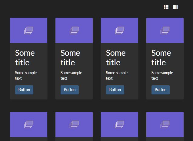
2. Add your images into a container element following the markup structure like so:
<div id="container">

  <!-- These are our grid blocks -->
  <div>
    <img src="1.jpg">
    <h3>Title 1</h3>
  </div>
  <div>
    <img src="2.jpg">
    <h3>Title 2</h3>
  </div>
  <div>
    <img src="3.jpg">
    <h3>Title 3</h3>
  </div>

  ..

</div>
3. The required CSS styles for the grid blocks & images.
#container {
  width: 100%;
  margin: auto;
}

#container > div {
  -webkit-box-shadow: 0 4px 15px -5px #555;
  box-shadow: 0 4px 15px -5px #555;
  background-color: #fff;
  width: 220px;
  padding: 2px;
  margin: 5px;
}

#container > div img {
  padding: 0px;
  display: block;
  width: 100%;
}
4. Call the plugin on the parent container and done.
$('#container').pinto();
5. Available options.
$('#container').pinto({

// a class of items that will be layout
itemClass: "pinto",

// a class of items that will be skipped and not layouted
itemSkipClass: "pinto-skip",

// the width of one grid block in pixels
itemWidth: 220,

// the width spacing between blocks in pixels
gapX: 10,

// the height spacing between blocks in pixels
gapY: 10,

// a blocks alignment ("left", "right", "center")
align: "left",

// adjust the block width to create optimal layout based on container size
fitWidth: true,

// update layout after browser is resized
autoResize: true,

// time in milliseconds between browser resize and layout update
resizeDelay: 50,

// fire after item layout complete
onItemLayout: function($item, column, position) {},

});
Change logs:
v1.5.0 (2016-04-22)
- update
v1.4.0 (2016-01-24)
- update
v1.3.1 (2015-10-30)
- update
v1.3.0 (2015-09-14)
- update
v1.2.0 (2015-09-14)
- Bug fixed (layout).
v1.1.0 (2015-08-25)
- update.
This awesome jQuery plugin is developed by MaxLawrence. For more Advanced Usages, please check the demo page or visit the official website.