Responsive Dynamic jQuery Tiled Layout Plugin - Elastic Tiles
| File Size: | 2.05 KB |
|---|---|
| Views Total: | 6641 |
| Last Update: | |
| Publish Date: | |
| Official Website: | Go to website |
| License: | MIT |
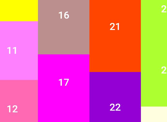
Elastic Tiles is a super lightweight (1kb, unminified) jQuery plugin to create a responsive & dynamic tiled grid that automatically resizes with CSS3 transitions to adapt the window's size.
How to use it:
1. Load the jQuery Elastic Tiles plugin's javascript after jQuery javascript library.
<script src="http://ajax.googleapis.com/ajax/libs/jquery/1.11.0/jquery.min.js"></script>
<script type="text/javascript" src="Elastic-tiles.jQuery.js"></script>
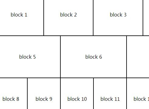
2. The html structure to create a tiled layout.
<body>
<div id="tile-wrapper">
<ul>
<li>block 1</li>
<li>block 2</li>
<li>block 3</li>
<li>block 4</li>
</ul>
<ul>
<li>block 5</li>
<li>block 6</li>
<li>block 7</li>
</ul>
<ul>
<li>block 8</li>
<li>block 9</li>
<li>block 10</li>
<li>block 11</li>
<li>block 12</li>
<li>block 13</li>
</ul>
<ul>
<li>block 14</li>
<li>block 15</li>
</ul>
</div>
</body>
3. The sample CSS to style the layout.
#tile-wrapper {
width: 100%
}
#tile-wrapper ul {
display: table;
margin: 0;
padding: 0;
width: 100%;
-moz-transition: all 0.3s ease-in-out;
-o-transition: all 0.3s ease-in-out;
-Webkit-transition: all 0.3s ease-in-out;
-ms-transition: all 0.3s ease-in-out;
}
#tile-wrapper ul li {
display: table-cell;
margin: 0;
padding: 0;
text-align: center;
outline: 1px solid #000;
vertical-align: middle;
}
4. Call the plugin on document ready.
<script>

$(function() {
$('#tile-wrapper').tiles();
});

</script>
This awesome jQuery plugin is developed by RyanR26. For more Advanced Usages, please check the demo page or visit the official website.