Minimalist jQuery Responsive Equal Height Grid Layout - Javascript Grids
| File Size: | 3.42 KB |
|---|---|
| Views Total: | 4349 |
| Last Update: | |
| Publish Date: | |
| Official Website: | Go to website |
| License: | MIT |
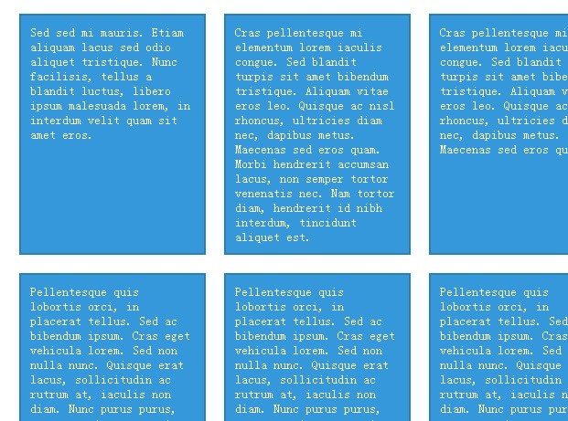
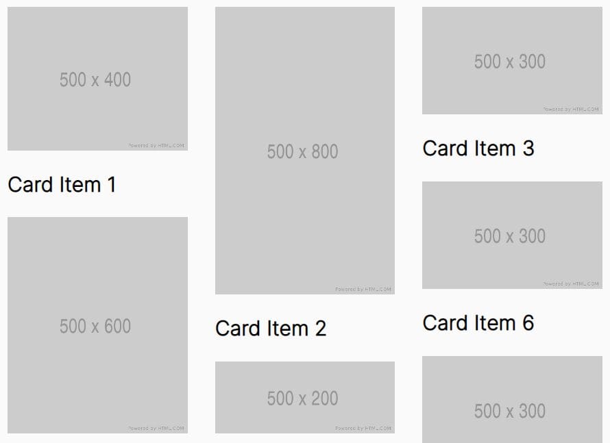
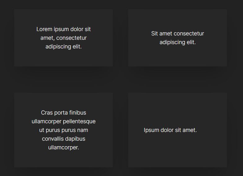
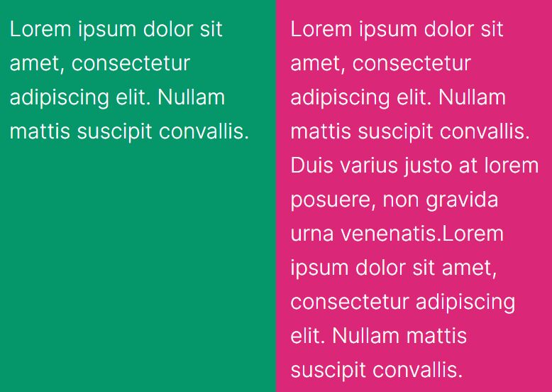
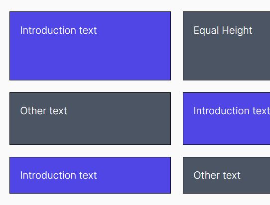
Javascript Grids is a super simple jQuery plugin for creating a nest & responsive grid layout that all the grid elements have the equal height, based on the tallest element.
See also:
- jQuery Plugin For Equalizing The Height of Your Elements - Equal Height Columns
- jQuery Plugin for Equalizing The Height or Width of Your Elements - equalize.js
Basic Usage:
1. Load the latest version of jQuery and jQuery javascript grids plugin in the html document.
<script src="/path/to/cdn/jquery.min.js"></script>
<script src="/path/to/grids.min.js"></script>
2. Create the html for a grid layout.
<div class="wrapper">
  <div class="element"> Block 1 </div>
  <div class="element"> Block 2 </div>
  <div class="element"> Block 3 </div>
  ...
</div>
3. The sample CSS to style the grid layout.
.wrapper{
  max-width:900px;
  margin:0 auto;
}

.element{
  background:#3498db;
  border:2px solid #2980b9;
  margin-bottom:20px;
  padding:10px;
  width:180px;
  float:left;
  color:#fff;
  margin-right:20px;
}
4. Simply call the plugin on the grid elements and you're done.
jQuery(function($) {
  $('.element').responsiveEqualHeightGrid();
});
This awesome jQuery plugin is developed by Sam152. For more Advanced Usages, please check the demo page or visit the official website.