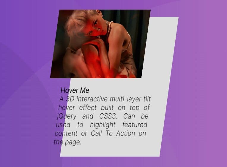
3D Multi-layer Parallax Effect With jQuery And CSS3
| File Size: | 1.76 KB |
|---|---|
| Views Total: | 4997 |
| Last Update: | |
| Publish Date: | |
| Official Website: | Go to website |
| License: | MIT |
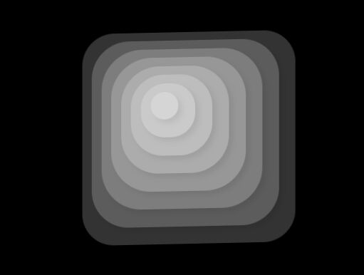
A 3D interactive multi-layer parallax animation effect that reacts to mouse movement, built using jQuery and CSS3.
How to use it:
1. Create a group of DIV layers in a container element.
<div class="box">
  <span class="layer"></span>
  <span class="layer"></span>
  <span class="layer"></span>
  <span class="layer"></span>
  <span class="layer"></span>
  <span class="layer"></span>
  <span class="layer"></span>
  <span class="layer"></span>
</div>
2. The CSS styles for the layers.
.box {
  position: relative;
  height: 100%;
  top: 50%;
  left: 50%;
  perspective: 9999px;
  transform-style: preserve-3d;
  transform: translate(-50%, -50%) rotateX(10deg);
  transition: 2s cubic-bezier(0.2, 0.9, 0.3, 1.3);/* Layers */
}

.box .layer {
  position: absolute;
  top: 50%;
  left: 50%;
  background: #FFFFFF;
  box-shadow: -4px -4px 10px 0px rgba(0, 0, 0, 0.4);
  animation: load 1.4s forwards;
  opacity: 0;
}

.layer:nth-child(1) {
  padding: 120px;
  transform: translate(-50%, -50%) rotateZ(180deg) translateZ(50px);
  border-radius: 15%;
  animation-delay: 0.2s;
}

.layer:nth-child(2) {
  padding: 105px;
  transform: translate(-50%, -50%) rotateZ(180deg) translateZ(80px);
  border-radius: 20%;
  animation-delay: 0.4s;
}

.layer:nth-child(3) {
  padding: 90px;
  transform: translate(-50%, -50%) rotateZ(180deg) translateZ(110px);
  border-radius: 25%;
  animation-delay: 0.6s;
}

.layer:nth-child(4) {
  padding: 75px;
  transform: translate(-50%, -50%) rotateZ(180deg) translateZ(140px);
  border-radius: 30%;
  animation-delay: 0.8s;
}

.layer:nth-child(5) {
  padding: 60px;
  transform: translate(-50%, -50%) rotateZ(180deg) translateZ(170px);
  border-radius: 35%;
  animation-delay: 1s;
}

.layer:nth-child(6) {
  padding: 45px;
  transform: translate(-50%, -50%) rotateZ(180deg) translateZ(200px);
  border-radius: 40%;
  animation-delay: 1.2s;
}

.layer:nth-child(7) {
  padding: 30px;
  transform: translate(-50%, -50%) rotateZ(180deg) translateZ(230px);
  border-radius: 45%;
  animation-delay: 1.4s;
}

.layer:nth-child(8) {
  padding: 15px;
  transform: translate(-50%, -50%) rotateZ(180deg) translateZ(260px);
  border-radius: 50%;
  animation-delay: 1.6s;
}

/* Load animation */
@keyframes
load {  to {
 opacity: .2;
}
}
3. The main JavaScript. Copy and insert the following JavaScript snippets after jQuery.
<script src="https://code.jquery.com/jquery-3.2.1.slim.min.js"
        integrity="sha384-KJ3o2DKtIkvYIK3UENzmM7KCkRr/rE9/Qpg6aAZGJwFDMVNA/GpGFF93hXpG5KkN"
        crossorigin="anonymous">
</script>
//Throttle:
var throttleOn = false;
var actionLock = false;
var throttleTimer = 100;

function throttle(e){
  if(throttleOn){
    actionLock = true;
  };
  if(!actionLock){
    throttleOn = true;
    setTimeout(function(){
      throttleOn = false;
    }, throttleTimer);
    translate(e);
  };
  actionLock = false;
};

//Tracking:
var threshold = 20;
var box = $(".box");

function translate(e){
  var xOrigin = box.width() / 2;
  var yOrigin = box.height() / 2;
  var xPivot = (e.clientY - yOrigin) / yOrigin * -threshold;
  var yPivot = (e.clientX - xOrigin) / xOrigin * threshold;
  box.css({
    'transform': 'translate(-50%, -50%) rotateX('+xPivot+'deg) rotateY('+yPivot+'deg)'
  });
};
4. Activate the effect on mouse move.
$(window).mousemove(function(e){
  throttle(e);
});
This awesome jQuery plugin is developed by Tobias Bogliolo. For more Advanced Usages, please check the demo page or visit the official website.