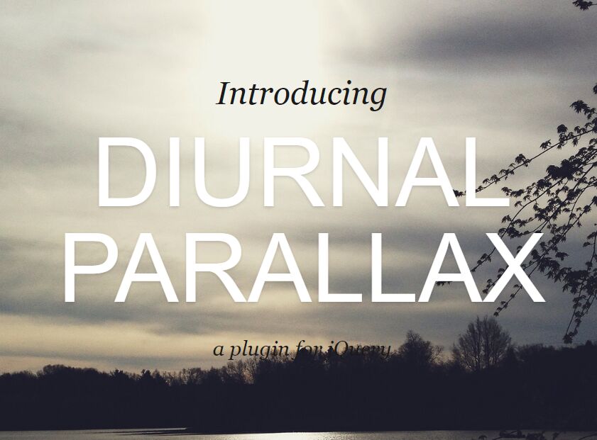
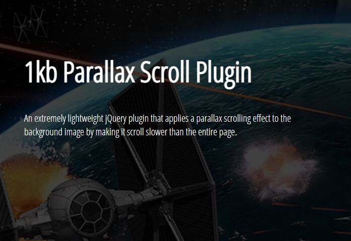
Apple TV Inspired Interactive Parallax Effect With jQuery And CSS3
| File Size: | 1.66 MB |
|---|---|
| Views Total: | 2377 |
| Last Update: | |
| Publish Date: | |
| Official Website: | Go to website |
| License: | MIT |
Just another jQuery/CSS3 implementation of the cool Apple TV Inspired multi-layer parallax effect in relation to your mouse position. With a lighting effect based on CSS3 mix-blend-mode property.
How to use it:
1. Add image & light layers to your webpage as follow:
<div class="ad">
  <div class="layer light"></div>
  <div class="layer light light-2"></div>
  <div class="layer layer-1"></div>
  <div class="layer layer-2"></div>
  <div class="layer layer-3"></div>
</div>
2. The CSS styles for the main wrapper.
.ad {
  position: absolute;
  left: 50%;
  top: 50%;
  width: 840px;
  height: 500px;
  margin-left: -420px;
  margin-top: -250px;
  background: black;
  overflow: hidden;
  border-radius: 3px;
  -webkit-transform-style: preserve-3d;
  will-change: transform;
  box-shadow: 0 60px 100px rgba(0, 0, 0, 0.5);
}
3. The CSS styles for the parallax layers.
.light {
  top: 50%;
  left: 50%;
  margin-left: -840px;
  margin-top: -800px;
  width: 1680px;
  height: 1000px;
  background: -webkit-radial-gradient(ellipse closest-side at center, #6c6c6c, #000000);
  background: radial-gradient(ellipse closest-side at center, #6c6c6c, #000000);
  mix-blend-mode: color-dodge;
  opacity: .6;
  z-index: 3;
}

.light-2 {
  z-index: 4;
  background: -webkit-radial-gradient(ellipse closest-side at center, #ffffff, #000000);
  background: radial-gradient(ellipse closest-side at center, #ffffff, #000000);
  mix-blend-mode: screen;
  opacity: .3;
}

.layer-1,
.layer-2,
.layer-3 {
  top: 50%;
  left: 50%;
  margin-left: -630px;
  margin-top: -375px;
  width: 1260px;
  height: 750px;
  -webkit-transform: scale(0.7);
          transform: scale(0.7);
}
4. Add background images to the parallax layers.
.layer-1 {
  background-image: url(1.jpg);
}

.layer-2 {
  background-image: url(2.png);
}

.layer-3 {
  background-image: url(3.png);
}
5. Place the latest version of jQuery library at the end of the document.
<script src="//code.jquery.com/jquery-3.1.0.slim.min.js"></script>
6. The core JavaScript to active the mouse move interactive parallax effect on the layers.
var $body = $('body');
var WIDTH = $body.width();
var HEIGHT = $body.height();
var $ad = $('.ad');
var $light = $ad.find('.light');
var $layer1 = $ad.find('.layer-1');
var $layer2 = $ad.find('.layer-2');
var $layer3 = $ad.find('.layer-3');

function moveAd(e) {
  var xPer = e.clientX / WIDTH;
  var yPer = e.clientY / HEIGHT;

  var rotateX = 5 - (yPer * 10);
  var rotateY = -5 + (xPer * 10);

  $ad.css({
    transform: 'rotateX(' + rotateX + 'deg) rotateY(' + rotateY + 'deg) '
  });

  var translateX = -5 + (xPer * 10);
  var translateY = -5 + (yPer * 10);

  $layer2.css({
    transform: 'scale(.7) translateX(' + translateX + 'px) translateY(' + translateY + 'px)'
  });

  $layer3.css({
    transform: 'scale(.7) translateX(' + (translateX * 2) + 'px) translateY(' + (translateY * 2) + 'px)'
  });

  var lightX = 800 - (xPer * 1600);
  var lightY = 300 - (yPer * 600);

  $light.css({
    transform: 'translateX(' + lightX + 'px) translateY(' + lightY + 'px)'
  });
}

$body.on('mousemove', moveAd);
This awesome jQuery plugin is developed by thomasxiii. For more Advanced Usages, please check the demo page or visit the official website.