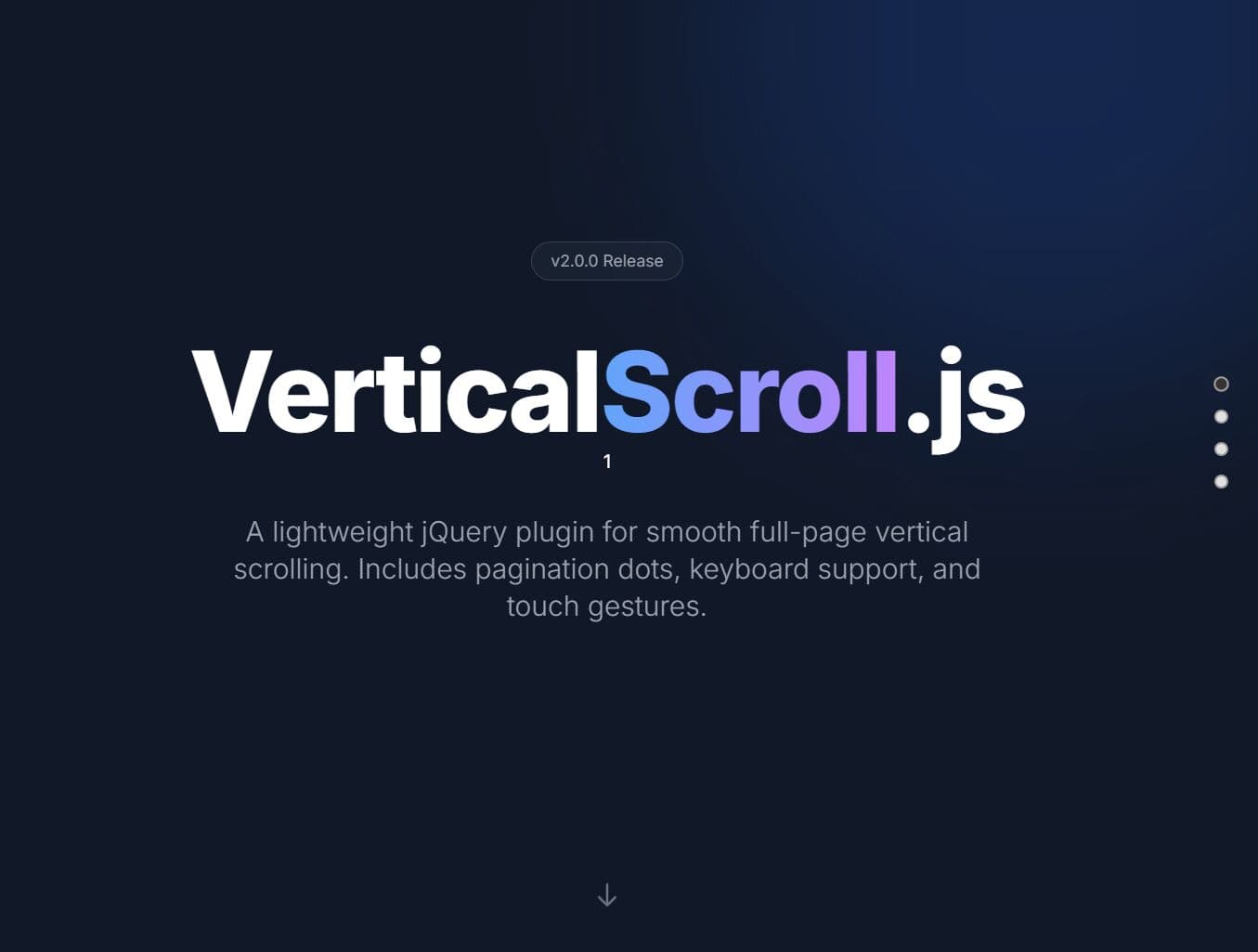
Smooth Fullscreen Vertical Page Scrolling with jQuery and CSS3
| File Size: | 1.97 KB |
|---|---|
| Views Total: | 4887 |
| Last Update: | |
| Publish Date: | |
| Official Website: | Go to website |
| License: | MIT |
A jQuery & CSS / CSS3 based full window one page scrolling effect which allows the user to slide smoothly through content sections using up and down arrows.
How to use it:
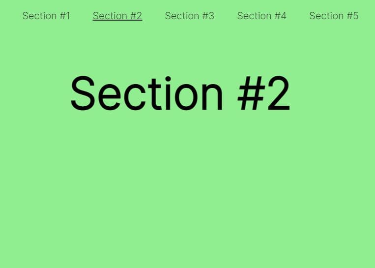
1. Add sectioned content with navigation arrows into the vertical page scrolling UI.
<section class="section section--blue">
<div class="container">
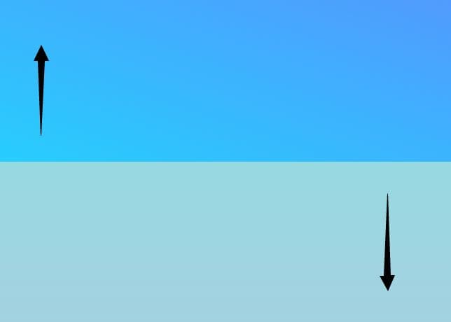
<span class="icon icon--arrow icon--arrow-down"></span>
<div class="content align middle center">
<h1>Section 1</h1>
</div>
</div>
</section>
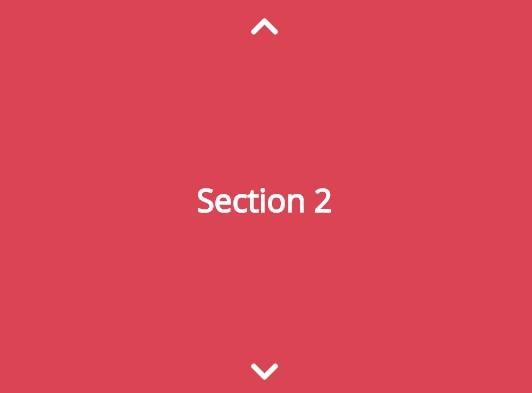
<section class="section">
<div class="container">
<span class="icon icon--arrow icon--arrow-up"></span>
<span class="icon icon--arrow icon--arrow-down"></span>
<div class="content align middle center">
<h1>Section 2</h1>
</div>
</div>
</section>
...
<section class="section">
<div class="container">
<span class="icon icon--arrow icon--arrow-up"></span>
<div class="content align middle center">
<h1>Section N</h1>
</div>
</div>
</section>
2. The primary CSS / CSS3 styles for the layout.
.section {
  width: 100%;
  height: 100vh;
  background: #ffffff;
}

.container {
  position: relative;
  width: 100%;
  max-width: 800px;
  height: 100%;
  margin: 0 auto;
  padding: 0 20px;
}

.content {
  max-width: 300px;
  text-align: center;
}

.align {
  display: block;
  position: relative;
  top: 0;
  -webkit-transform: translateY(0);
  -moz-transform: translateY(0);
  -ms-transform: translateY(0);
  -o-transform: translateY(0);
  transform: translateY(0);
}

.align.middle {
  top: 50%;
  -webkit-transform: translateY(-50%);
  -moz-transform: translateY(-50%);
  -ms-transform: translateY(-50%);
  -o-transform: translateY(-50%);
  transform: translateY(-50%);
}

.align.bototm {
  top: 100%;
  -webkit-transform: translateY(-100%);
  -moz-transform: translateY(-100%);
  -ms-transform: translateY(-100%);
  -o-transform: translateY(-100%);
  transform: translateY(-100%);
}

.align.center { margin: 0 auto; }
3. The required CSS / CSS3 styles for the navigation arrows.
.icon {
  display: block;
  position: absolute;
  left: 0;
  right: 0;
  width: 31px;
  height: 17px;
  margin: 0 auto;
  text-align: center;
  cursor: pointer;
}

.icon.icon--arrow:before {
  content: '';
  display: block;
  position: absolute;
  left: 0;
  top: 6px;
  width: 20px;
  height: 5px;
  background: #ffffff;
  border-radius: 5px;
}

.icon.icon--arrow:after {
  content: '';
  display: block;
  position: absolute;
  right: 0;
  top: 6px;
  width: 20px;
  height: 5px;
  background: #ffffff;
  border-radius: 5px;
}

.icon.icon--arrow-up { top: 20px; }

.icon.icon--arrow-up:before {
  -webkit-transform: rotate(-45deg);
  -moz-transform: rotate(-45deg);
  -ms-transform: rotate(-45deg);
  -o-transform: rotate(-45deg);
  transform: rotate(-45deg);
}

.icon.icon--arrow-up:after {
  -webkit-transform: rotate(45deg);
  -moz-transform: rotate(45deg);
  -ms-transform: rotate(45deg);
  -o-transform: rotate(45deg);
  transform: rotate(45deg);
}

.icon.icon--arrow-down { bottom: 20px; }

.icon.icon--arrow-down:before {
  -webkit-transform: rotate(45deg);
  -moz-transform: rotate(45deg);
  -ms-transform: rotate(45deg);
  -o-transform: rotate(45deg);
  transform: rotate(45deg);
}

.icon.icon--arrow-down:after {
  -webkit-transform: rotate(-45deg);
  -moz-transform: rotate(-45deg);
  -ms-transform: rotate(-45deg);
  -o-transform: rotate(-45deg);
  transform: rotate(-45deg);
}
4. Load the needed jQuery JavaScript library at the end of your document.
<script src="//code.jquery.com/jquery-2.1.4.min.js"></script>
5. The JavaScript (jQuery script) to animate scrolling to next / prev sections.
(function ($) {
  'use strict';

  $('.icon').on('click', function () {
    var $this = $(this);
    if ($this.hasClass('icon--arrow-up')) {
      var $slide = $(window).scrollTop() - $(window).height();
    }
    if ($this.hasClass('icon--arrow-down')) {
      var $slide = $(window).scrollTop() + $(window).height();
    }

    $('html, body').animate({
      scrollTop: $slide
    }, 1200);
  });

})(jQuery)
This awesome jQuery plugin is developed by ianabalus. For more Advanced Usages, please check the demo page or visit the official website.