Create Interactive Moving Objects with jQuery and CSS3 - bgMouseMove
| File Size: | 613 KB |
|---|---|
| Views Total: | 11036 |
| Last Update: | |
| Publish Date: | |
| Official Website: | Go to website |
| License: | MIT |
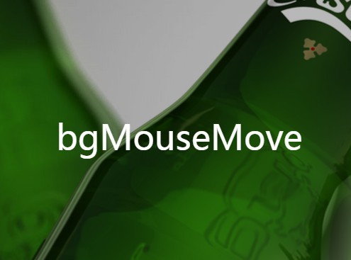
bgMouseMove is a small jQuery script that utilizes CSS3 3D Transforms to create Parallax Effect-like interactive moving background/objects with mouse interaction.
See also:
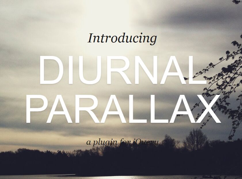
- jQuery Plugin To Add Interative Parallax Effects To Objects - Piao
- jQuery Plugin To Create Interactive Parallax Effects - Real Parallax
- Minimalist 3D Parallax Effect with jQuery and CSS3
- Smooth Parallax Effects with jQuery and CSS3 - woolParalax
- Interactive Mouse Hover Parallax Effect with jQuery - Mouse Parallax
- Simple and Lightweight jQuery Parallax Engine - Parallax.js
- Creating 3D Interative Parallax Background Effects with jQuery - Simples 3D
- Interactive Parallax Effect with jQuery - jparallax
How to use it:
1. Create two moving layers that react to your cursor.
<div class="layer img1"></div>
<div class="layer img2"></div>
2. The sample CSS to style the moving layers.
.layer {
  -webkit-box-sizing: content-box;
  -moz-box-sizing: content-box;
  box-sizing: content-box;
  padding: 50px 200px;
  margin: -50px -200px;
  left: 0px;
  top: 0px
}

.img1 {
  background: url("img/2.jpg");
  z-index: 1;
  -moz-background-size: cover;
  -o-background-size: cover;
  background-size: cover;
  background-position: center center;
  background-repeat: no-repeat;
  -webkit-transform: translate3d(0, 0, 0);
  -moz-transform: translate3d(0, 0, 0);
  transform: translate3d(0, 0, 0);
  -webkit-transform-style: preserve-3d;
  -moz-transform-style: preserve-3d;
  transform-style: preserve-3d
}

.img2 {
  background: url("img/1.png");
  z-index: 2;
  -moz-background-size: cover;
  -o-background-size: cover;
  background-size: cover;
  background-position: center center;
  background-repeat: no-repeat;
  -webkit-transform: translate3d(0, 0, 0);
  -moz-transform: translate3d(0, 0, 0);
  transform: translate3d(0, 0, 0);
  -webkit-transform-style: preserve-3d;
  -moz-transform-style: preserve-3d;
  transform-style: preserve-3d
}
3. Create an overlay that stays in front of the layers.
<div class="overlay">
  ...
</div>
4. Make the overlay cover the whole page.
.overlay {
  position: absolute;
  top: 0;
  left: 0;
  z-index: 5;
  width: 100%;
  height: 100%;
  background: rgba(0,0,0,0.28)
}
5. Include the necessary jQuery library on your webpage.
<script src="//code.jquery.com/jquery-2.1.3.min.js"></script>
7. The jQuery script to apply interactive parallax effect on the layers using CSS3 translate3D().
var img2 = $('.img2');
var img1 = $('.img1');
var overlay = $('.overlay');


overlay.mousemove(function(e){
    var amountMovedX = (e.pageX * -1 / 6);
    var amountMovedY = (e.pageY * -1 / 20);
	img2.css({
  '-webkit-transform' : 'translate3d(' + amountMovedX + 'px,' + amountMovedY + 'px, 0)',
  '-moz-transform'    : 'translate3d(' + amountMovedX + 'px,' + amountMovedY + 'px, 0)',
  '-ms-transform'     : 'translate3d(' + amountMovedX + 'px,' + amountMovedY + 'px, 0)',
  '-o-transform'      : 'translate3d(' + amountMovedX + 'px,' + amountMovedY + 'px, 0)',
  'transform'         : 'translate3d(' + amountMovedX + 'px,' + amountMovedY + 'px, 0)'
	});

});


overlay.mousemove(function(e){
    var amountMovedX = (e.pageX * -1 / 12);
    var amountMovedY = (e.pageY * -1 / 20);
	img1.css({
  '-webkit-transform' : 'translate3d(' + amountMovedX + 'px,' + amountMovedY + 'px, 0)',
  '-moz-transform'    : 'translate3d(' + amountMovedX + 'px,' + amountMovedY + 'px, 0)',
  '-ms-transform'     : 'translate3d(' + amountMovedX + 'px,' + amountMovedY + 'px, 0)',
  '-o-transform'      : 'translate3d(' + amountMovedX + 'px,' + amountMovedY + 'px, 0)',
  'transform'         : 'translate3d(' + amountMovedX + 'px,' + amountMovedY + 'px, 0)'
});

});
Change log:
2015-04-08
- added a delay for animation
This awesome jQuery plugin is developed by dyrehauge. For more Advanced Usages, please check the demo page or visit the official website.