10 Custom Cursor & Mouse Effects in JavaScript - mouse-animations
| File Size: | 161 KB |
|---|---|
| Views Total: | 553 |
| Last Update: | |
| Publish Date: | |
| Official Website: | Go to website |
| License: | MIT |

mouse-animations is a framework-agnostic JavaScript library that provides 10 custom cursors and click/hover effects for modern web design. Works with both Vanilla JavaScript and jQuery.
Features:
- 10 built-in effects: Trail, Ripple, CustomCursor, Magnetic, Particles, Parallax, Tilt, Spotlight, Invert, and Image.
- Each effect is a standalone class. You instantiate what you need, and the rest never loads.
- Canvas-based rendering for Trail and Particles.
- Lerp-based motion for smooth animations.
See It In Action:
Table of Contents:
- Trail
- Ripple
- CustomCursor
- Magnetic
- Particles
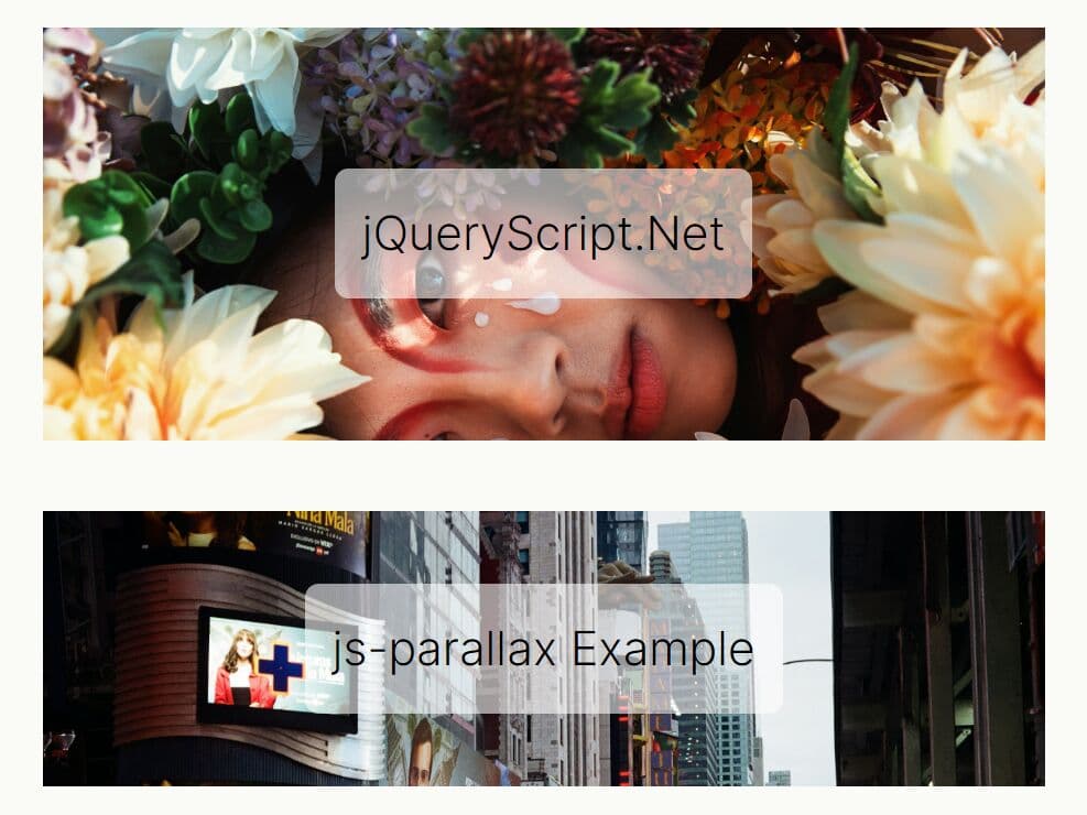
- Parallax
- Tilt
- Spotlight
- Invert
- Image
- Combining Effects
- jQuery Plugin
- API Methods
Installation:
1. Install the package via npm for projects that use a build step:
# NPM
$ npm install mouse-animations
import {
  Trail,
  Ripple,
  Particles,
  CustomCursor,
  Magnetic,
  Parallax,
  Tilt,
  Spotlight,
  Invert,
  Image
} from "mouse-animations";
2. You can also import it directly from a CDN.
import {
  Trail,
  Ripple,
  Particles,
  CustomCursor,
  Magnetic,
  Parallax,
  Tilt,
  Spotlight,
  Invert,
  Image
} from "https://cdn.jsdelivr.net/npm/mouse-animations/+esm";
Trail
Trail renders a fading dot trail on a fixed canvas overlay. Each dot shrinks in size and alpha as it ages. The canvas resizes automatically on window resize.
Configuration Options:
color(string): The fill color of each trail dot. Accepts any valid CSS color value. Default:"#ffffff".size(number): The maximum radius of each dot in pixels. Dot size scales with its position in the trail. Default:6.length(number): The number of trail points to retain in the queue. A higher value produces a longer tail. Default:20.decay(number): The alpha value subtracted from each dot per animation frame. Accepts a value between0and1. Default:0.05.blur(number): CSS blur applied to each dot in pixels. Set to0to disable. Default:0.
import { Trail } from "mouse-animations";

// Create a trail with a teal color, larger dots, and a longer tail
const trail = new Trail({
  color: "#0d9488",
  size: 10,
  length: 30,
  decay: 0.04,
  blur: 2,
});
Ripple
Ripple spawns an expanding circle at each click position. It uses a CSS @keyframes animation and removes each ripple element from the DOM after the animation completes.
Configuration Options:
color(string): The fill color of the ripple circle. Supportsrgba()for transparency. Default:"rgba(255,255,255,0.4)".duration(number): The ripple animation duration in milliseconds. Default:600.maxSize(number): The maximum ripple diameter in pixels. Default:100.
import { Ripple } from "mouse-animations";

// Spawn a large, slow blue ripple on each click
const ripple = new Ripple({
  color: "rgba(59, 130, 246, 0.45)",
  duration: 800,
  maxSize: 140,
});
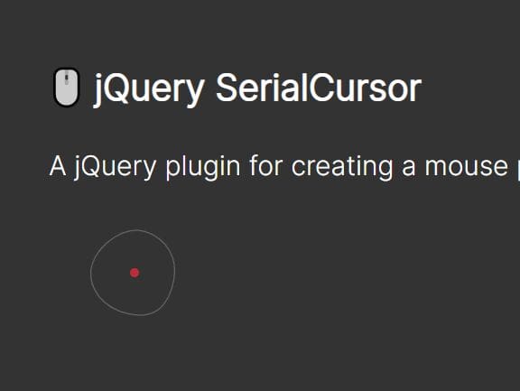
CustomCursor
CustomCursor replaces the native browser cursor with a small inner dot and a larger outer ring. The inner dot snaps to the cursor position instantly. The outer ring follows with a lerp-based lag controlled by the smoothness option.
Configuration Options:
innerSize(number): The diameter of the inner dot in pixels. Default:8.outerSize(number): The diameter of the outer ring in pixels. Default:36.innerColor(string): The background color of the inner dot. Default:"#ffffff".outerColor(string): The border color of the outer ring. Supportsrgba(). Default:"rgba(255,255,255,0.5)".smoothness(number): The lerp factor for the outer ring's motion. A lower value creates more lag. Accepts a value between0and1. Default:0.15.hideDefault(boolean): Whentrue, hides the native cursor across the entire page. Default:true.
import { CustomCursor } from "mouse-animations";

// Replace the native cursor with a violet dot and a slow-following outer ring
const cursor = new CustomCursor({
  innerSize: 10,
  outerSize: 42,
  innerColor: "#7c3aed",
  outerColor: "rgba(124, 58, 237, 0.4)",
  smoothness: 0.1,
  hideDefault: true,
});
Magnetic
Magnetic applies a CSS transform: translate() pull to matched elements as the cursor enters their activation radius. The transform resets when the cursor leaves. A selector option is required.
Configuration Options:
selector(string): A CSS selector for the elements to magnetize. Required.strength(number): The pull strength multiplier. Higher values produce a stronger pull. Default:0.3.radius(number): The cursor proximity in pixels that activates the magnetic pull. Default:100.ease(number): The lerp ease factor for the transform animation. Lower values create a slower, stickier response. Accepts a value between0and1. Default:0.15.
import { Magnetic } from "mouse-animations";

// Apply a strong magnetic pull to all elements with the .cta-button class
const magnetic = new Magnetic({
  selector: ".cta-button",
  strength: 0.45,
  radius: 120,
  ease: 0.12,
});
Particles
Particles bursts a set of colored canvas circles from the position of each click. Each particle has randomized direction, speed, and a color drawn from the colors array.
Configuration Options:
count(number): The number of particles spawned per click. Default:20.colors(string[]): An array of CSS color strings. Each particle picks a color at random from this array. Default:["#ff6b6b", "#ffd93d", "#6bcb77", "#4d96ff", "#c77dff", "#ff9f1c"].size(number): The maximum particle radius in pixels. Default:6.spread(number): The initial speed spread that determines how far particles travel from the origin. Default:8.decay(number): The alpha value subtracted from each particle per animation frame. Default:0.02.
import { Particles } from "mouse-animations";

// Burst 28 purple-toned particles on each click
const particles = new Particles({
  count: 28,
  colors: ["#f0abfc", "#e879f9", "#c026d3"],
  size: 8,
  spread: 10,
  decay: 0.025,
});
Parallax
Parallax shifts matched elements along the X and Y axes as the mouse moves across the viewport. The shift amount scales with the mouse's normalized position relative to the viewport center. A selector option is required.
Configuration Options:
selector(string): A CSS selector for the elements to shift. Required.depth(number): The maximum translation in pixels when the cursor reaches the viewport edge. Default:20.ease(number): The lerp ease factor for the shift animation. Default:0.1.
import { Parallax } from "mouse-animations";

// Apply a deep parallax shift to background layer elements
const parallax = new Parallax({
  selector: ".bg-layer",
  depth: 35,
  ease: 0.08,
});
Tilt
Tilt applies a CSS 3D perspective rotation to matched elements as the cursor moves over them. An optional glare overlay renders as a rotating gradient highlight. A selector option is required.
Configuration Options:
selector(string): A CSS selector for the elements to tilt. Required.maxTilt(number): The maximum tilt angle in degrees. Default:15.perspective(number): The CSSperspectivedistance in pixels. Lower values produce a more dramatic 3D effect. Default:800.ease(number): The lerp ease factor for the tilt animation. Default:0.1.glare(boolean): Whentrue, overlays a rotating gradient highlight on each element. Default:false.
import { Tilt } from "mouse-animations";

// Apply a 3D tilt with glare to all product card elements
const tilt = new Tilt({
  selector: ".product-card",
  maxTilt: 18,
  perspective: 700,
  ease: 0.08,
  glare: true,
});
Spotlight
Spotlight renders a radial gradient glow that tracks the cursor position inside each matched element. It works best on dark cards and panels. A selector option is required.
Configuration Options
selector(string): A CSS selector for the elements to apply the spotlight to. Required.color(string): The glow color of the spotlight. Supportsrgba()for transparency. Default:"rgba(255,255,255,0.12)".size(number): The spotlight radius in pixels. Default:200.
import { Spotlight } from "mouse-animations";

// Apply a warm spotlight glow to all dark panel elements
const spotlight = new Spotlight({
  selector: ".dark-panel",
  color: "rgba(251, 191, 36, 0.15)",
  size: 250,
});
Invert
Invert renders an opaque circle that follows the cursor and inverts everything beneath it using mix-blend-mode: difference. It works on text, images, and colored backgrounds. The inversion output depends on the circle color — white (#ffffff) produces a full inversion on dark backgrounds; use #000000 for the same result on white backgrounds.
Configuration Options
size(number): The diameter of the inversion circle in pixels. Default:40.color(string): The circle color, which determines the inversion output. Default:"#ffffff".smoothness(number): The lerp factor for the circle's motion. A value of1snaps instantly to the cursor; lower values add lag. Accepts a value between0and1. Default:1.hideDefault(boolean): Whentrue, hides the native cursor. Default:true.
import { Invert } from "mouse-animations";

// Full-inversion circle with a slight lag on dark-background pages
const invert = new Invert({
  size: 48,
  color: "#ffffff",
  smoothness: 0.85,
  hideDefault: true,
});
Image
Image replaces the native cursor with a custom image URL or an inline SVG string. It supports state-based cursor swaps for hover, active, and custom CSS selector zones via the states option.
Note: The class name Image shadows the DOM built-in Image constructor (HTMLImageElement). If you need both in the same file, import with an alias:
setSource() Method
Swap a cursor image at runtime on a live instance:
// Swap the default cursor image at runtime
cursor.setSource("normal", updatedStarSvg);

// Swap the hover state image
cursor.setSource("hover", newHandSvg);

// Swap the image for a custom selector zone
cursor.setSource(".restricted", "/updated-warn.png");
Combining Effects
All seven effects are independent. You can run them all at once. The example below activates a full stack and tears everything down in a single pass:
import { Trail, Ripple, Particles, CustomCursor, Magnetic, Parallax, Tilt, Spotlight, Invert, Image } from "mouse-animations";

const trail     = new Trail({ color: "#7c3aed", size: 8 });
const ripple    = new Ripple({ color: "rgba(124, 58, 237, 0.35)", duration: 700 });
const particles = new Particles({ count: 24, colors: ["#a78bfa", "#7c3aed", "#ddd6fe"] });
const cursor    = new CustomCursor({ innerColor: "#7c3aed", smoothness: 0.12 });
const magnetic  = new Magnetic({ selector: ".nav-link", strength: 0.4 });
const parallax  = new Parallax({ selector: ".hero-bg", depth: 25 });
const tilt      = new Tilt({ selector: ".feature-card", glare: true });
const spotlight = new Spotlight({ selector: ".feature-card", color: "rgba(124, 58, 237, 0.15)" });
const invert    = new Invert({ size: 48, color: "#ffffff" });
const image     = new Image({ src: starSvg, overrideAll: true });

// Tear down every effect in a single iteration
[trail, ripple, particles, cursor, magnetic, parallax, tilt, spotlight, invert, image].forEach(e => e.destroy());
jQuery Plugin
All effects are available as jQuery methods.
// Attach global effects to the body element
$("body").trail({ color: "#7c3aed", size: 8 });
$("body").ripple({ duration: 700, maxSize: 130 });
$("body").customCursor({ innerColor: "#7c3aed", smoothness: 0.12 });
$("body").particles({ count: 24 });
$("body").invert({ size: 40, color: "#ffffff" });
$("body").image({ src: "<svg .../>", overrideAll: true, states: { hover: "<svg .../>" } });

// Selector-based effects — omit `selector` to auto-stamp a unique class onto matched elements
$(".nav-btn").magnetic({ strength: 0.4, radius: 120 });
$(".hero-bg").parallax({ depth: 25, ease: 0.1 });
$(".feature-card").tilt({ maxTilt: 15, perspective: 800, glare: true });
$(".card").spotlight({ color: "rgba(255,255,255,0.12)", size: 200 });

// Lifecycle control through the jQuery plugin interface
$("body").trail("disable");
$("body").trail("enable");
$("body").trail("destroy");
API Methods
All effect instances share the same three lifecycle methods:
// Start or resume an effect after instantiation or after disable()
effect.enable();

// Pause the effect — all DOM elements remain in the page
effect.disable();

// Stop the effect completely and remove all DOM elements it created
effect.destroy();
Alternatives:
Changelog:
2026-05-12
- v0.4.0: Bugfixes
2026-03-24
- add Invert and improve Image effect
This awesome jQuery plugin is developed by tgomilar. For more Advanced Usages, please check the demo page or visit the official website.