Flexible & Responsive jQuery Grid Layout Plugin - Flexgrid
| File Size: | 15.7 KB |
|---|---|
| Views Total: | 6080 |
| Last Update: | |
| Publish Date: | |
| Official Website: | Go to website |
| License: | MIT |
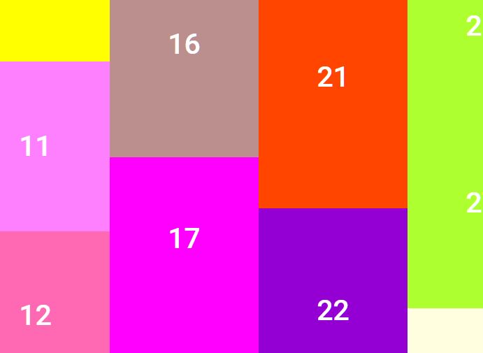
Flexgrid is a fresh new jQuery & CSS based grid system that is flexible, cross browser, fully responsive, mobile-friendly and heavily customizable. Based on 12 columns and also 5 columns.
Features:
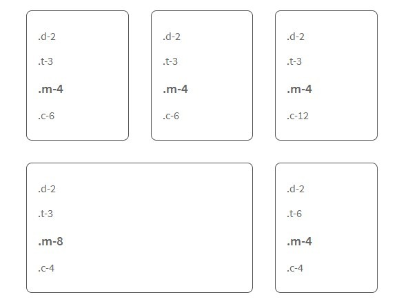
- All grid classes can be overriden by more specific screen sizes.
- Grid containers can be infinitely nested.
- Elements can be reordered at different screen sizes by applying a couple classes.
- Apply the .equal class to the parent of any set of flexgrid containers, and each container on the same row will have equal heights.
Basic Usage:
1. Load the latest version of jQuery javascript library from a CDN.
<script src="http://ajax.googleapis.com/ajax/libs/jquery/1.11.0/jquery.min.js"></script>
2. Load the jQuery flexgrid plugin's javascript and CSS after jQuery library.
<link rel="stylesheet" type="text/css" href="flexgrid.min.css">
<script src="flexgrid.min.js"></script>
3. Create a grid layout by adding grid classes to Html elements. For example, "a-6 t-4" will be 6 columns on all screen sizes except tablets, in which it would convert to 4 columns.
4. That's it. Check the demo page for more usages.
Change log:
v1.5.2 (2014-10-15)
- update.
v1.5.1 (2014-07-06)
- update.
v1.5 (2014-04-29)
- smaller and faster.
2014-04-05
- update to flexgrid 1.2
This awesome jQuery plugin is developed by codingfriend1. For more Advanced Usages, please check the demo page or visit the official website.