Pinterest-like Responsive Grid System with jQuery - jaliswall
| File Size: | 2.78 KB |
|---|---|
| Views Total: | 9742 |
| Last Update: | |
| Publish Date: | |
| Official Website: | Go to website |
| License: | MIT |

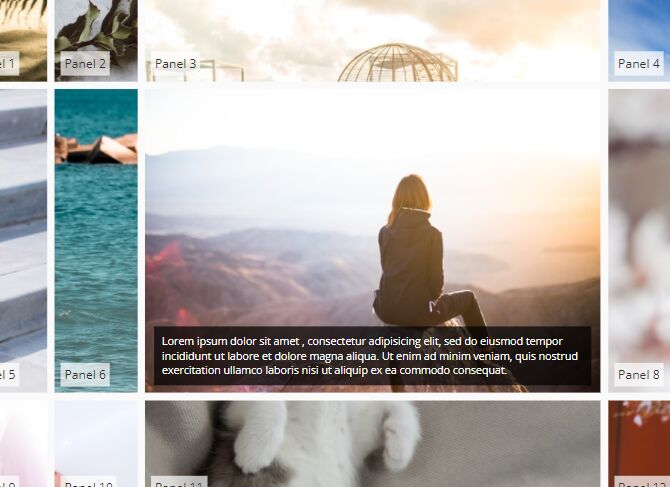
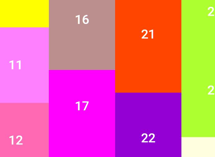
Just another jQuery implementation of the familiar Pinterest-like responsive, fluid grid system that dynamically adjusts the number of columns according to the width set in the CSS.
How to use it:
1. The required markup structure for the grid system.
<div class="wall">
  <a class="wall-item" href="#">
    <img src="1.jpg">
    <h2>wall-item 1</h2>
  </a>

  <a class="wall-item" href="#">
    <img src="2.jpg">
    <h2>wall-item 2</h2>
  </a>

  <a class="wall-item" href="#">
    <img src="3.jpg">
    <h2>wall-item 3</h2>
  </a>

  ...

</div>
2. Style the grid system.
.wall-item {
  display: block;
  margin: 0 0 30px 0;
  padding: 12px;
  background: white;
  border-radius: 3px;
  box-shadow: 0px 1px 2px 0px rgba(0, 0, 0, 0.05);
  transition: all 220ms;
}

.wall-item:hover {
  box-shadow: 0px 2px 3px 1px rgba(0, 0, 0, 0.1);
  transform: translateY(-5px);
  transition: all 220ms;
}

.wall-item > img {
  display: block;
  width: 100%;
  margin: 0 0 24px 0;
}

.wall-item h2 {
  text-align: center;
  font-size: 14px;
  text-transform: uppercase;
  margin: 0 0 12px 0;
}

.wall {
  display: block;
  position: relative;
}

.wall-column {
  display: block;
  position: relative;
  width: 33.333333%;
  float: left;
  padding: 0 12px;
  box-sizing: border-box;
}
3. Make it responsive.
@media (max-width: 640px) {

.wall-column { width: 50%; }

}

@media (max-width: 480px) {

.wall-column {
  width: auto;
  float: none;
}

}
4. Load the latest jQuery library and the jQuery jaliswall plugin at the bottom of the web page.
<script src="//code.jquery.com/jquery-2.1.4.min.js"></script>
<script src="jaliswall.js"></script>
5. Initialize the grid system by calling the function on the top element.
$('.wall').jaliswall();
6. Possible plugin options.
$('.wall').jaliswall({

  // item classname
  item : '.wall-item',

  // column classname
  columnClass : '.wall-column'

});
This awesome jQuery plugin is developed by pierre-bonnin-pro. For more Advanced Usages, please check the demo page or visit the official website.