Reveal Cards From A Single Point Using jQuery And TweenMax.js
| File Size: | 8.15 KB |
|---|---|
| Views Total: | 907 |
| Last Update: | |
| Publish Date: | |
| Official Website: | Go to website |
| License: | MIT |
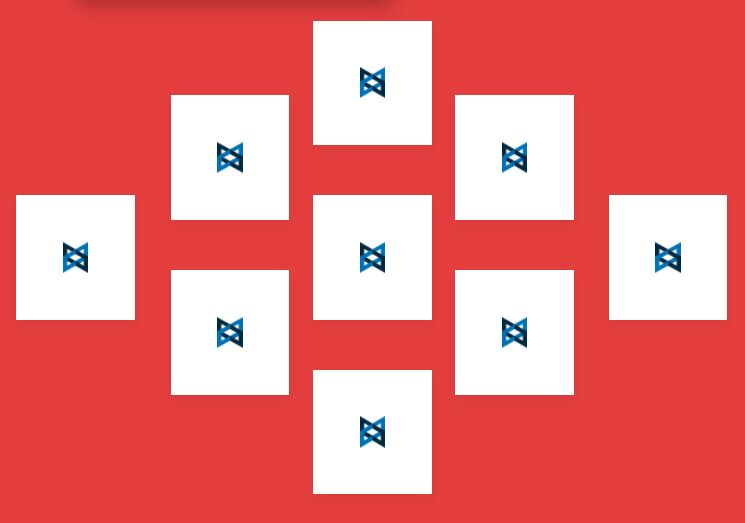
A fancy animated card layout that reveals grid items (cards) from a single point with a smooth shuffle animation.
Based on jQuery and GSAP's TweenMax.js. Responsive design based on CSS Grid Layout.
How to use it:
1. Add grid items to the card layout.
<div class="layoutContainer">
  <div class="layoutContent imgMiddle">
    <div class="layoutContent shuffle item__Card">
      <div class="layoutCard layoutContentCenter item__Card firstCol">
        <div>
          <img src="1.png"/>
        </div>
      </div>
      <div class="layoutCard layoutContentCenter item__Card fifthCol">
        <div>
          <img src="2.png"/>
        </div>
      </div>
      <div class="layoutCardRow2 layoutContentCenter item__Card secondColOne">
        <div>
          <img src="3.png"/>
        </div>
      </div>
      <div class="layoutCardRow2 layoutContentCenter item__Card secondColTwo">
        <div>
          <img src="4.png"/>
        </div>
      </div>
      <div class="layoutCardRow2 layoutContentCenter item__Card thirdColTwo">
        <div>
          <img src="5.png"/>
        </div>
      </div>
      <div class="layoutCardRow2 layoutContentCenter item__Card thirdColOne">
        <div>
          <img src="5.png"/>
        </div>
      </div>
      <div class="layoutCardRow2 layoutContentCenter item__Card thirdColThree">
        <div>
          <img src="6.png"/>
        </div>
      </div>
      <div class="layoutCardRow2 layoutContentCenter item__Card fourthColOne">
        <div>
          <img src="7.png"/>
        </div>
      </div>
      <div class="layoutCardRow2 layoutContentCenter item__Card fourthColTwo">
        <div>
          <img src="8.png"/>
        </div>
      </div>
    </div>
  </div>
</div>
2. The necessary CSS styles for the card layout.
.container {
  background-color: orange;
}

.firstCol {
  display: block;
  width: 100%;
  margin: 0;
  width: calc((100% / 40) * (11));
}

@media (max-width: 800px) {
  .firstCol {
    width: calc((100% / 40) * (9));
  }
}

@supports (display: grid) {
  .firstCol {
    grid-row: 8 / 13;
    grid-column-end: 11;
    grid-column-start: 6;
    padding-left: initial;
  }
  @media (max-width: 800px) {
    .firstCol {
      grid-row: 7 / 12;
    }
  }
  @media (max-width: 800px) {
    .firstCol {
      grid-column-end: 9;
    }
  }
  @media (max-width: 800px) {
    .firstCol {
      grid-column-start: 3;
      padding-left: initial;
    }
  }
}

@media (max-width: 720px) {
  .firstCol {
    width: 100%;
    margin: auto;
  }
  @supports (display: grid) {
    .firstCol {
      grid-row: auto;
      grid-column: 1 / -1;
    }
  }
}

.fifthCol {
  display: block;
  width: 100%;
  margin: 0;
  width: calc((100% / 40) * (34));
  padding-left: calc((100% / 40) * 6);
}

@media (max-width: 800px) {
  .fifthCol {
    width: calc((100% / 40) * (37));
    padding-left: calc((100% / 40) * 3);
  }
}

@supports (display: grid) {
  .fifthCol {
    grid-row: 8 / 13;
    grid-column-end: -11;
    grid-column-start: -6;
    padding-left: initial;
  }
  @media (max-width: 800px) {
    .fifthCol {
      grid-row: 7 / 13;
    }
  }
  @media (max-width: 800px) {
    .fifthCol {
      grid-column-end: -9;
    }
  }
  @media (max-width: 800px) {
    .fifthCol {
      grid-column-start: -3;
      padding-left: initial;
    }
  }
}

@media (max-width: 720px) {
  .fifthCol {
    width: 100%;
    margin: auto;
  }
  @supports (display: grid) {
    .fifthCol {
      grid-row: auto;
      grid-column: 1 / -1;
    }
  }
}

.secondColOne {
  display: block;
  width: 100%;
  margin: 0;
  width: calc((100% / 40) * (17));
}

@media (max-width: 800px) {
  .secondColOne {
    width: calc((100% / 40) * (16));
  }
}

@supports (display: grid) {
  .secondColOne {
    grid-row: 4 / 9;
    grid-column-end: 17;
    grid-column-start: 12;
    padding-left: initial;
  }
  @media (max-width: 800px) {
    .secondColOne {
      grid-row: 3 / 9;
    }
  }
  @media (max-width: 800px) {
    .secondColOne {
      grid-column-end: 16;
    }
  }
  @media (max-width: 800px) {
    .secondColOne {
      grid-column-start: 10;
      padding-left: initial;
    }
  }
}

@media (max-width: 720px) {
  .secondColOne {
    width: 100%;
    margin: auto;
  }
  @supports (display: grid) {
    .secondColOne {
      grid-row: auto;
      grid-column: 1 / -1;
    }
  }
}

.secondColTwo {
  display: block;
  width: 100%;
  margin: 0;
  width: calc((100% / 40) * (17));
}

@media (max-width: 800px) {
  .secondColTwo {
    width: calc((100% / 40) * (16));
  }
}

@supports (display: grid) {
  .secondColTwo {
    grid-row: 11 / 16;
    grid-column-end: 17;
    grid-column-start: 12;
    padding-left: initial;
  }
  @media (max-width: 800px) {
    .secondColTwo {
      grid-row: 12 / 18;
    }
  }
  @media (max-width: 800px) {
    .secondColTwo {
      grid-column-end: 16;
    }
  }
  @media (max-width: 800px) {
    .secondColTwo {
      grid-column-start: 10;
      padding-left: initial;
    }
  }
}

@media (max-width: 720px) {
  .secondColTwo {
    width: 100%;
    margin: auto;
  }
  @supports (display: grid) {
    .secondColTwo {
      grid-row: auto;
      grid-column: 1 / -1;
    }
  }
}

.thirdColTwo {
  display: block;
  width: 100%;
  margin: 0;
  width: calc((100% / 40) * (23));
}

@media (max-width: 800px) {
  .thirdColTwo {
    width: calc((100% / 40) * (24));
  }
}

@supports (display: grid) {
  .thirdColTwo {
    grid-row: 8 / 13;
    grid-column-end: 23;
    grid-column-start: 18;
    padding-left: initial;
  }
  @media (max-width: 800px) {
    .thirdColTwo {
      grid-row: 9 / 15;
    }
  }
  @media (max-width: 800px) {
    .thirdColTwo {
      grid-column-end: 24;
    }
  }
  @media (max-width: 800px) {
    .thirdColTwo {
      grid-column-start: 18;
      padding-left: initial;
    }
  }
}

@media (max-width: 720px) {
  .thirdColTwo {
    width: 100%;
    margin: auto;
  }
  @supports (display: grid) {
    .thirdColTwo {
      grid-row: auto;
      grid-column: 1 / -1;
    }
  }
}

.thirdColOne {
  display: block;
  width: 100%;
  margin: 0;
  width: calc((100% / 40) * (23));
}

@media (max-width: 800px) {
  .thirdColOne {
    width: calc((100% / 40) * (24));
  }
}

@supports (display: grid) {
  .thirdColOne {
    grid-row: 1 / 6;
    grid-column-end: 23;
    grid-column-start: 18;
    padding-left: initial;
  }
  @media (max-width: 800px) {
    .thirdColOne {
      grid-row: 1 / 7;
    }
  }
  @media (max-width: 800px) {
    .thirdColOne {
      grid-column-end: 24;
    }
  }
  @media (max-width: 800px) {
    .thirdColOne {
      grid-column-start: 18;
      padding-left: initial;
    }
  }
}

@media (max-width: 720px) {
  .thirdColOne {
    width: 100%;
    margin: auto;
  }
  @supports (display: grid) {
    .thirdColOne {
      grid-row: auto;
      grid-column: 1 / -1;
    }
  }
}

.thirdColThree {
  display: block;
  width: 100%;
  margin: 0;
  width: calc((100% / 40) * (23));
}

@media (max-width: 800px) {
  .thirdColThree {
    width: calc((100% / 40) * (24));
  }
}

@supports (display: grid) {
  .thirdColThree {
    grid-row: -1 / -6;
    grid-column-end: 23;
    grid-column-start: 18;
    padding-left: initial;
  }
  @media (max-width: 800px) {
    .thirdColThree {
      grid-row: -1 / -7;
    }
  }
  @media (max-width: 800px) {
    .thirdColThree {
      grid-column-end: 24;
    }
  }
  @media (max-width: 800px) {
    .thirdColThree {
      grid-column-start: 18;
      padding-left: initial;
    }
  }
}

@media (max-width: 720px) {
  .thirdColThree {
    width: 100%;
    margin: auto;
  }
  @supports (display: grid) {
    .thirdColThree {
      grid-row: auto;
      grid-column: 1 / -1;
    }
  }
}

.fourthColOne {
  display: block;
  width: 100%;
  margin: 0;
  width: calc((100% / 40) * (29));
}

@media (max-width: 800px) {
  .fourthColOne {
    width: calc((100% / 40) * (32));
  }
}

@supports (display: grid) {
  .fourthColOne {
    grid-row: 4 / 9;
    grid-column-end: 29;
    grid-column-start: 24;
    padding-left: initial;
  }
  @media (max-width: 800px) {
    .fourthColOne {
      grid-row: 4 / 10;
    }
  }
  @media (max-width: 800px) {
    .fourthColOne {
      grid-column-end: 32;
    }
  }
  @media (max-width: 800px) {
    .fourthColOne {
      grid-column-start: 26;
      padding-left: initial;
    }
  }
}

@media (max-width: 720px) {
  .fourthColOne {
    width: 100%;
    margin: auto;
  }
  @supports (display: grid) {
    .fourthColOne {
      grid-row: auto;
      grid-column: 1 / -1;
    }
  }
}

.fourthColTwo {
  display: block;
  width: 100%;
  margin: 0;
  width: calc((100% / 40) * (29));
}

@media (max-width: 800px) {
  .fourthColTwo {
    width: calc((100% / 40) * (32));
  }
}

@supports (display: grid) {
  .fourthColTwo {
    grid-row: -5 / -10;
    grid-column-end: 29;
    grid-column-start: 24;
    padding-left: initial;
  }
  @media (max-width: 800px) {
    .fourthColTwo {
      grid-row: -5 / -11;
    }
  }
  @media (max-width: 800px) {
    .fourthColTwo {
      grid-column-end: 32;
    }
  }
  @media (max-width: 800px) {
    .fourthColTwo {
      grid-column-start: 26;
      padding-left: initial;
    }
  }
}

@media (max-width: 720px) {
  .fourthColTwo {
    width: 100%;
    margin: auto;
  }
  @supports (display: grid) {
    .fourthColTwo {
      grid-row: auto;
      grid-column: 1 / -1;
    }
  }
}

.layoutContainer {
  box-sizing: border-box;
  position: relative;
  display: -webkit-box;
  display: -webkit-flex;
  display: -ms-flexbox;
  display: flex;
  -webkit-flex-wrap: wrap;
  -ms-flex-wrap: wrap;
  flex-wrap: wrap;
  -webkit-flex-direction: column;
  -ms-flex-direction: column;
  flex-direction: column;
  width: 100%;
  margin: auto;
}

@supports (display: grid) {
  .layoutContainer {
    display: grid;
    grid-template-columns: repeat(var(--cells), 1fr);
    grid-auto-rows: minmax(max-content, var(--cellSize));
  }
}

:root {
  --cells: 40;
  --cellSize: calc(100vw / var(--cells));
}

.layoutContentCenter {
  display: -webkit-box;
  display: -webkit-flex;
  display: -ms-flexbox;
  display: flex;
  -webkit-box-pack: center;
  -webkit-justify-content: center;
  -ms-flex-pack: center;
  justify-content: center;
  -webkit-flex-wrap: wrap;
  -ms-flex-wrap: wrap;
  flex-wrap: wrap;
  position: relative;
  margin: 0;
  padding: 0;
  width: 33.33%;
}

@supports (display: grid) {
  .layoutContentCenter {
    width: inherit;
  }
}

@media (max-width: 801px) {
  .layoutContentCenter {
    left: 0 !important;
  }
}

.layoutContentCenter[bg] {
  z-index: 2;
}

.layoutContentCenter div {
  -webkit-align-self: flex-end;
  -ms-flex-item-align: end;
  align-self: flex-end;
  width: 100%;
  margin: 0;
}

.layoutContentCenter div:only-child {
  -webkit-align-self: center;
  -ms-flex-item-align: center;
  align-self: center;
}

@media (max-width: 800px) {
  .layoutContentCenter div {
    -webkit-align-self: center;
    -ms-flex-item-align: center;
    align-self: center;
  }
}

.layoutContentCenter img,
.layoutContentCenter svg {
  width: auto;
  max-width: 15%;
  height: auto;
  vertical-align: middle;
}

@supports (display: grid) {
  .layoutContentCenter img,
  .layoutContentCenter svg {
    max-width: 60%;
  }
}

@media (max-width: 800px) {
  .layoutContentCenter img,
  .layoutContentCenter svg {
    max-width: 40%;
  }
  @media (max-width: 401px) {
    .layoutContentCenter img,
    .layoutContentCenter svg {
      max-width: 33.33%;
    }
  }
}

.layoutContentCenter .layoutCardCaption {
  -webkit-align-self: flex-start;
  -ms-flex-item-align: start;
  align-self: flex-start;
}

@supports (display: grid) {
  .layoutContentCenter .layoutCardCaption {
    margin-top: 12.5%;
  }
}

@media all and (-ms-high-contrast: none) {
  .layoutContentCenter .layoutCardCaption {
    padding: 0 0 25px;
  }
}

@media (max-width: 800px) {
  .layoutContentCenter .layoutCardCaption {
    display: none;
  }
}

.shuffle {
  --rows: 19;
  -webkit-perspective: 1000px;
  -moz-perspective: 1000px;
  -ms-perspective: 1000px;
  perspective: 1000px;
  -webkit-flex-direction: row !important;
  -ms-flex-direction: row !important;
  flex-direction: row !important;
  max-width: 70%;
  margin: 20px auto;
  margin-top: 12px !important;
}

@supports (display: grid) {
  .shuffle {
    max-width: none;
    margin: calc(var(--cellSize) * 2) auto 20px;
  }
}

@media (max-width: 801px) {
  .shuffle {
    --rows: 22;
    margin: calc(var(--cellSize) * 5) auto;
  }
}

@media (min-width: 721px) {
  .shuffle {
    grid-template-rows: repeat(var(--rows), var(--cellSize));
  }
}

@media (max-width: 720px) {
  .shuffle {
    grid-template-columns: repeat(3, 1fr) !important;
    grid-gap: var(--cellSize) !important;
    grid-column: 5 / -5 !important;
  }
  .shuffle>[class*='item_'] {
    grid-column: initial;
    padding: calc(var(--cellSize) * 3) 0;
  }
  .shuffle>[class*='item_'][bg*='f36'] {
    grid-row: 2;
    grid-column: 2;
  }
}

.imgMiddle {
  text-align: center;
  overflow: hidden;
}

.layoutContent {
  flex-direction: inherit;
  flex-wrap: inherit;
  display: inherit;
  width: inherit;
  grid-template-columns: inherit;
  grid-column: 1 / -1;
}

.layoutCard {
  box-shadow: 0 10px 20px rgba(0, 0, 0, 0.05), 0 0 1px rgba(0, 0, 0, 0.2);
  background: #FFF
}

.layoutCardRow2 {
  left: calc(var(--cellSize) * 0.5);
  box-shadow: 0 10px 20px rgba(0, 0, 0, 0.05), 0 0 1px rgba(0, 0, 0, 0.2);
  background: #FFF;
}
3. Load the necessary jQuery and TweenMax.js libraries in the document.
<script src="/path/to/cdn/jquery.slim.min.js"></script>
<script src="/path/to/cdn/TweenMax.min.js"></script>
4. The main JavaScript to activate the reveal effect.
$(document).ready(function () {
  TweenLite.from('.firstCol', 2.5, {
      ease: Power2.easeOut,
      x: 400
  });
  TweenLite.to('.firstCol', 0, {
      ease: Power2.easeOut,
      x: 0
  });
  TweenLite.from('.fifthCol', 2.5, {
      ease: Power3.easeOut,
      x: -400
  });
  TweenLite.to('.fifthCol', 0, {
      ease: Power3.easeOut,
      x: 100
  });
  TweenLite.from('.secondColOne', 2.5, {
      ease: Power3.easeOut,
      x: 300,
      y: 100
  });
  TweenLite.to('.secondColOne', 0, {
      ease: Power3.easeOut,
      x: 100,
      y: 100
  });
  TweenLite.from('.secondColTwo', 2.5, {
      ease: Power3.easeOut,
      x: 300,
      y: 0
  });
  TweenLite.to('.secondColTwo', 0, {
      ease: Power3.easeOut,
      x: 100,
      y: 100
  });
  TweenLite.from('.thirdColOne', 2.5, {
      ease: Power3.easeOut,
      x: 0,
      y: 300
  });
  TweenLite.to('.thirdColOne', 0, {
      ease: Power3.easeOut,
      x: 100,
      y: 100
  });
  TweenLite.from('.thirdColThree', 2.5, {
      ease: Power3.easeOut,
      x: 0,
      y: -300
  });
  TweenLite.to('.thirdColThree', 0, {
      ease: Power3.easeOut,
      x: 100,
      y: 100
  });
  TweenLite.from('.fourthColOne', 2.5, {
      ease: Power3.easeOut,
      x: -300,
      y: 300
  });
  TweenLite.to('.fourthColOne', 0, {
      ease: Power3.easeOut,
      x: 100,
      y: 100
  });
  TweenLite.from('.fourthColTwo', 2.5, {
      ease: Power3.easeOut,
      x: -300,
      y: 0
  });
  TweenLite.to('.fourthColTwo', 0, {
      ease: Power3.easeOut,
      x: 100,
      y: 100
  });
});
This awesome jQuery plugin is developed by AkashKJ18. For more Advanced Usages, please check the demo page or visit the official website.


